 English
 中文简体
A wedding planner sends over a script monogram with hairline strokes and tiny curls. On screen it looks elegant. On a folded napkin beside a wine glass, the loops close up and the letters blur together. Custom Foil Napkins can carry delicate lettering and detailed motifs, but the result depends on how the artwork is prepared for the size, material, and placement of the finished product.
Restaurants, hotels, caterers, and event planners all face the same question: how much detail can a small paper surface hold? The answer changes with each design, so it helps to know what to look for before a file goes to production.
Content
- 1 Fine Fonts: What Holds Up and What Doesn't
- 2 Using Script Fonts Sensibly
- 3 Line Weight, Spacing, and Pattern Detail
- 4 Complex Patterns
- 5 Preparing Artwork and Choosing Placement
- 6 Artwork Preparation
- 7 Placement
- 8 Logos, Small Text, and Paper
- 9 Logos and Small Text
- 10 Paper Surface
- 11 Reviewing the Proof
- 12 Working with the Supplier
- 13 Keeping Delicate Designs Clear
Fine Fonts: What Holds Up and What Doesn't
Thin strokes and narrow gaps lose definition when a design shrinks from a monitor to a napkin. Zooming in on a file gives a false picture of the finished piece, so review the artwork at the size it will actually occupy. Printing the design on ordinary paper at real size is a simple way to check.
| Font Characteristic | Possible Concern |
| Thin strokes | Lines may look weak or broken |
| Connected script | Letters may merge visually |
| Tight letter spacing | Characters become hard to tell apart |
| Small decorative curls | Fine details may disappear |
| Complex letter shapes | Wording becomes harder to read |
A font's structure matters more than its mood. A typeface with clear letter shapes stays readable at a small size, while a highly ornamental style needs more room to keep its details intact.
Using Script Fonts Sensibly
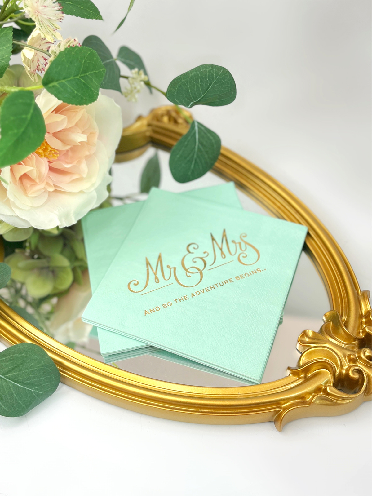
Script suits weddings, anniversary dinners, and hospitality settings, especially for names or initials. Trouble starts with hairline connectors, tight loops, and crossing flourishes that compete with the letters themselves.
Split the roles. Use script for a name or short heading, and pair it with a plain typeface for the date or venue. This gives contrast without forcing every line to carry the same elaborate style.
Check the full wording and not a single letter. Characters that look fine alone can confuse when joined to their neighbors. Word spacing deserves attention too, since flowing scripts can make two words read as one. A couple's names such as "Anna and Owen" may look like a single long word if the gaps are too small.
Line Weight, Spacing, and Pattern Detail
Line thickness gives a design its visual weight, and spacing keeps nearby elements apart. Parallel strokes, small circles, and narrow openings are the usual trouble spots. A design can stay delicate without being heavy, provided the important elements have enough separation.
Ask these questions of the artwork:
- Can the main lines be told apart from nearby details?
- Do narrow gaps stay visible after the design is reduced?
- Is each decorative stroke needed to recognize the image?
- Does a border compete with the central wording?
- Is the design understandable without zooming in?
Answering them before submitting a file saves time later. A problem found on a desk costs little, while one found on a finished batch of napkins costs a great deal more.
Complex Patterns
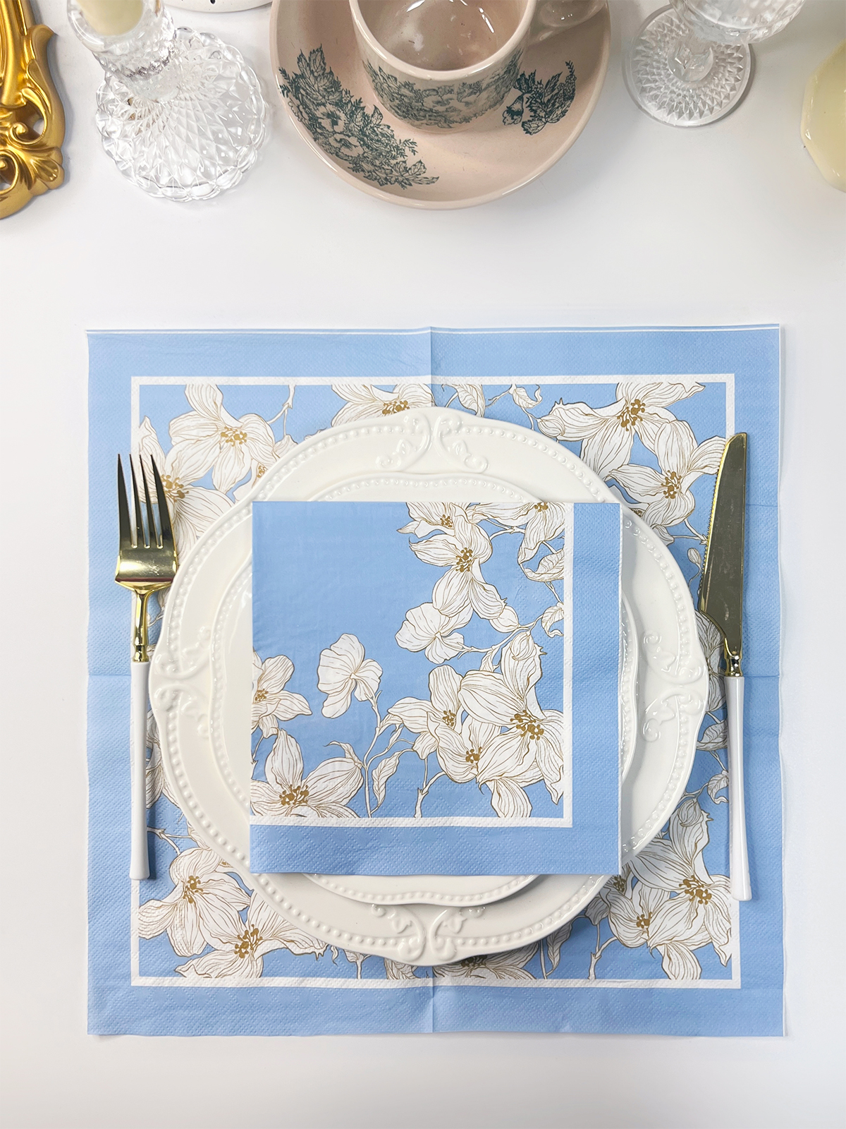
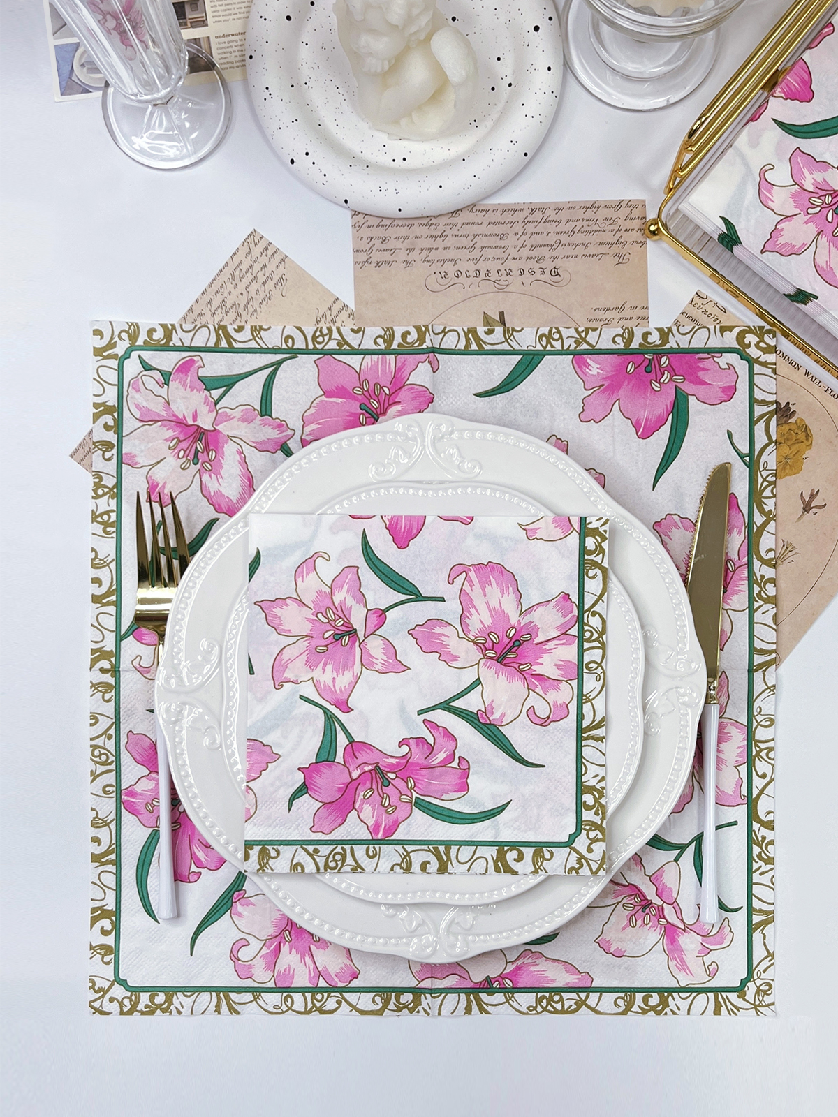
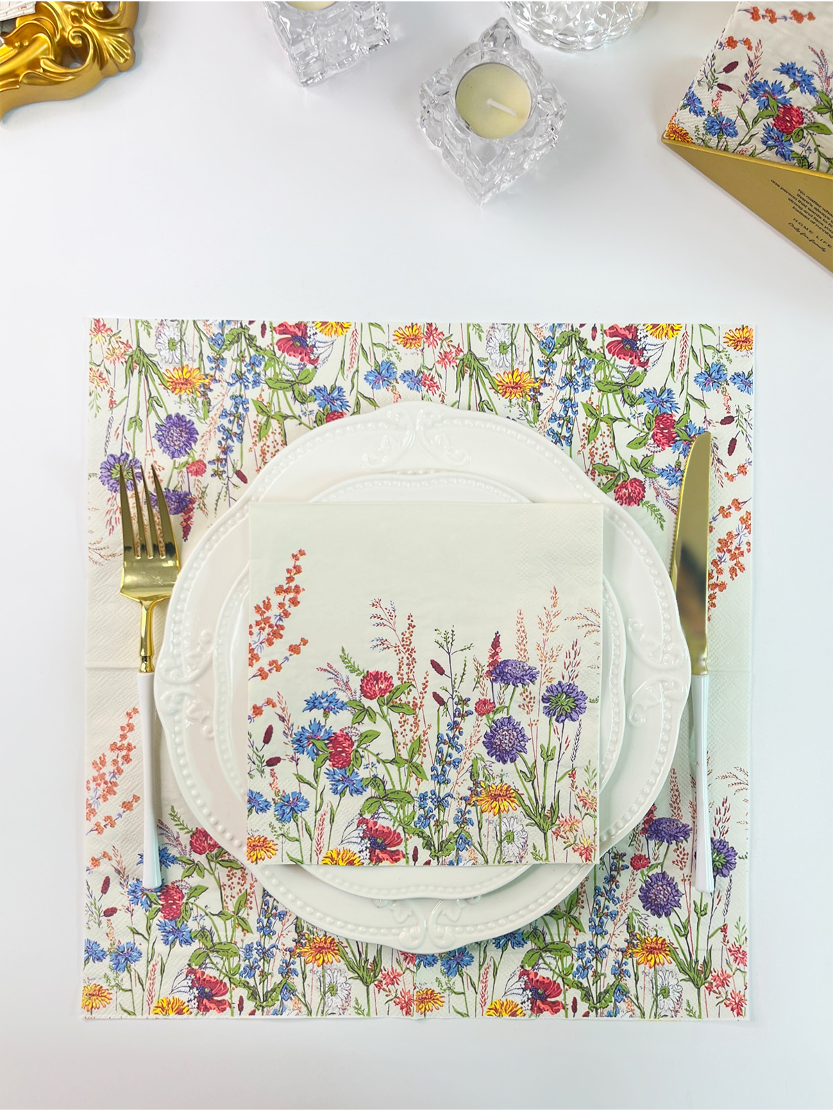
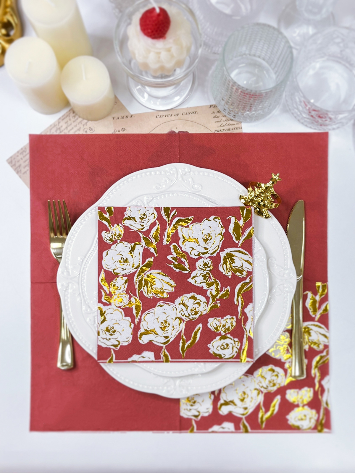
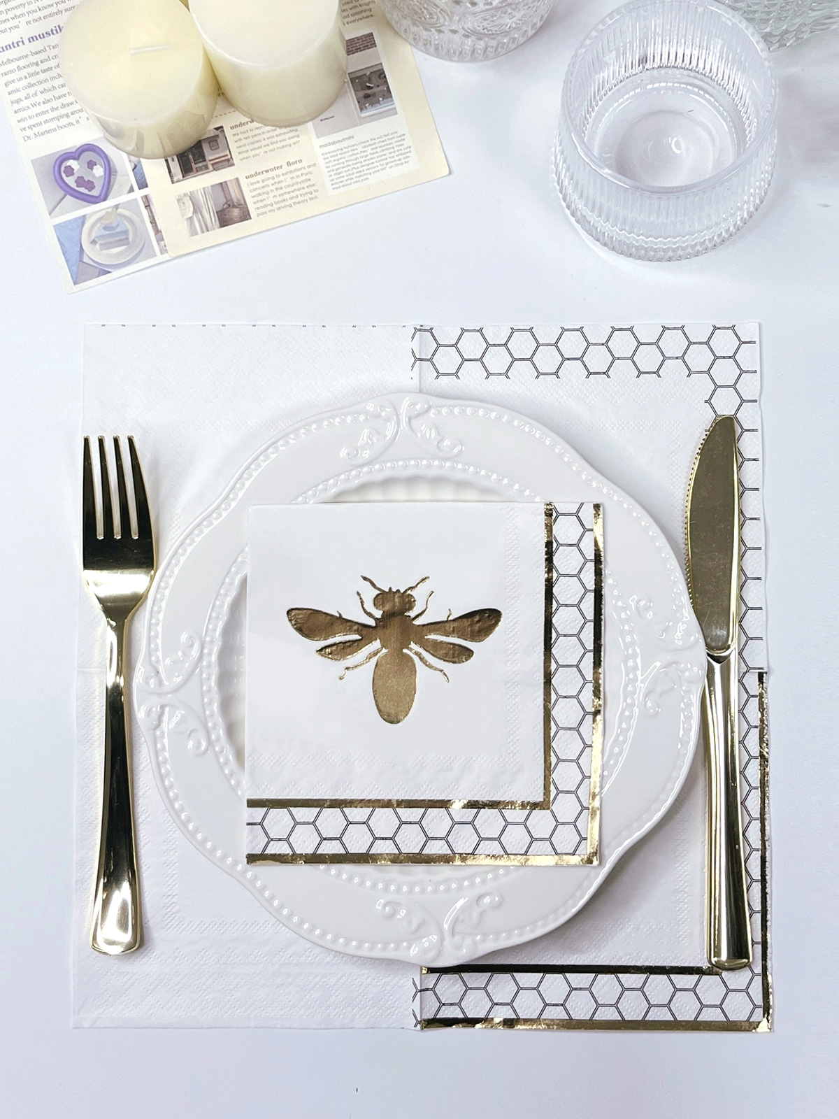
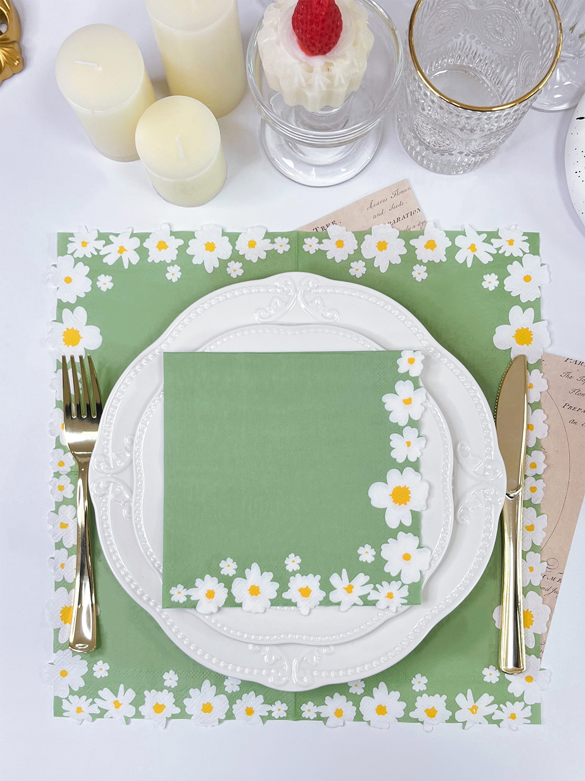
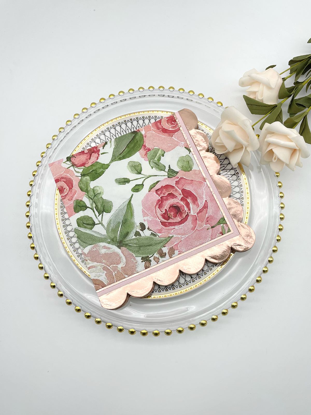
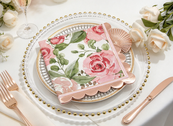
A large flower built from a few clear outlines transfers well to foil. A dense botanical illustration with overlapping leaves, tiny veins, and layered shading carries more information than a small area can hold.
Detail does not have to disappear. Keep the main outline, drop minor internal marks, and reduce overlaps so the pattern stays recognizable. A designer can often trim a drawing by a third in visual complexity while the flower still looks like the same flower.
| Pattern Type | Artwork Consideration |
| Simple floral outline | Keep the main shape clear |
| Dense botanical illustration | Review overlaps and small details |
| Geometric border | Keep spacing between elements consistent |
| Ornamental frame | Leave room around the central design |
| Detailed logo | Preserve features that identify the brand |
Match the amount of detail to the purpose. A formal dinner may need only a small emblem in one corner. A promotional napkin for a café may rely on a logo and a short phrase that guests can read at a glance across a table.
Preparing Artwork and Choosing Placement
Artwork Preparation
Start from a clean source file instead of an image saved from a website or a social media post. Low-resolution files have soft edges, and those edges make thin lines look uneven once they are applied to paper.
Convert fonts to outlines or identify them clearly to preserve their intended appearance. Keep logo outlines clean without added effects. Soft shadows, gradients, and transparent areas may not reproduce well in metallic foil, so keep foiled sections clearly separated from the bare paper.
A practical sequence looks like this:
- Decide whether the focus is a name, logo, message, or pattern.
- Review the artwork at its real size.
- Remove details that add nothing to recognition.
- Check for thin strokes, crowded curves, and narrow gaps.
- Confirm the design fits the usable area of the napkin.
- Review a proof before approving production.
Placement
A technically clear design can still look awkward in the wrong spot. A centered logo suits a restaurant or hotel table. Initials near a corner fit a private event. A border placed too near the edge or a fold looks crowded once the napkin is handled.
Tell the supplier how the napkin will be folded and presented. A triangle fold, a pocket fold, and a flat placement under cutlery all show different parts of the surface. Text near a fold may vanish in the finished arrangement, and a flat preview will not reveal that.
Leave clear margins around detailed illustrations. A pattern that looks balanced in the middle of a screen can feel cramped when the surrounding paper is narrow.
Logos, Small Text, and Paper
Logos and Small Text
Brand logos often contain narrow gaps, tiny lettering, and shapes placed close together. A file made for a large sign may need a simplified version for a napkin. The brand owner should approve that version, and it should follow the company's brand-use rules.
Contact details, slogans, and web addresses become hard to read in limited space. Decide whether they are needed at all. A restaurant might print its logo and name and leave out the street address, since guests already know where they are sitting.
Paper Surface
Napkins differ in texture, softness, and absorbency. A noticeable surface texture changes how fine lines appear, so judge small shapes against the chosen material and not the artwork alone.
Handling matters in daily use. Napkins get folded, picked up with damp hands, and pressed against tables. A design that sits too close to a fold line or edge may wear differently from one placed in a calm area of the surface. Ask for a sample or production proof when available, and assess readability and placement along with the metallic effect.
Reviewing the Proof
Glancing at the overall look lets small errors pass: a wrong letter, a shifted logo, a line that is hard to distinguish. Read every word aloud, including names, dates, and punctuation. A second person checking the spelling often catches what the designer no longer sees.
| Review Area | What to Check |
| Text | Spelling, letter shapes, readability |
| Logo | Correct artwork, recognizable details |
| Line work | Clear separation between nearby strokes |
| Spacing | Room between letters and patterns |
| Placement | Suitable position in the layout |
| Material | Fit with the intended design |
Name the problem precisely. "A crowded letter," "a narrow gap," or "a border too close to the logo" gives the supplier something to act on. "Make it more refined" does not.
Approve only the version meant for production. If the artwork changes afterward, even slightly, check the revised proof again instead of assuming the earlier approval still applies.
Working with the Supplier
A supplier can check files, discuss placement, flag crowded details, and explain how the paper may affect appearance. Say which elements must stay unchanged and which may be simplified, and approve any proposed changes in advance.
Buyers do not need printing vocabulary. Pointing to specific lines, gaps, or letters on the proof is enough for both sides to understand each other. Photos of past napkins you liked, or ones that disappointed you, also help the supplier see your expectations.
Timing matters as well. Event dates rarely move, so allow room for at least one round of revisions before the napkins are needed. Rushed approval is a common reason a small error reaches the final batch.
Keeping Delicate Designs Clear
A delicate design does not need every flourish to keep its character. Protect the features that carry meaning, whether that is a name's letter shapes or a flower's main outline, and give them room to breathe.
Artwork judged at real size, sensible spacing, a suitable paper, and a careful proof review make decisions simpler before production begins. For Custom Foil Napkins, clear communication between buyer and supplier turns a fine idea into a napkin that still looks good on a busy table.