2026-05-25
Content
Not all wedding napkins follow formal wording. Some carry small phrases that feel closer to daily life. These lines are often light, simple, and sometimes a bit playful.
Instead of focusing only on decoration, couples use napkins to share small parts of their story. It can be something that makes guests smile while sitting at the table or waiting for drinks.
Common ideas include:
A napkin near a drink station might say something playful. A napkin at a dining table might feel more calm and simple. The tone often depends on where it is placed.
These small phrases don't need explanation. Guests usually understand the feeling behind them without reading too deeply.
Names and initials are familiar parts of wedding napkin design. They act like a small visual anchor for the entire table.
When two people come together in a ceremony, there is often a shared identity being formed. Napkins are one of the many ways that identity appears in physical form.
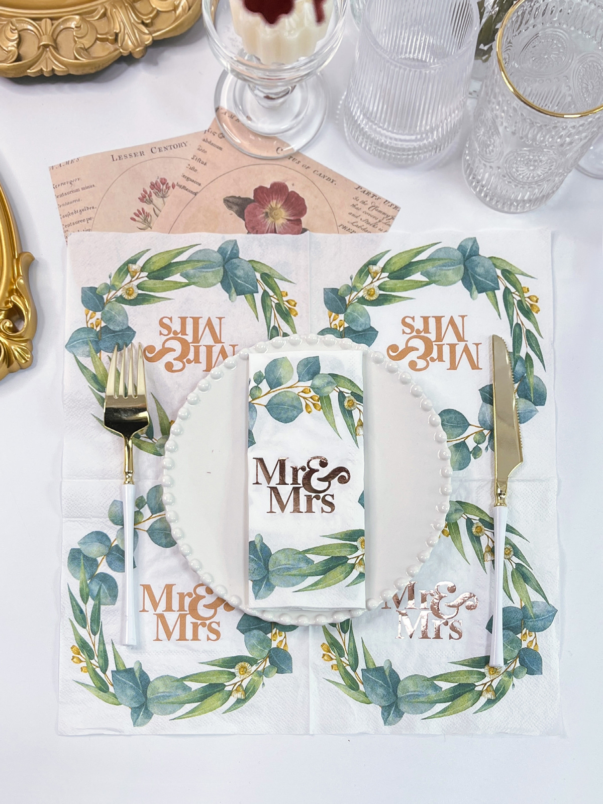
In Custom Paper Napkins Wedding layouts, initials are often used because they are simple but meaningful. They can appear in different ways:
The style of lettering also changes how the message feels. A softer script style feels more personal. A structured font feels more organized and calm.
Even when the design is minimal, the presence of initials is usually enough to link the table setting back to the couple.
A date printed on a napkin may look like a small detail, but it quietly holds the meaning of the whole day. It marks a moment that will not repeat, even if the setting looks similar elsewhere.
Guests don't always focus on the date during the event. It sits in the background of the design. Later, though, it can bring back the setting more clearly than expected.
In Custom Paper Napkins Wedding designs, dates are usually placed in a way that keeps them readable even after folding. The layout is often simple:
The goal is not decoration alone. It is recognition. A simple number or line can quietly connect the napkin back to the memory of the day.
Even though napkins are meant for use during meals and drinks, some of them end up being kept after the event. Not because they are valuable in a traditional sense, but because they carry a small memory of the experience.
A guest might fold one and take it home. Later, it may remind them of the table, the conversation, or the atmosphere of the reception.
This happens more often when the design feels simple and clear. Overloaded designs are harder to remember, while lighter layouts tend to stay in the mind a bit longer.
In Custom Paper Napkins Wedding settings, this effect is usually not planned. It happens naturally when the design feels connected to the moment rather than separate from it.
A wedding table is not just a collection of objects. It is a visual combination of different elements working together. Napkins are one part of that combination, and customization helps them fit into the larger picture.
When names, initials, or dates are added, the napkin often becomes part of a coordinated system that includes:
Instead of standing alone, the napkin starts to follow the same visual direction as the rest of the table.
| Element | Role on Table | Visual Effect |
|---|---|---|
| Names | Identity connection | Direct and clear |
| Initials | Shared symbol | Simple and balanced |
| Date | Memory reference | Subtle and steady |
| Short phrase | Emotional tone | Light and informal |
This kind of structure helps the table feel more connected without adding complexity.
Even when design is personalized, the napkin still needs to work in real use. Guests hold it, fold it, place it beside food or drinks. If it does not function well, the design loses part of its purpose.
In many wedding settings, napkins are used at:
Because of this, personalization is usually kept light enough to avoid interfering with folding or handling.
A napkin still needs to feel natural in the hand. Decoration should not change that basic function.
Some wedding napkins include light humor or relaxed phrases. These are usually placed in areas where guests are already socializing, such as drink stations or cocktail tables.
The tone is often simple and easy to read:
The wording is usually kept short so it does not distract from the rest of the table setup.
Typography quietly shapes how all printed information feels. Even the same words can create different impressions depending on how they are written.
In Custom Paper Napkins Wedding design, common choices include:
If spacing is too tight, folded napkins may hide parts of the design. If it is too loose, the message can feel disconnected.
Layout decisions are often small, but they affect how comfortable the napkin feels during use.
Color and material are not always noticed directly, but they change how personalization appears. A name printed on one surface can feel different depending on background tone and texture.
Soft colors usually keep the design calm. Darker colors create stronger contrast. Paper texture also affects how printing appears under light.
In Custom Paper Napkins Wedding design, these elements are often combined quietly rather than highlighted separately. The goal is to keep everything working together in a balanced way.
Different wedding spaces naturally guide design direction. A garden setting feels different from a closed indoor hall, and napkins usually follow that atmosphere.
For example:
The napkin does not change the venue, but it adjusts to fit into it.
Personalization in wedding napkins continues to move toward smaller and more meaningful details. Instead of heavy decoration, simple elements are used more often.
Common directions include:
Custom Paper Napkins Wedding designs keep focusing on how small printed details can quietly connect guests, couple, and atmosphere without changing the natural flow of the table.
Color and paper feel quietly shape how personalization is seen during a wedding. A name printed on napkin paper can look slightly different depending on what sits behind it and how the surface reacts to light.
In Custom Paper Napkins Wedding settings, color is often chosen to match the table environment rather than to stand out alone. Softer tones usually let printed names or initials sit in a calm way, without pulling attention away from food, flowers, or glassware. Darker tones create stronger contrast, so the text shows up more clearly when guests notice the table.
Material also changes the result in a practical way. A smoother surface tends to keep printed lines clean. A more textured surface can soften the edges of letters, which sometimes makes the design feel more relaxed.
In actual use, these details affect things like:
When color and material do not match well, even a simple design can feel slightly off in appearance. When they match naturally, personalization feels like part of the table instead of something added on top.
Wedding spaces tend to set a quiet direction for all table details, including napkins. The same design can feel different depending on where it is placed.
In outdoor settings, the surroundings already carry a lot of visual texture. Trees, natural light, and open air usually push designs toward lighter and softer directions. Napkins in these spaces often use gentle tones and simple lettering so they do not compete with the environment.
In indoor venues, the setting feels more controlled. Lighting, table structure, and decoration often allow for cleaner layouts. Names and initials may appear more defined because the background is more stable and less changing.
Some practical shifts influenced by venue include:
Even though napkins are small items, they still respond to the space around them. When they fit the environment well, the table feels more unified without needing extra explanation.
Personalization in wedding napkins has gradually moved toward quieter expression. Instead of full surfaces filled with decoration, many designs now rely on small details placed with more care.
In Custom Paper Napkins Wedding use, this shift is easy to notice in everyday setups. Text tends to be shorter, often limited to names, initials, or a brief phrase. The reason is simple. Shorter wording is easier to read while holding a glass or sitting at a table.
Monograms still appear often, but they are usually placed in a way that leaves space around them. The empty space is not unused; it helps the design feel calmer and easier on the eyes during meals.
Illustrations, when included, are usually simple and directly tied to personal meaning. Instead of complex artwork, a small symbol or light drawing is often enough to represent a shared story.
Common directions include:
The general direction is not about adding more decoration, but about reducing visual noise so the personal details can be noticed more naturally.
Over time, Custom Paper Napkins Wedding design continues to follow this quieter approach, where small printed elements carry meaning without needing to dominate the table.
Related Products
Shopping for a reliable source of napkins?
Established in 2007 and located in Zhuji City, Zhejiang Province, Zhuji Furong Paper Products Co., Ltd. is a professional manufacturer of color-printed napkins. Enhance Your Event With Custom Printed Napkins.
Telephone
+86-15325932613
Address
Jianglong Industrial Park, Jiyang Street, Zhuji City, Shaoxing, Zhejiang, China.
Contact Us
Products
Contact Us
+86-15325932613
+86-575-87765556
+86-575-87765559
Jianglong Industrial Park, Jiyang Street, Zhuji City, Shaoxing, Zhejiang, China.
Party Printed Paper Napkins Manufacturer Customized Napkins And Paper Towels Factory
Copyright © by Zhuji Furong Paper Products Co., Ltd. Rights Reserved.

 English
 中文简体
中文简体