 English
 中文简体
中文简体
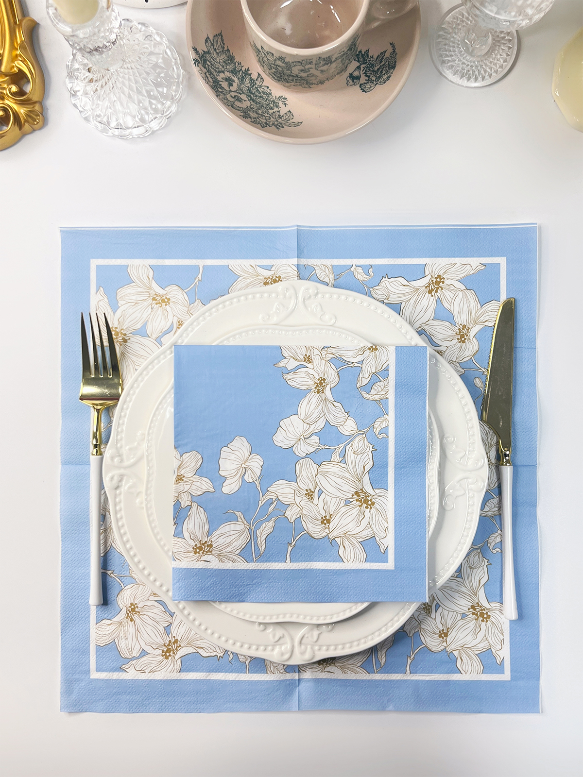
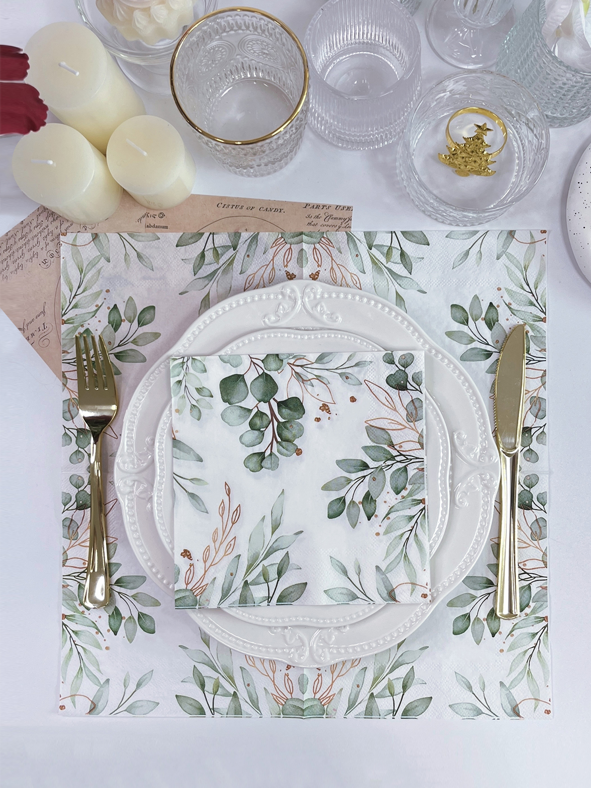
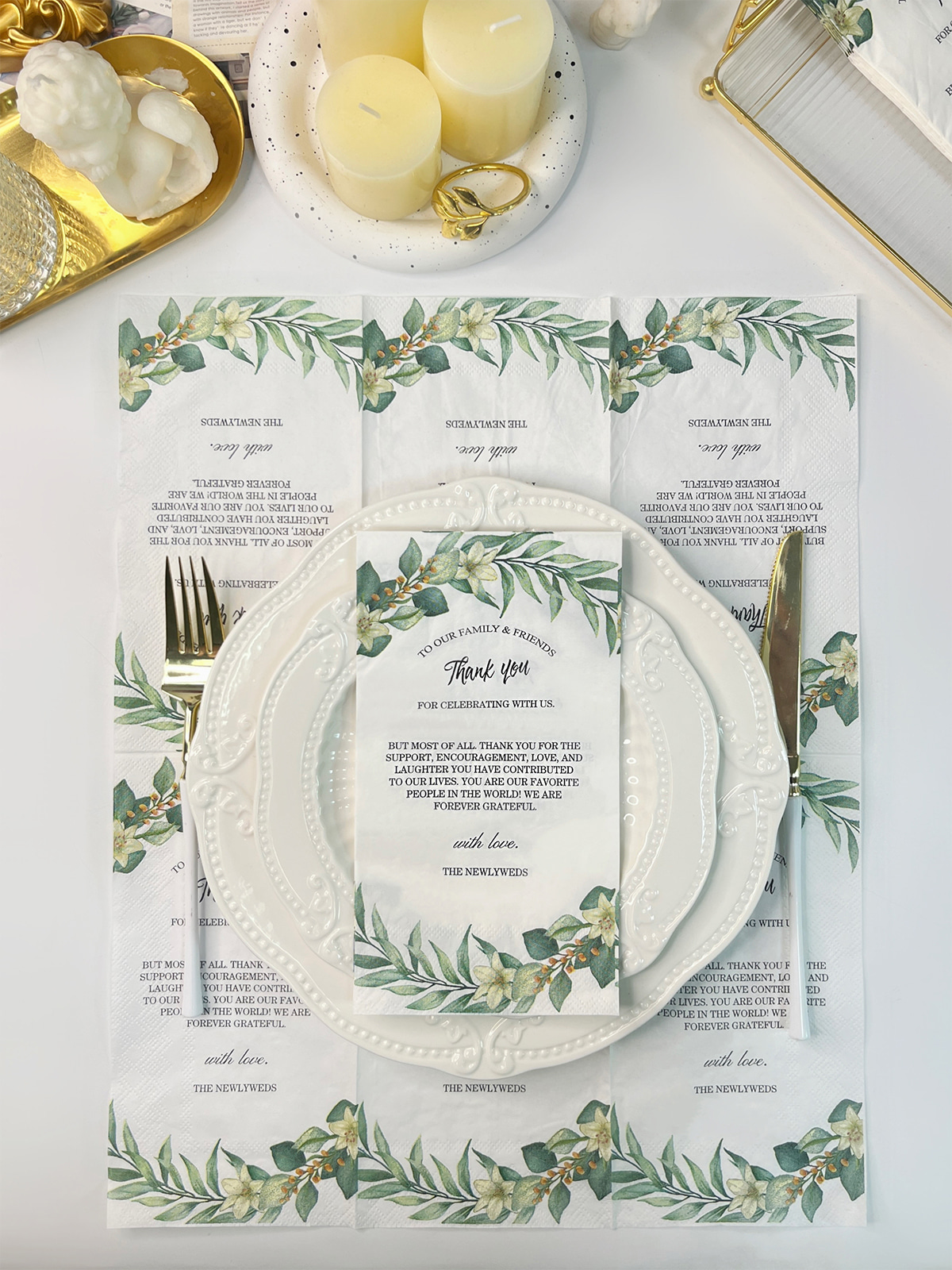
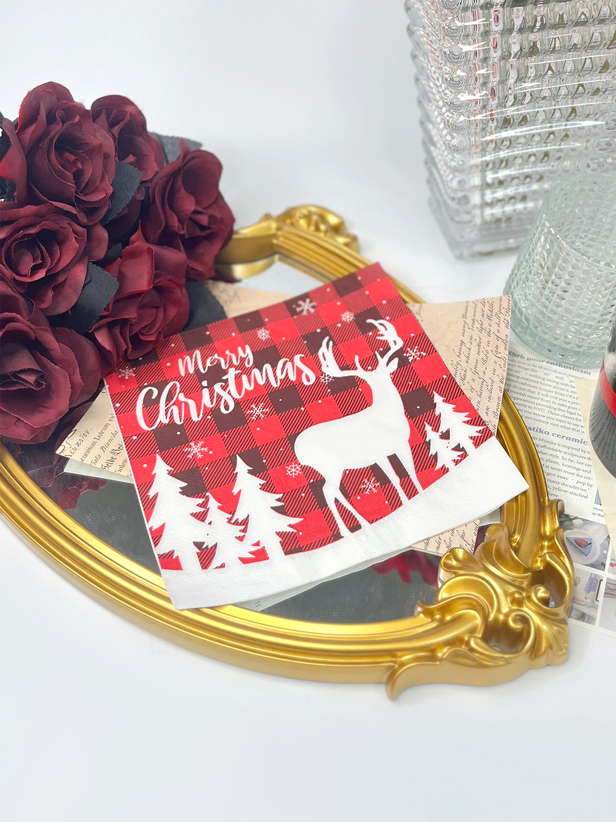
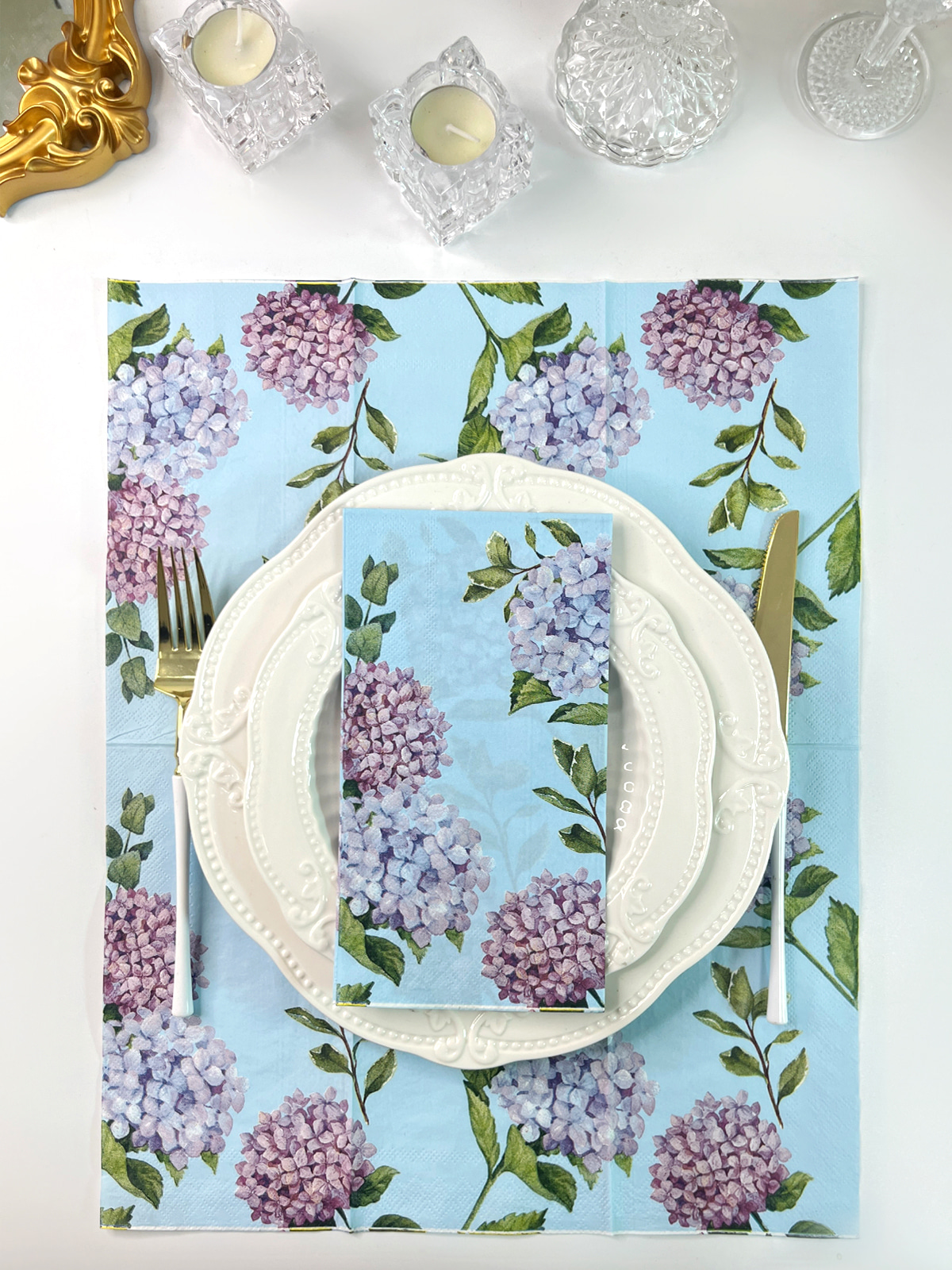
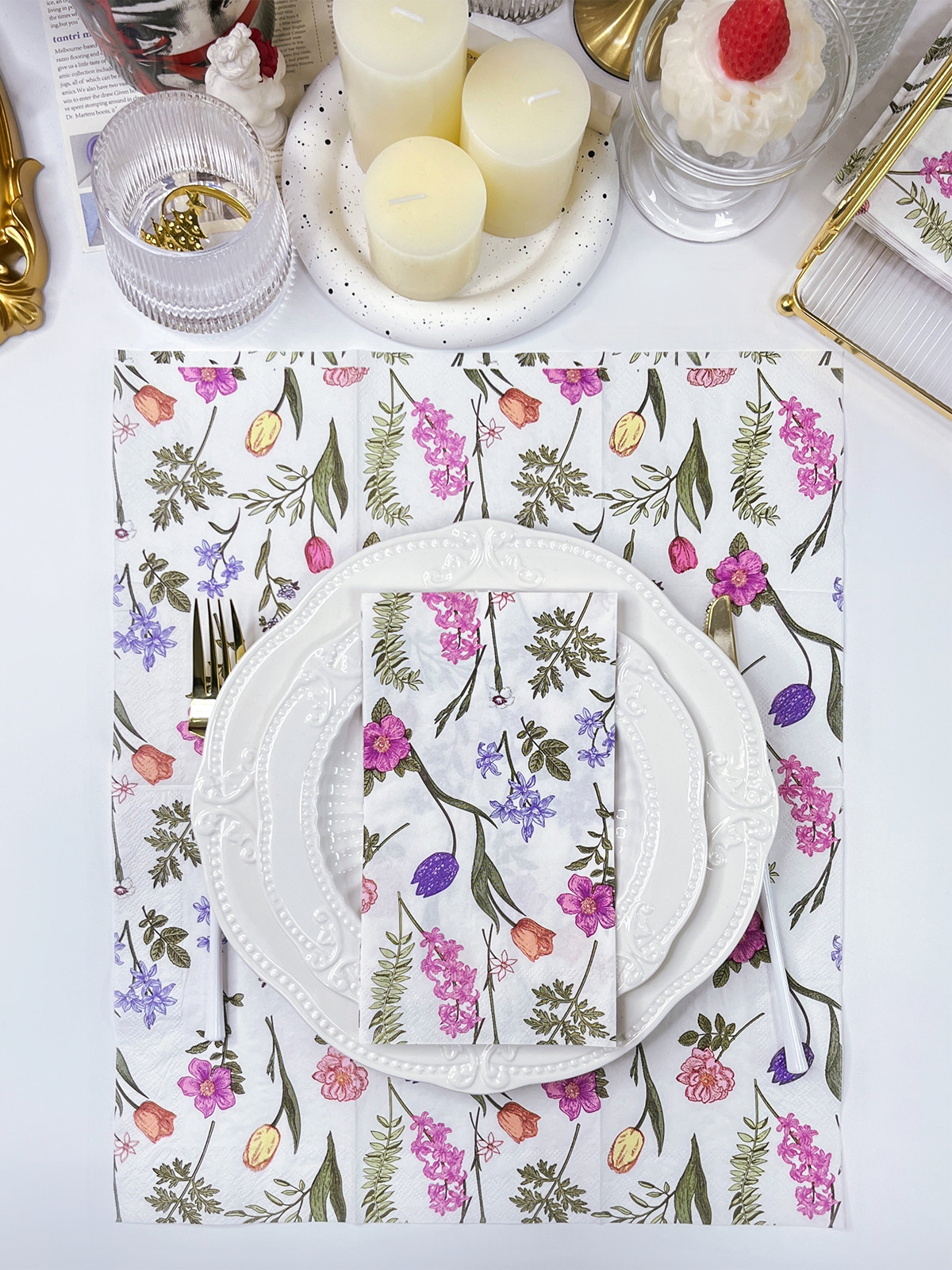
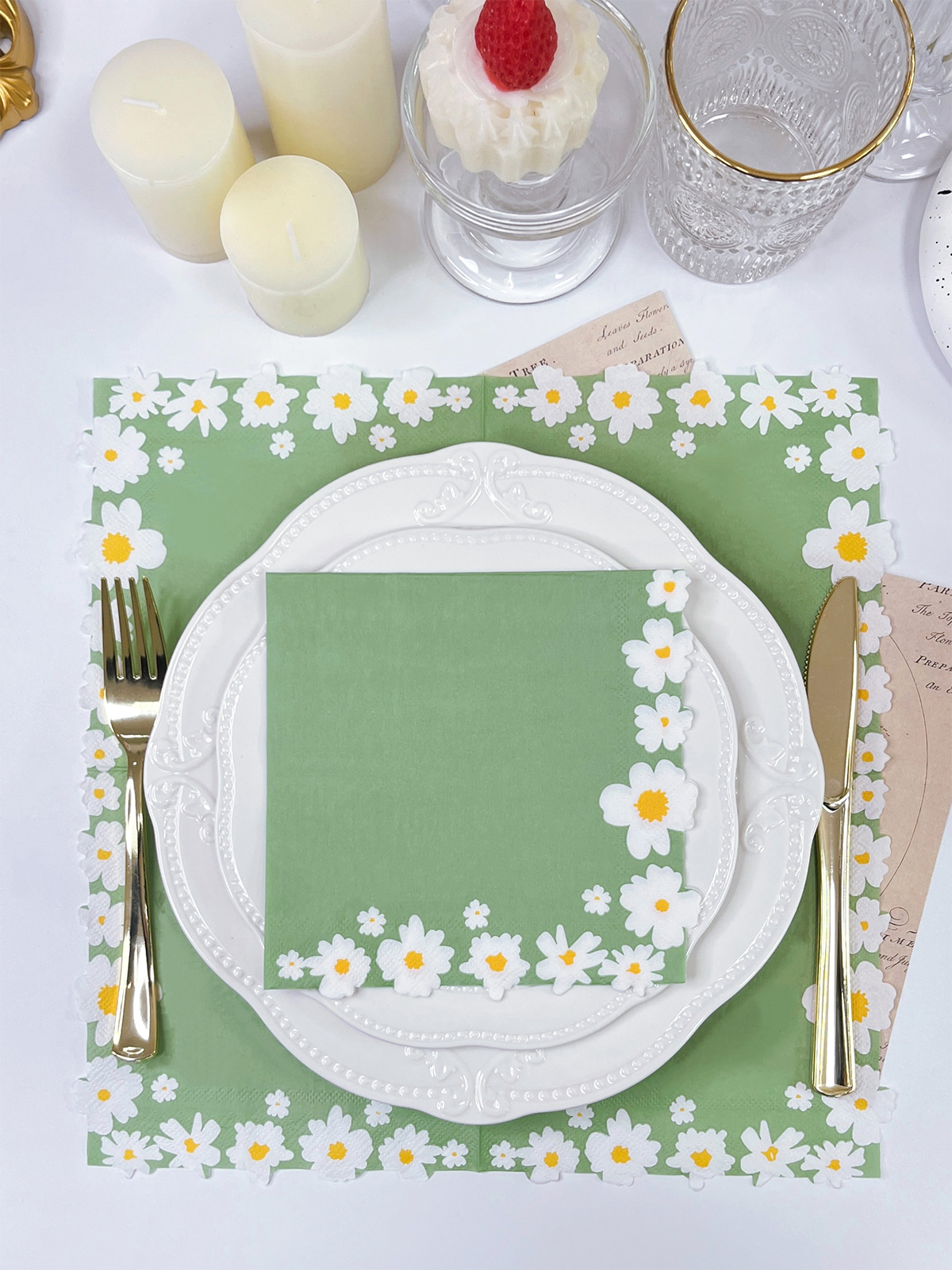
Paper napkins are often printed with colors, patterns, lettering, or small decorative elements. Compared with a rigid paper sheet, a napkin has a softer surface and a different level of absorbency. Ink therefore does not behave in exactly the same way as it does on smooth packaging paper or coated materials.
When several colors are placed on one design, production needs to consider more than the number of colors. Paper condition, image detail, color overlap, printing order, and surface absorption can all affect the finished appearance. The same design may also look different when printed on napkins with different paper characteristics.
Content
- 1 How Does Color Printing Work on Paper Napkins?
- 2 What Affects Color Accuracy on Printed Paper Napkins?
- 3 Can Foil and Color Printing Be Combined on One Napkin?
- 4 How Does Production Order Affect Color and Foil Effects?
- 5 Which Design Areas Are Suitable for Combining Color and Foil?
- 6 What Should a Paper Napkin Factory Check Before Production?
- 7 How Can Color Printing and Foil Be Balanced in One Design?
- 8 What Should Be Checked After Printing and Foil Stamping?
How Does Color Printing Work on Paper Napkins?
Color printing on napkins starts with the interaction between the ink and the paper surface. Napkin paper is designed to remain soft and absorbent, so ink can spread or penetrate differently depending on the paper structure and the amount applied.
Simple graphics are generally easier to control because they leave enough space between individual elements. A design containing fine lines, small letters, or closely placed colors requires more attention to the way ink reaches the paper.
Several parts of the production process can affect the final result:
- The surface condition of the paper
- Ink absorption and spreading
- The size of printed areas
- The spacing between colors
- The position of each printed element
- The condition of the paper during processing
Color placement also matters. When two colors meet along a narrow boundary, even a small shift can change the appearance of the edge. Larger areas provide more visual tolerance, while small lettering and thin lines leave less room for variation.
The folded condition of a napkin adds another consideration. A printed area may appear in a different position when the napkin is folded, opened, or placed on a table. For products intended for events, restaurants, or table settings, the design needs to work in the way the napkin will actually be handled.
What Affects Color Accuracy on Printed Paper Napkins?
Color appearance is influenced by the relationship between the ink and the paper rather than by the artwork alone. A pale paper surface may produce a different visual effect from a darker or differently textured surface. Absorbency can also affect how sharply an edge appears.
Large blocks of color and small decorative details behave differently during printing. A broad color area can make changes in ink coverage more noticeable, while a small graphic may be affected by spreading around its edges.
When several colors are used together, their boundaries require attention. One color should not unintentionally cover or weaken another. Closely positioned elements also need sufficient separation to remain visually clear after printing.
A useful production check can focus on three areas:
- Paper condition: The paper needs to be suitable for the intended printing process. Surface texture and absorbency influence how the ink settles.
- Artwork structure: Small text, narrow lines, dense patterns, and overlapping colors may require adjustment before production.
- Color relationship: Colors placed next to each other need enough definition to remain distinguishable on the finished napkin.
The goal is not to force every color to look exactly like a digital image. Screen displays and printed paper work in different ways. A practical design process considers the material from the beginning and allows the printed result to retain the intended visual relationship between colors.
This becomes especially relevant when a design contains several colors with different visual weights. A dark graphic beside a pale background may remain clear with relatively simple printing conditions, while several close shades can require more careful control.
Can Foil and Color Printing Be Combined on One Napkin?
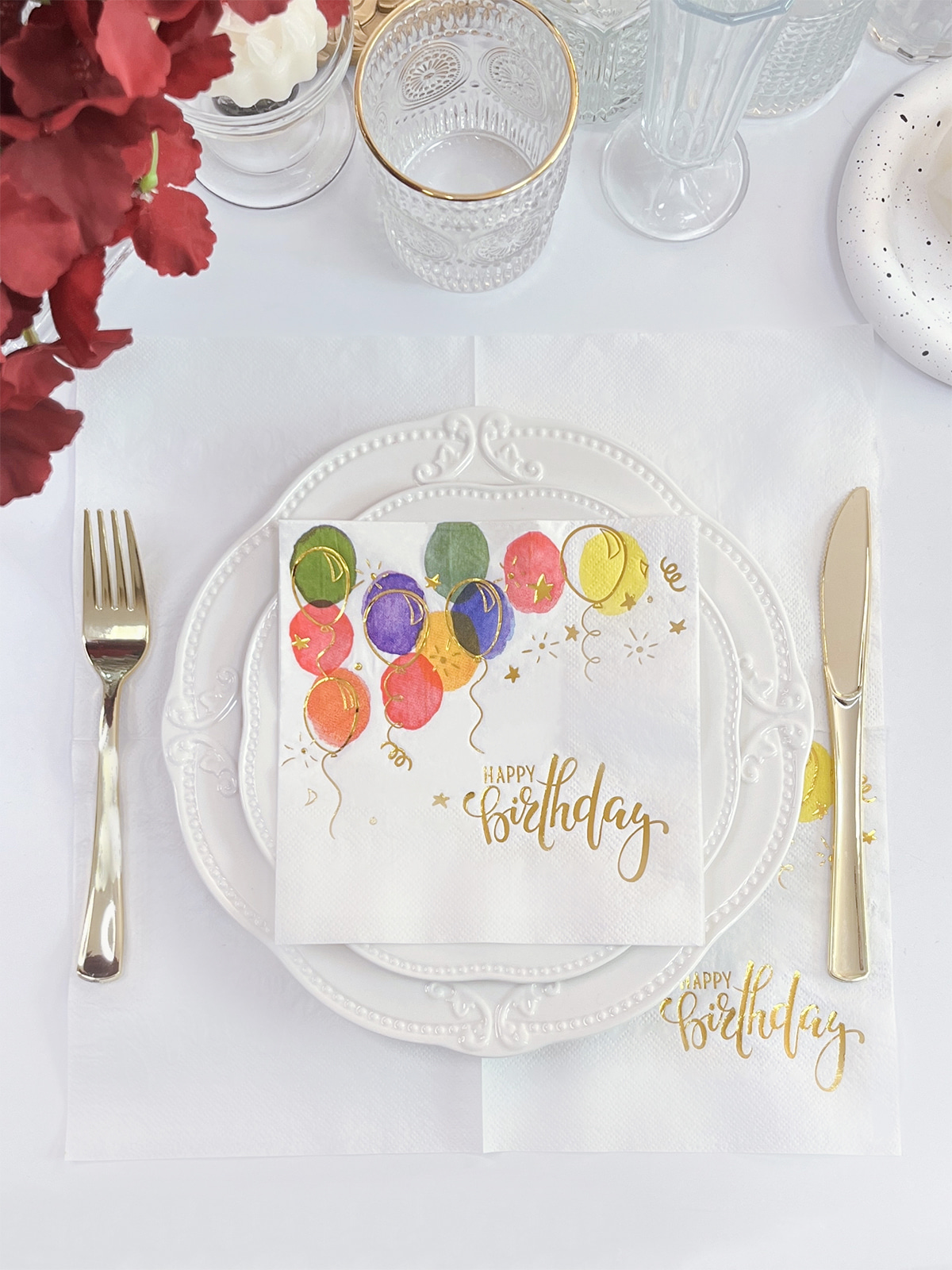
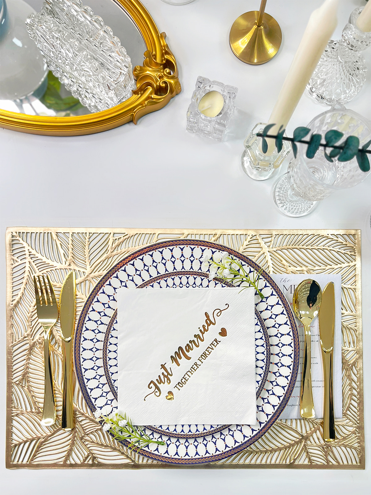
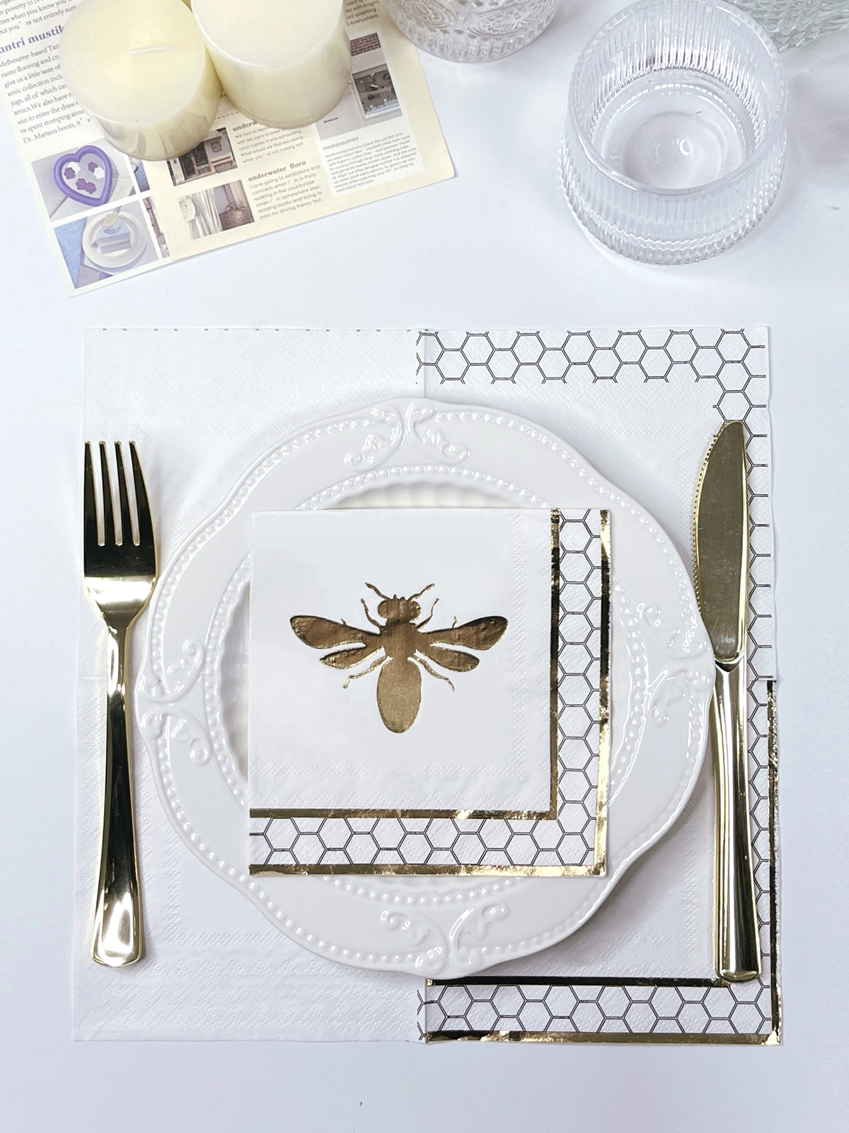
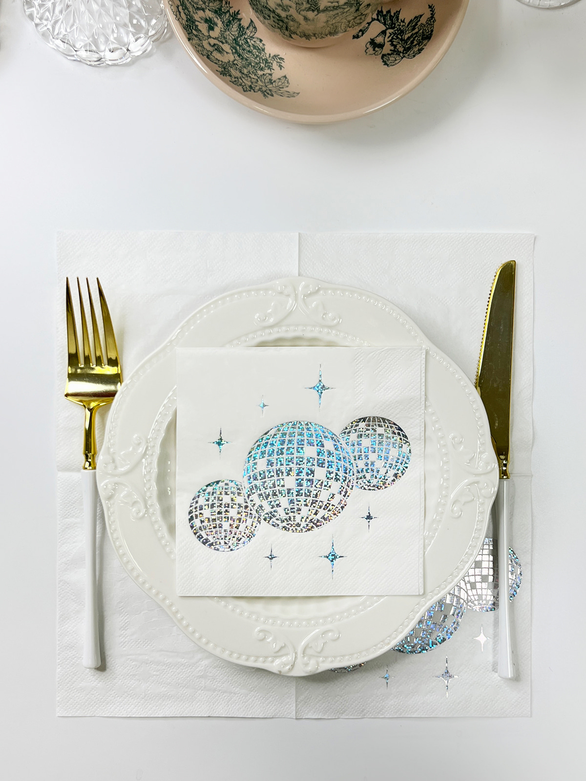
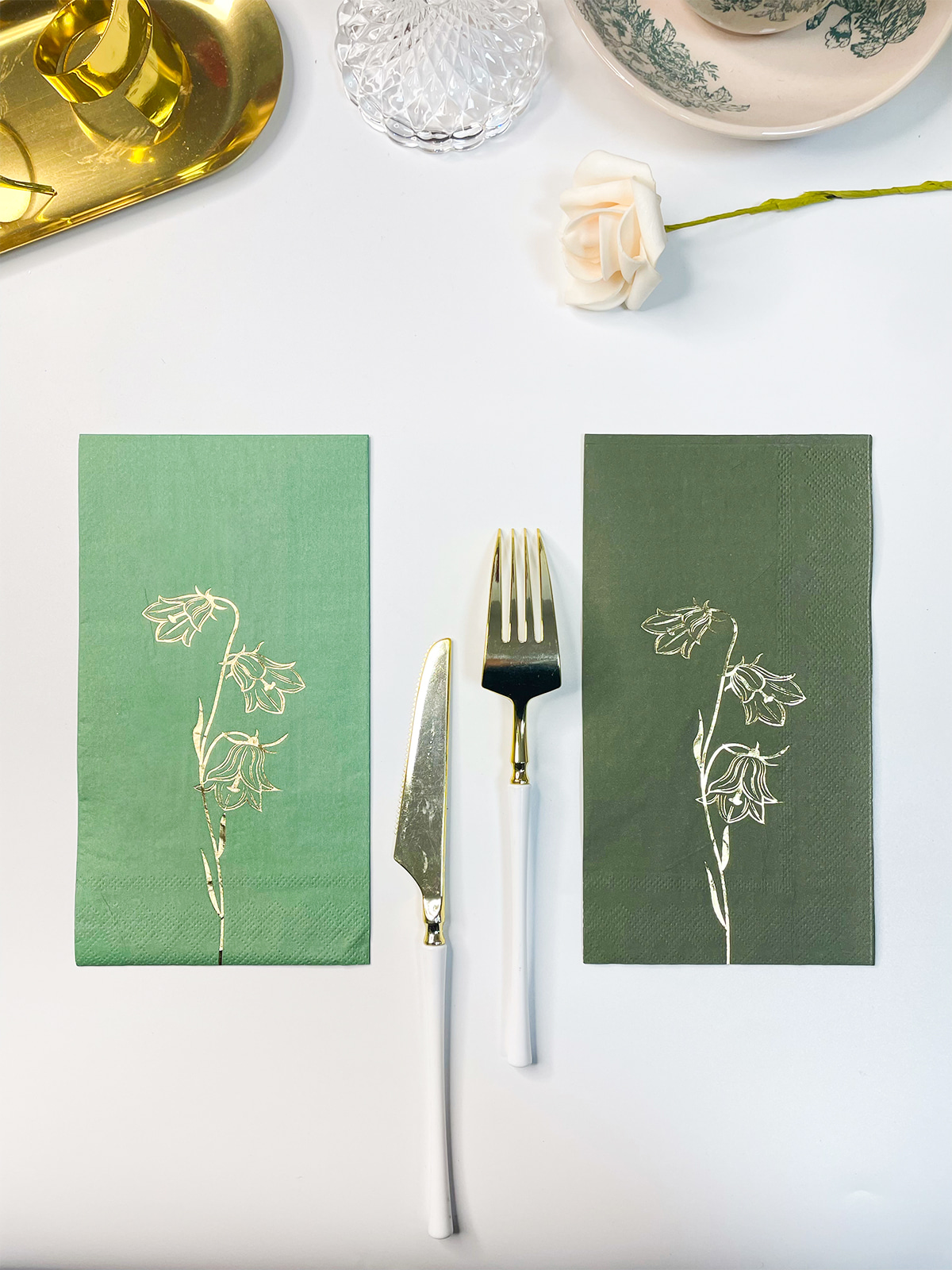
Color printing and foil stamping can be used together when the design and production process are planned around both surface treatments. They perform different visual functions, so combining them is less about applying two effects at random and more about assigning each effect to a suitable area.
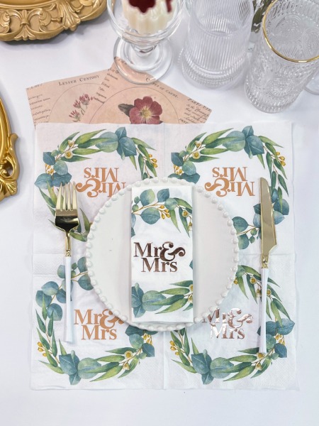
Color printing can carry the main illustration, background, lettering, or decorative pattern. Foil can then be placed on selected parts of the design to create a reflective or metallic-looking surface.
For Foil Stamping Napkins, the foil area needs to be considered as part of the complete artwork. It should have a clear position rather than being added after the color design has already been finalized.
A combined design might use:
- Colored patterns as the main background
- Foil on selected lettering
- A colored border with a small foil detail
- A printed illustration with a foil decorative element
- A plain printed area surrounding a limited foil section
The relationship between the two treatments matters. When foil covers too much of a detailed printed area, small visual elements can become difficult to distinguish. When the foil is placed in a clearly defined section, the difference between the two surfaces can become easier to see.
Paper condition also affects the result. Foil needs a suitable surface and controlled application, while printed color needs to settle properly on the paper. Combining them therefore requires attention to the order and conditions of each processing step.
The two methods should not be treated as interchangeable. Color provides information through hue, contrast, and shape. Foil creates a different surface effect. Their roles can complement each other when the design separates those functions clearly.
How Does Production Order Affect Color and Foil Effects?
Once color printing and foil are included in the same design, production order becomes an important consideration. The surface condition after one process can influence the way the next process behaves.
For example, printed areas may need time or suitable conditions to stabilize before another treatment is applied. Applying the next process without considering the condition of the printed surface can affect edges, positioning, or surface appearance.
The exact sequence depends on the paper, printing method, foil material, artwork, and production equipment. There is no single order that fits every napkin design.
Planning can begin by separating the artwork into functional areas:
- Identify the main printed colors.
- Mark the areas intended for foil.
- Check whether the two areas overlap.
- Review small details around the foil boundary.
- Confirm the processing sequence with the production conditions.
- Check the finished appearance after both treatments have been applied.
Which Design Areas Are Suitable for Combining Color and Foil?
Combining color and foil works better when each treatment has a clear role in the design. Color can carry the main image, background, lettering, or decorative pattern, while foil can be placed on selected details that need a different surface appearance.
The choice of area depends on the size, shape, and position of each element. A broad printed background may provide a visual base, while a small foil detail can sit within it without covering important information.
| Design Area | Suitable Treatment | Main Consideration |
|---|---|---|
| Background | Color printing | Keep the overall pattern clear |
| Main lettering | Color or foil | Check readability and spacing |
| Decorative border | Color or foil | Keep the edges clearly defined |
| Small graphic details | Color printing | Avoid overly dense details |
| Selected accents | Foil | Keep the foil area clearly separated |
| Overlapping areas | Combined treatment | Check positioning and processing order |
Fine details need additional care. Very narrow lines or closely spaced elements may not leave enough room for a clean separation between printed color and foil. Larger letters, simple borders, and clearly defined decorative shapes can be easier to coordinate.
A practical design can divide the artwork into separate areas:
- Main color area: carries the basic pattern, illustration, or background.
- Secondary color area: adds contrast or supports smaller visual elements.
- Foil area: creates a different surface effect on selected parts.
- Clear separation area: keeps foil away from details that need sharp visual definition.
Such separation also helps during production. When the artwork clearly shows which areas belong to each process, the production team has a clearer reference for positioning and processing.
For Foil Stamping Napkins, the foil section should also be considered in relation to the folded and opened condition of the napkin. A decorative mark placed near a fold may not appear in the intended position once the napkin is opened. The same issue can occur when a design extends across several folded layers.
What Should a Paper Napkin Factory Check Before Production?
A production check can prevent design problems from becoming processing problems. Before printing begins, the paper, artwork, color areas, and foil areas need to be considered together.
The paper itself is an important starting point. Its surface, softness, absorbency, and structure can affect how color and foil appear. A design prepared for one type of paper may need adjustment when the material changes.
Artwork should also be checked for areas that may be difficult to reproduce. Fine lines, tightly packed lettering, small gaps, and overlapping colors can create problems when the design reaches the physical printing stage.
A Paper Napkin Factory can review several points before production:
- Whether the paper surface is suitable for the planned processing
- Whether the printed colors have enough visual separation
- Whether small text and fine lines are practical for the selected process
- Whether foil areas are clearly marked in the artwork
- Whether color and foil sections overlap unnecessarily
- Whether the planned processing order suits the paper condition
- Whether the folded layout keeps important elements in a useful position
A sample or production check can also reveal differences between the digital design and the physical napkin. Color may appear softer or stronger depending on the paper surface, while foil can have a different visual effect after pressing and handling.
How Can Color Printing and Foil Be Balanced in One Design?
A combined design does not need every area to contain a special effect. In many cases, leaving some areas for ordinary color printing helps separate the foil elements from the rest of the artwork.
For example, a printed background can support a small foil border. A colored illustration can contain a limited foil detail. A simple printed pattern can leave selected lettering for foil treatment.
The visual balance depends on contrast and spacing. When too many elements compete for attention, the design can become difficult to read. Giving each treatment a defined area helps the artwork remain clear after the napkin is folded and opened.
The intended use also matters. A napkin used on a restaurant table may require a restrained layout that remains easy to handle. A design prepared for a wedding, celebration, or themed event may use decorative elements differently. The processing choice should follow the purpose of the printed napkin rather than being added simply because another surface effect is available.
What Should Be Checked After Printing and Foil Stamping?
Inspection after processing should cover both the printed image and the foil area. Looking at only one part can miss problems caused by their interaction.
Color areas can be checked for uneven coverage, unclear edges, unwanted marks, or visible position changes. Small text and narrow graphics deserve attention because minor changes can affect their readability.
Foil sections should be checked for:
- Incomplete transfer
- Uneven coverage
- Position changes
- Damaged edges
- Unwanted marks around the intended area
The relationship between color and foil also needs to be reviewed. A foil element that sits slightly away from its intended printed border may change the appearance of the complete design, even when both individual processes appear acceptable.
The folded napkin should also be inspected. A printed pattern may shift visually when the layers are folded together, and an important decorative element may not appear where expected after opening.
Physical handling provides another useful check. The finished napkin should retain its intended softness and practical use while carrying the printed and foil decoration. Surface treatment should not be considered separately from the basic function of the paper.
Combining several colors with foil is therefore a production task involving artwork, paper selection, processing order, positioning, and inspection. Foil Stamping Napkins can contain both printed color and foil elements when the design gives each treatment a clear area and the production process is planned around the characteristics of the paper.
For a Paper Napkin Factory, the connection between design preparation and physical processing remains important from the artwork stage through final inspection. A workable design is one that can be reproduced clearly while remaining suitable for the way the napkin will be folded, handled, and used.