2026-11-11
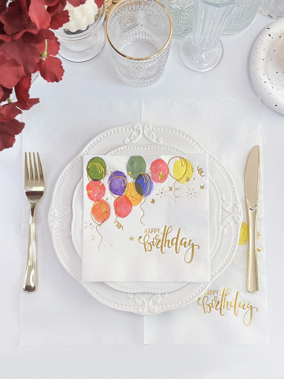
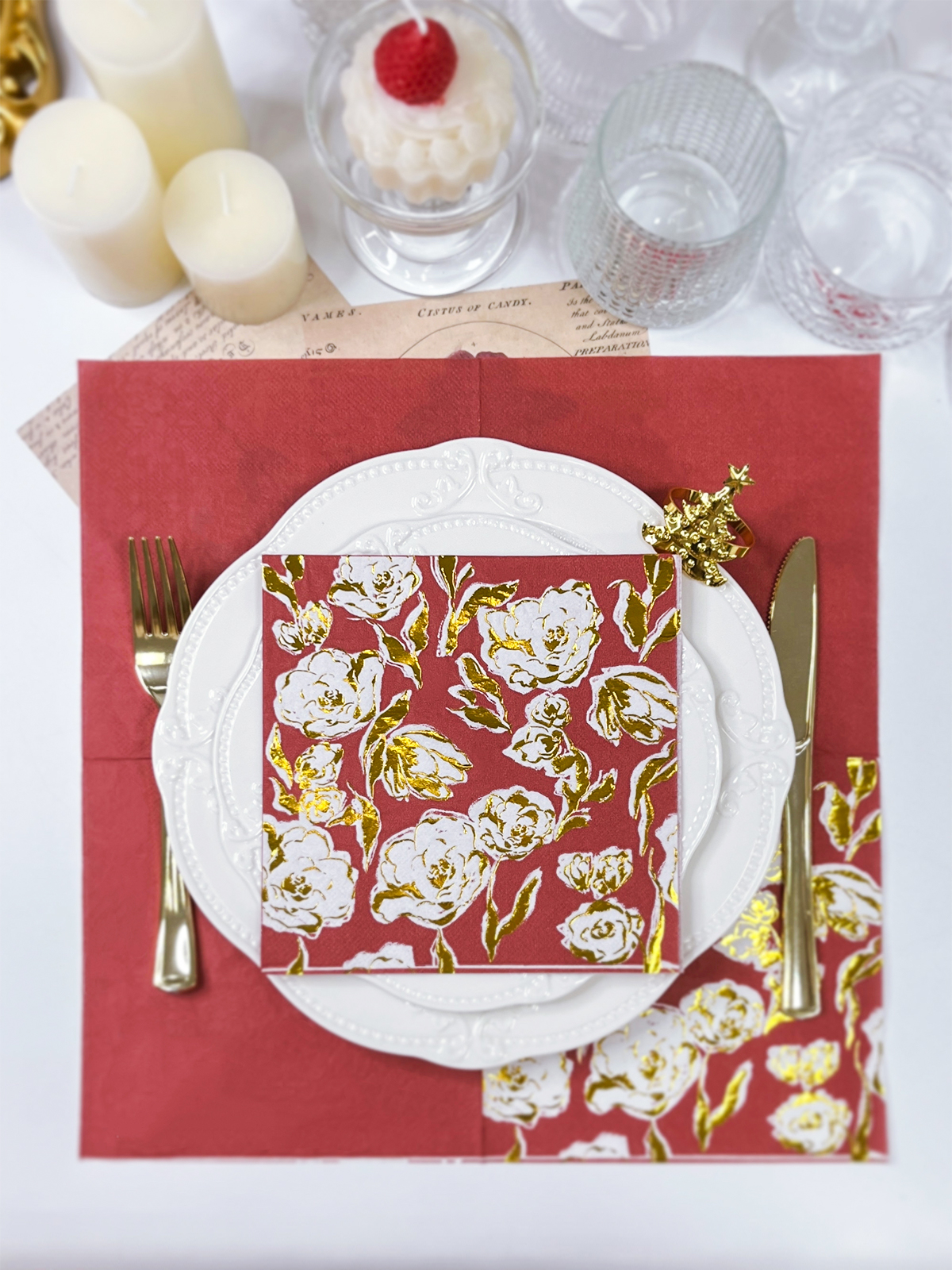
A napkin is handled repeatedly during a meal, unlike many printed items on a dining table. Guests unfold it, use it, and put it down again. Its texture, color, and decorative details all contribute to the overall feel of a meal or event. Custom Foil Napkins add a metallic detail to that everyday object, and the result depends on how the paper's surface receives the foil.
The same logo can look different on two napkins. On a smooth sheet it may appear crisp and mirror-like. On a surface with visible grain it may look softer and more dimensional. Weddings, restaurants, and corporate gatherings all call for this kind of material judgment, because the napkin sits close to the guest and is seen at close range.
Content
Paper texture describes how a surface feels and looks. It may be smooth, finely grained, embossed, or patterned like linen. Each type changes how the foil meets the paper.
Foil stamping uses heat and pressure to press a thin metallic film onto the material through a shaped plate. The foil needs steady contact with the surface to transfer cleanly. Where contact is uneven, the metallic layer can appear patchy or soft at the edges.
An even surface gives the stamping plate consistent contact. Small lettering, thin borders, and detailed marks tend to stay legible, and the metallic area reads as one continuous shape.
A pronounced texture creates a surface with raised and recessed areas. Foil tends to adhere to the raised sections while leaving some recessed areas uncovered. This can result in several visible effects in the finished design:
None of this rules out textured paper. It means the artwork and the surface should be judged together before production begins.
Appearance is only part of the experience. A smooth napkin feels clean and understated. A textured one feels natural and slightly crafted. When a restaurant sets a table with a linen-patterned napkin carrying a small metallic emblem, guests notice the contrast between the soft surface and the reflective mark, even if they cannot name it.
Neither surface is better in every situation. The right choice follows from the artwork and the setting.
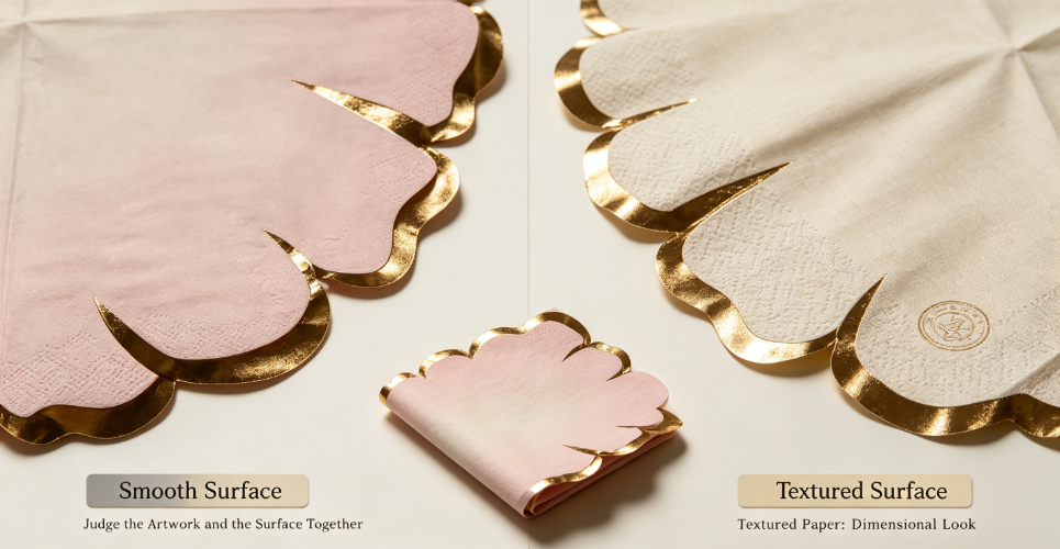
Smooth stock suits designs that depend on precision. It supports:
A café with a thin-lined logo, for example, usually gets a cleaner result on a smooth napkin than on one with deep embossing.
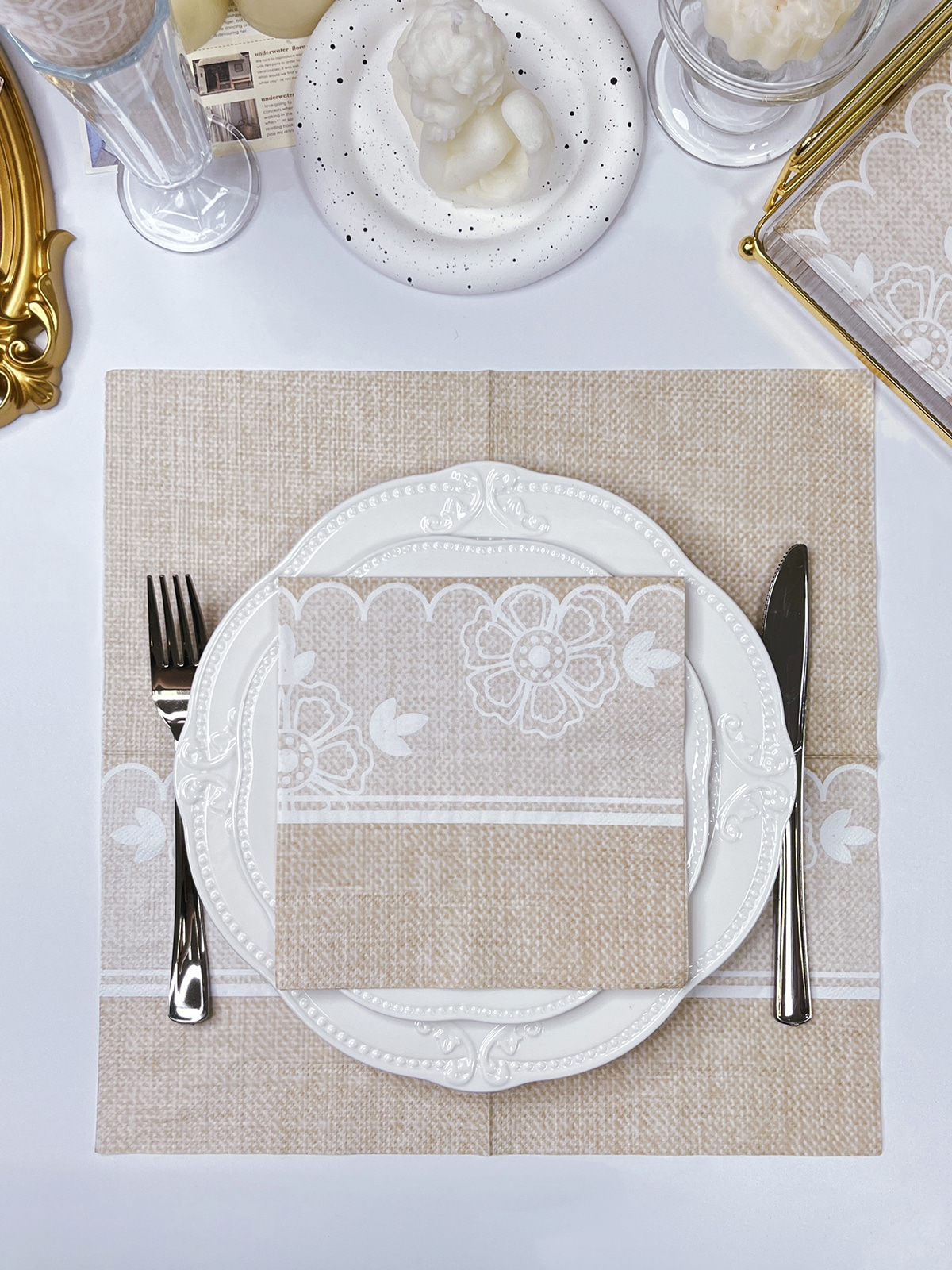
Textured stock suits designs that gain from depth. Linen patterns, subtle grain, and light embossing give the metallic detail a backdrop with character. A bold, simple emblem tends to hold up on such surfaces, because its size allows for small gaps in transfer without losing the shape.
| Consideration | Smooth Paper | Textured Paper |
|---|---|---|
| Surface character | Even and refined | Tactile and decorative |
| Foil contact | Generally consistent | Varies with texture depth |
| Fine lettering | Suitable for detail | Needs careful review |
| Metallic look | Continuous and sharp | May show surface variation |
| Visual style | Modern and understated | Natural and dimensional |
| Artwork direction | Logos and precise graphics | Bold shapes and tactile accents |
Weigh these points against the artwork, the napkin material, and the way the napkins will be used. A banquet hall and a brunch café may reach different conclusions with the same logo.
Beyond smooth and textured, the surface treatment of the paper also matters.
Uncoated stock keeps a natural, matte feel. Some versions are quite even, while others show fibers and grain. The label alone says little, so the real surface needs inspection. Look at uniformity, visible fibers, thickness, and flexibility. Napkins are often built differently from printing sheets, which makes a direct check more useful than assumptions.
A coating changes how the surface behaves. It can feel smoother and more controlled, though coating type and foil compatibility still need confirmation. A coated surface that looks suitable may not accept every foil type equally well.
Embossing adds patterns that can be felt. When metallic decoration is added, the relationship between raised areas, recessed areas, and the stamping position becomes important. A large emblem may sit comfortably across an embossed pattern, while thin script may struggle on the same surface. Physical samples are the practical way to judge this.
Foil color and paper color work as one visual decision. The same metallic shade reads differently on different grounds.
Gold is common at formal celebrations and in hospitality settings. On ivory, cream, or white paper it creates a warm, defined contrast. On a textured surface, it picks up the pattern and takes on a layered look. It pairs naturally with champagne and warm beige palettes.
Silver has a cooler tone. It suits white, gray, and pale blue napkins and works well in contemporary settings. On smooth stock the reflective edges look clean. On textured stock, the outcome depends on how evenly the foil transfers.
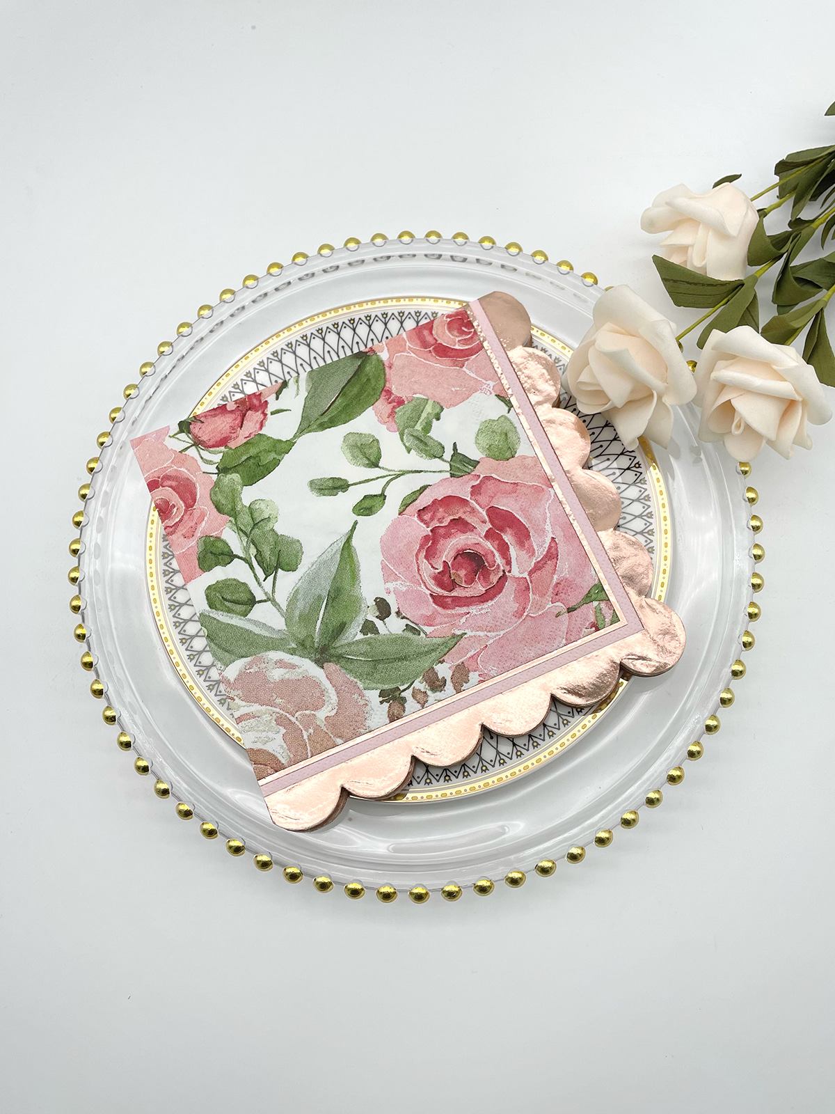
Rose gold adds a soft pink warmth to the metallic effect. It sits comfortably with blush, cream, and dusty rose schemes, particularly when the rest of the table avoids competing metallic tones.
| Foil Finish | Suggested Paper Color | Design Character |
|---|---|---|
| Gold | Ivory, cream, white | Warm and formal |
| Silver | White, gray, pale blue | Cool and contemporary |
| Rose gold | Blush, beige, cream | Soft and decorative |
| Copper | Terracotta, warm beige | Natural and earthy |
Lighting changes the picture as well. Metallic surfaces look different in daylight, under warm restaurant bulbs, and in photographs taken with flash. Checking a sample in the actual venue light avoids surprises.
Rigid stationery sits flat and stays untouched. Napkins are folded, handled, and used, so the material has different demands.
Paper napkins vary in softness, layering, absorbency, and surface texture. A foil process that works on a firm printing sheet may behave differently on a soft or multi-layer napkin. Before choosing a finish, consider:
A supplier with napkin experience can check these points before production starts.
A design that looks sharp on a screen may need changes in physical form. Thin strokes, tightly packed elements, and tiny text can blur on a pronounced surface. A few adjustments help:
A simple monogram often communicates identity more clearly than a crowded illustration.
At a wedding reception, Custom Foil Napkins can echo the couple's monogram and match the place cards. In a restaurant, a small metallic logo near one corner reinforces the brand without overwhelming the table. At a corporate dinner, napkins can be coordinated with menus and name cards to create a consistent look. Extensive decoration may affect how the napkin feels when folded, while a small design near the corner leaves more of the surface uncluttered.
A sound choice starts with the intended look, then moves to materials.
Decide whether the napkin should feel understated, decorative, contemporary, or formal. A clean logo on smooth stock gives a different impression from a metallic monogram on linen-pattern stock. Gather reference images that show real foil on real paper rather than color swatches alone.
| Artwork Type | Surface to Evaluate | Main Concern |
|---|---|---|
| Small monogram | Smooth paper | Letter definition |
| Detailed logo | Smooth or lightly textured | Fine-line clarity |
| Large emblem | Smooth or compatible textured | Foil coverage |
| Simple lettering | Smooth or lightly textured | Readability |
| Decorative border | Surface-compatible paper | Consistent transfer |
These pairings are starting points. Actual compatibility depends on the napkin material and stamping conditions.
A screen preview cannot show how foil sits on a real surface. When a sample arrives, check these points:
View the sample under the lighting expected at the event, and fold it the way it will be presented.
Before approving an order, raise specific questions. Which napkin materials suit the chosen foil? Can the logo be reproduced at the intended size? Are there limits on fine lines or small type? Can a production sample be provided? How will the design appear on the folded napkin? Clear answers reduce the gap between expectation and the finished product.
Paper texture and foil finish shape each other. Smooth stock supports sharp metallic detail, and textured stock adds physical depth to bolder designs. Napkin construction, artwork complexity, and the setting all affect which direction suits a given project.
Our team works with customers on paper options, foil colors, logo placement, and artwork adjustments for Custom Foil Napkins. Whether the project involves wedding tables, a restaurant brand, or a corporate event, we are available to review your design, discuss compatible material and foil combinations, and advise on preparing artwork for production. Contact us to begin a conversation about your napkin project.
Related Products
Shopping for a reliable source of napkins?
Established in 2007 and located in Zhuji City, Zhejiang Province, Zhuji Furong Paper Products Co., Ltd. is a professional manufacturer of color-printed napkins. Enhance Your Event With Custom Printed Napkins.
Telephone
+86-15325932613
Address
Jianglong Industrial Park, Jiyang Street, Zhuji City, Shaoxing, Zhejiang, China.
Contact Us
Products
Contact Us
+86-15325932613
+86-575-87765556
+86-575-87765559
Jianglong Industrial Park, Jiyang Street, Zhuji City, Shaoxing, Zhejiang, China.
Party Printed Paper Napkins Manufacturer Customized Napkins And Paper Towels Factory
Copyright © by Zhuji Furong Paper Products Co., Ltd. Rights Reserved.

 English
 中文简体