2026-11-09
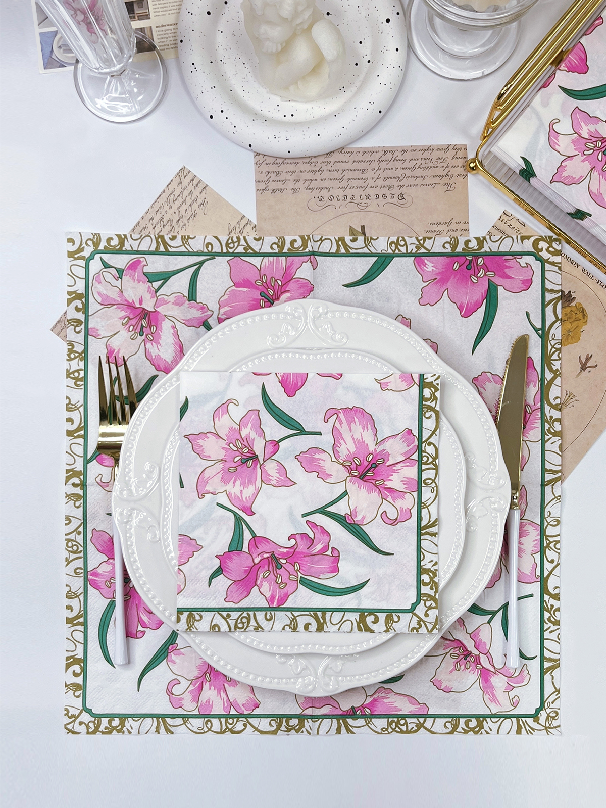
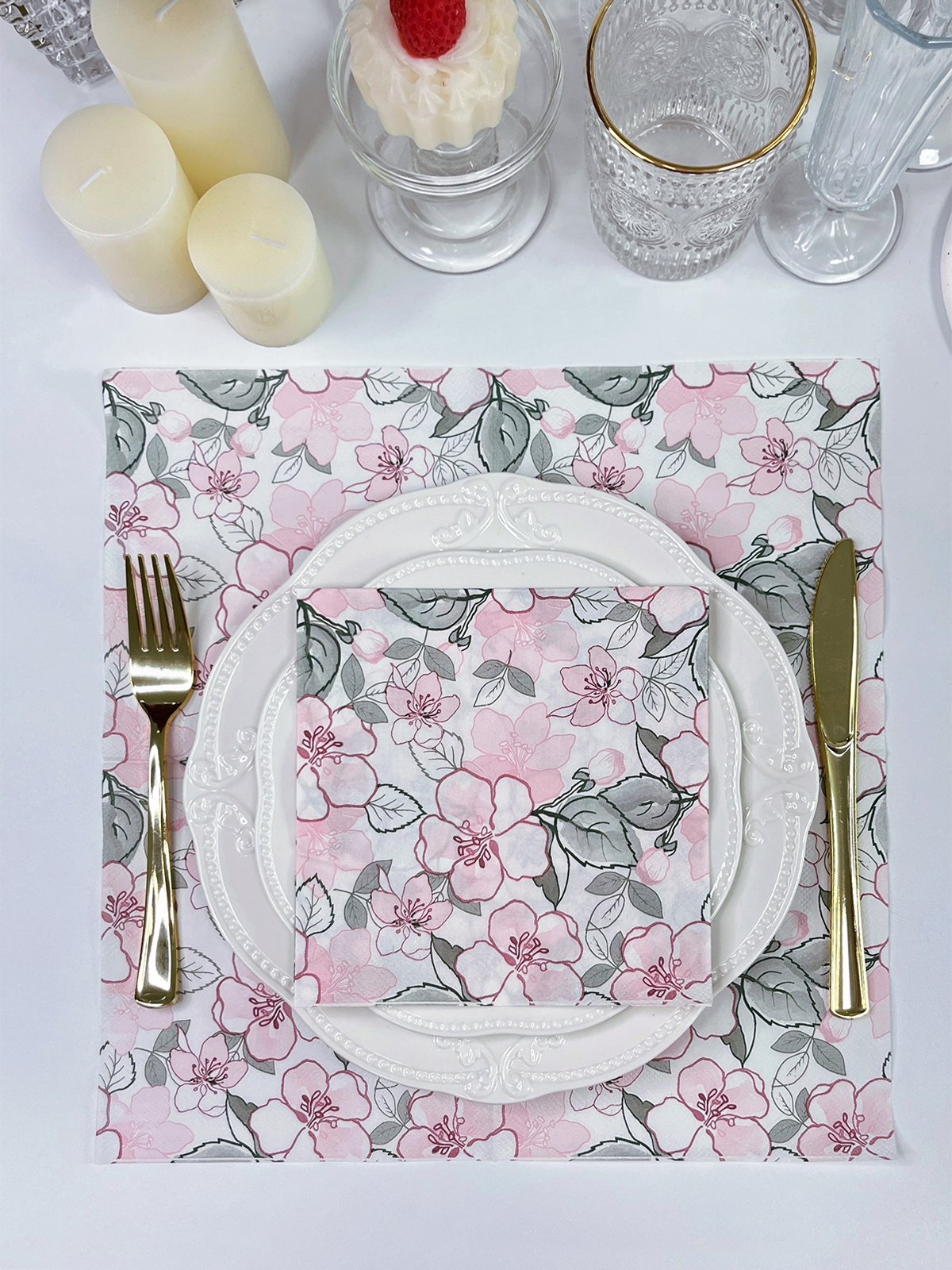
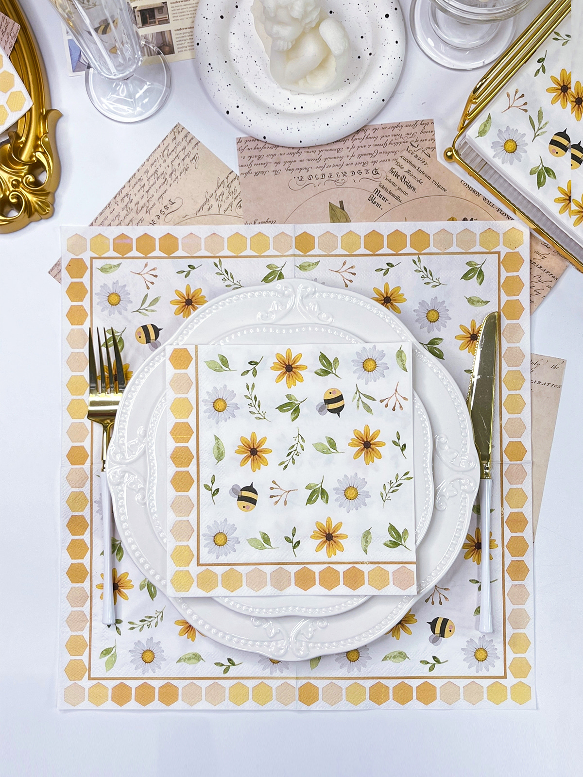
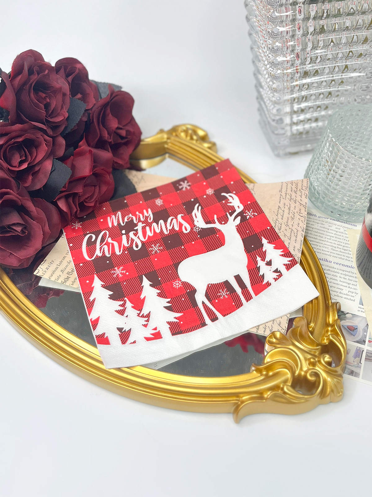
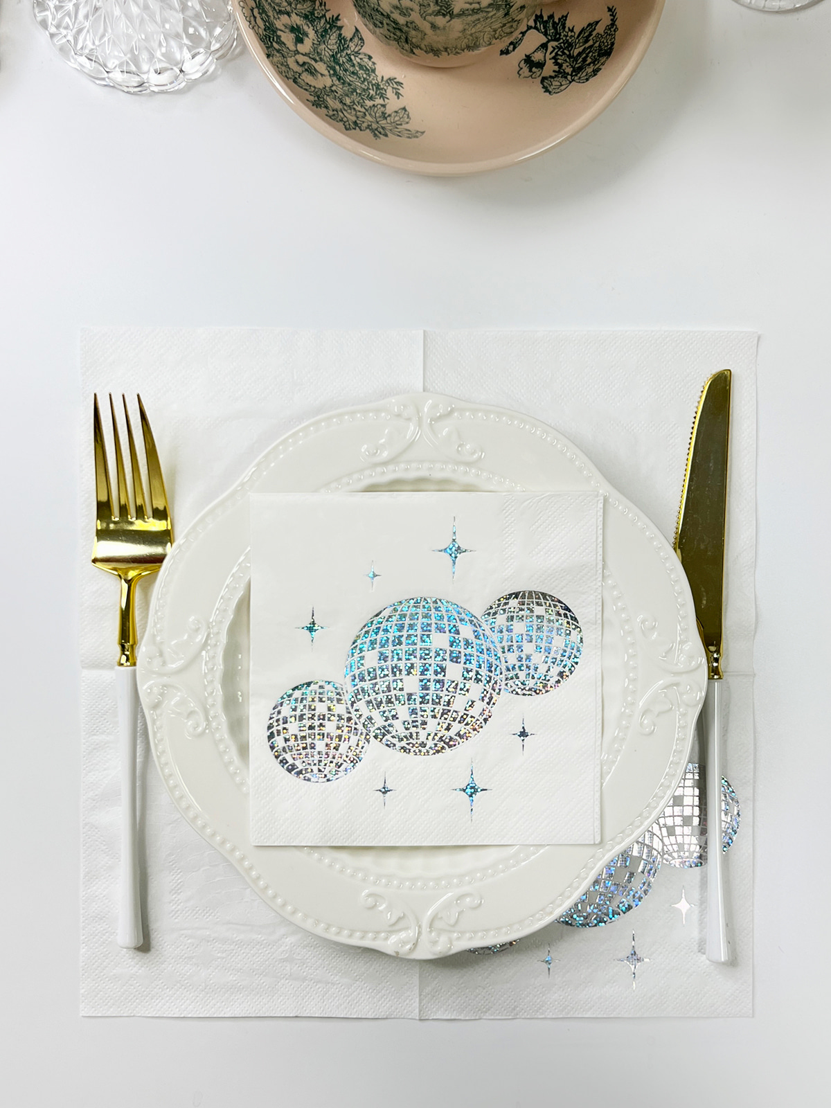
Think about what people remember after a dinner: the candlelight, a name card, maybe the napkin folded beside their plate. Custom Foil Napkins borrow a trick from bookbinding and luxury packaging. A thin sheet of metallic foil gets pressed onto chosen spots with heat, so a logo, monogram, or border picks up a shine that plain ink can't give. Gold, silver, rose gold, and copper each change the mood of a table, and the napkin color, the lighting, and the tableware around it all nudge the result one way or another.
Content
Foil stamping moves a thin metallic layer onto a surface with a heated die. On a paper napkin, the foil lands only on the parts of the design you pick, never across the whole sheet. Ordinary printing lays down ink to build color. Foil does something different: it makes a surface that reacts to whatever light happens to be in the room.
The work runs through a short chain of steps:
The napkin itself plays a bigger part than people expect. Paper napkins are soft and absorbent, and a smooth, steady surface holds crisp foil edges far better than a heavily textured one. A cocktail napkin with a deep embossed pattern may give a patchy metallic finish, while a flat dinner napkin tends to behave. Choosing the material is really part of the design.
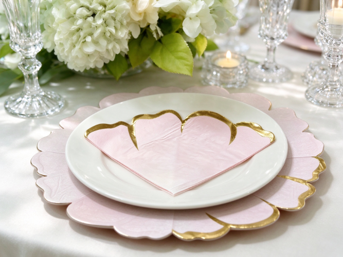
Ink soaks up much of the light that hits it. Foil throws light back. As someone moves around the table, or as the room lighting shifts, the foil areas seem to change with them. A gold monogram on ivory might look calm at a lunch gathering, then glow noticeably once the evening candles come out.
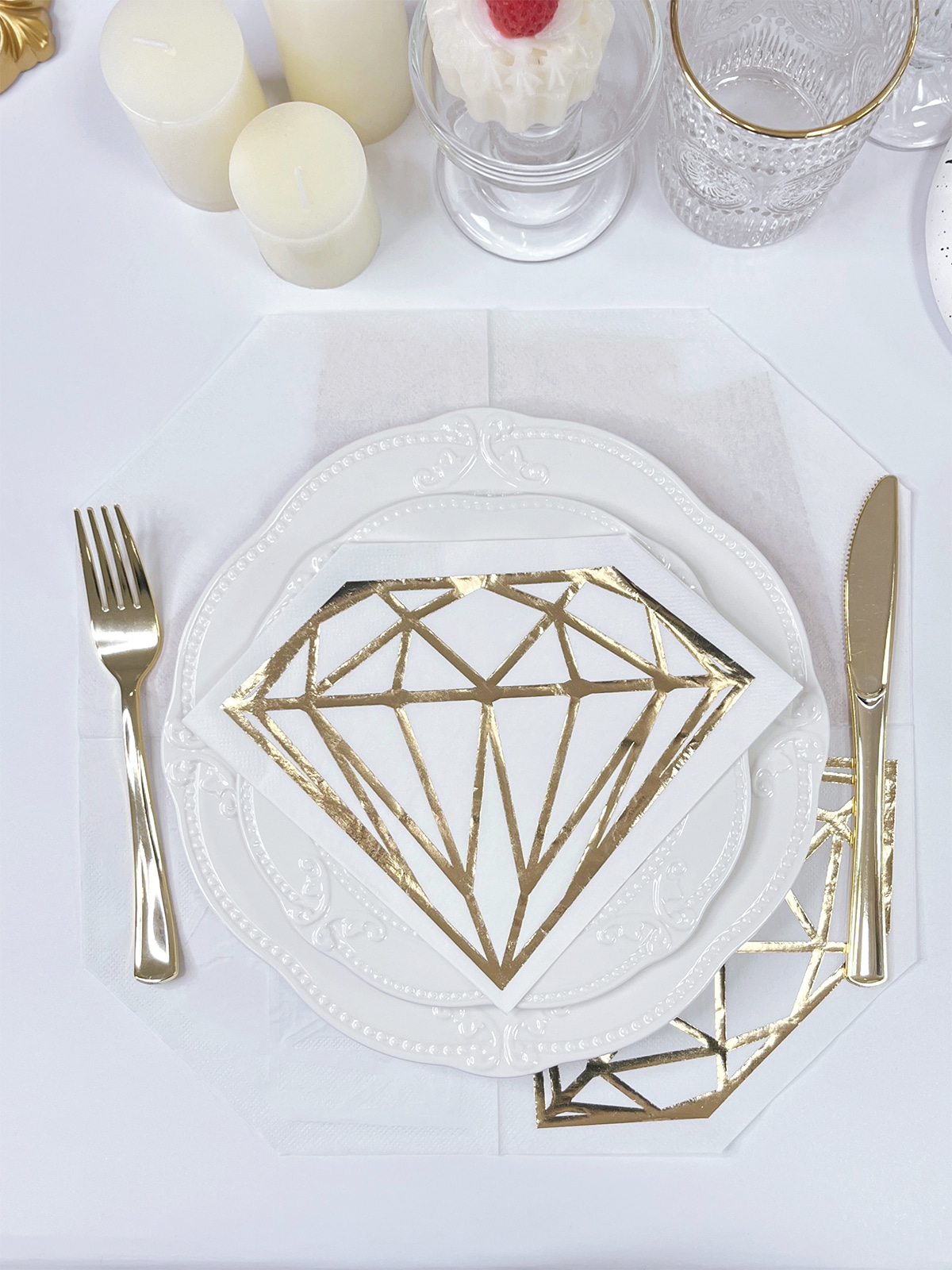
Every metal has its own temperament. Gold feels warm, silver feels cool and polished, rose gold is softer, and copper carries a vintage, slightly earthy note. The contrast between shiny and matte matters too. Picture a white napkin with a small gold logo: the background stays quiet, and the metallic detail pulls the eye straight to it. Using foil sparingly also lets the napkin color and the printed artwork keep their place.
Tie the foil to the rest of the table and the whole setting feels intentional. Gold sits comfortably beside warm-toned tableware, while silver echoes polished metal and cooler linens.
Foil decides what gets noticed. Put it on a few chosen elements and the design gains a natural pecking order.
A logo turns into a focal point without needing a busy printed backdrop. A restaurant name can sit dead center on a cocktail napkin, or a hotel mark can run along a folded edge. Clean shapes with room around them tend to look best, since the metal needs space to breathe.
Lettering style shifts the tone as well:
| Typography style | Visual character | Suitable use |
|---|---|---|
| Serif | Traditional and formal | Wedding names and monograms |
| Script | Soft and expressive | Romantic celebrations |
| Sans-serif | Clean and contemporary | Restaurant and corporate branding |
| Bold lettering | Strong and noticeable | Event titles and short messages |
Watch the stroke thickness. Hairline strokes and tightly packed letters sometimes fail to transfer evenly. Patterns behave in a similar way: floral outlines, geometric borders, frames around names, and tiny stars or leaves look sharper when foil is kept to a handful of recognizable shapes.
One logo can feel entirely different in gold, silver, rose gold, or copper. The napkin background, the table décor, the lighting, and the event theme all pull on the outcome, so gut preference alone isn't a reliable guide.
Gold looks classic on white for a clean wedding, dramatic on black for a formal dinner, and gentle on ivory for a matching palette. Silver feels modern and sits well with chrome accessories and cool linens, particularly on navy, charcoal, or white. Rose gold likes blush, cream, and champagne tones. Copper flatters terracotta, brown, and muted green.
| Foil color | Visual impression | Napkin pairing |
|---|---|---|
| Gold | Warm and elegant | White, ivory, black, green |
| Silver | Cool and contemporary | White, navy, gray, black |
| Rose gold | Soft and romantic | Blush, cream, beige |
| Copper | Warm and earthy | Terracotta, brown, olive |
How the foil relates to its background counts just as much as the metal does.
Not every napkin calls for a lavish metallic treatment. The amount of foil should follow the mood of the design.
Minimalist layouts leave plenty of empty space, and that emptiness is what lets a small gold monogram, a line of silver lettering, or a slim border stand out without crowding anything.
Wedding napkins can carry personal touches: the couple's initials, a custom crest, a short phrase, or florals that echo the invitations. Rose gold lettering on blush paper reads gently, and gold on ivory suits a traditional room.
Restaurants and hotels can mirror their own identity. A dining room with dark interiors and polished metal fittings may suit silver on charcoal, while a boutique hotel full of warm neutrals might choose gold on cream. The napkin should feel like it belongs in the room rather than like an advertisement dropped on the table.
Some artwork needs trimming back before stamping. Tiny text, delicate lines, and tightly packed ornaments often fail to reproduce as hoped. Add spacing, skip thin lines, keep elements apart, and look at the artwork at real production size. When a design has intricate parts, ask for a sample.
Printing builds colored artwork out of ink, while foil stamping adds a reflective metallic finish. Neither one fits every design.
| Consideration | Foil stamping | Regular printing |
|---|---|---|
| Surface | Reflective metallic finish | Printed ink finish |
| Light interaction | Metallic reflection | Depends on ink and surface |
| Color range | Selected foil finishes | Varied printed colors |
| Emphasis | Highlights chosen elements | Reproduces full artwork |
| Typical use | Logos, initials, borders | Illustrations, detailed graphics |
| Overall style | Decorative and metallic | Flexible and colorful |
Foil suits designs that want a distinct metallic accent, like monograms, logos, decorative lettering, and simple outlined patterns. Printing handles detailed illustrations, gradients, and multicolor artwork. A colorful floral illustration needs ink for its shades, though foil can still add metallic highlights on top, which gives you color and shine together.
Begin with the colors already in play. For a wedding, glance at the invitations, flowers, linens, and place cards. For a restaurant, think about the interior, the menus, and the brand palette. Pick the napkin color, choose a foil that complements it, test the pairing under the lighting you'll actually have, and settle it before production begins.
Material and size change the outcome too. Cocktail napkins suit compact logos and small details, while dinner napkins give more room for personalized artwork. Softness and absorbency should also fit the occasion.
Keep the artwork balanced. A monogram in the middle, a logo tucked near the edge, a border around a short message, or a few highlighted floral outlines all keep the metallic detail tied to the rest of the design.
Check a sample before the full run. Screens often look different from real paper, so compare logo position, lettering clarity, foil color, small details, and how well the material carries the design.
A well-chosen napkin ties together several corners of a dining experience. Its color can echo the linens, its metallic finish can match the cutlery, and a monogram or logo gives guests a small detail to remember. Couples can carry their initials into the dining area, restaurants and hotels can keep their brand presentation consistent, and corporate events can bring a visual identity right to the table.
Our approach to Custom Foil Napkins focuses on foil color, artwork placement, napkin material, and design details before production begins. Browse our Custom Foil Napkins collection and share your design requirements with our team to talk through suitable options for your wedding, restaurant, or event.
Related Products
Shopping for a reliable source of napkins?
Established in 2007 and located in Zhuji City, Zhejiang Province, Zhuji Furong Paper Products Co., Ltd. is a professional manufacturer of color-printed napkins. Enhance Your Event With Custom Printed Napkins.
Telephone
+86-15325932613
Address
Jianglong Industrial Park, Jiyang Street, Zhuji City, Shaoxing, Zhejiang, China.
Contact Us
Products
Contact Us
+86-15325932613
+86-575-87765556
+86-575-87765559
Jianglong Industrial Park, Jiyang Street, Zhuji City, Shaoxing, Zhejiang, China.
Party Printed Paper Napkins Manufacturer Customized Napkins And Paper Towels Factory
Copyright © by Zhuji Furong Paper Products Co., Ltd. Rights Reserved.

 English
 中文简体