2026-11-02
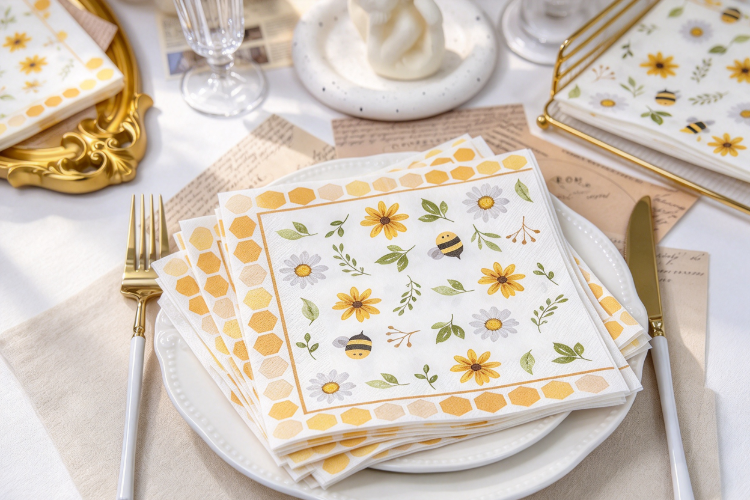
Look at a cafe table just before the lunch rush. Cutlery, menus, and a stack of napkins are already in place, and the napkin is often the item guests handle most. For businesses ordering custom Luncheon Paper Napkins, the print decides whether that small item reads as part of the brand or as an afterthought. Paper surface, ink behavior, folding, and artwork all affect the result. A logo that looks sharp on a monitor can turn soft on absorbent paper. The sections below cover printing methods, color, artwork, paper, and the checks worth making before an order.
Content
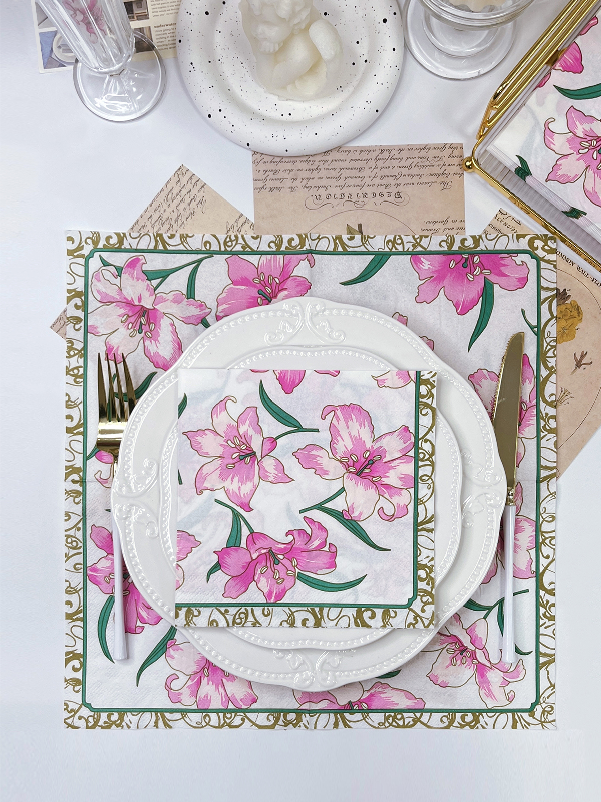
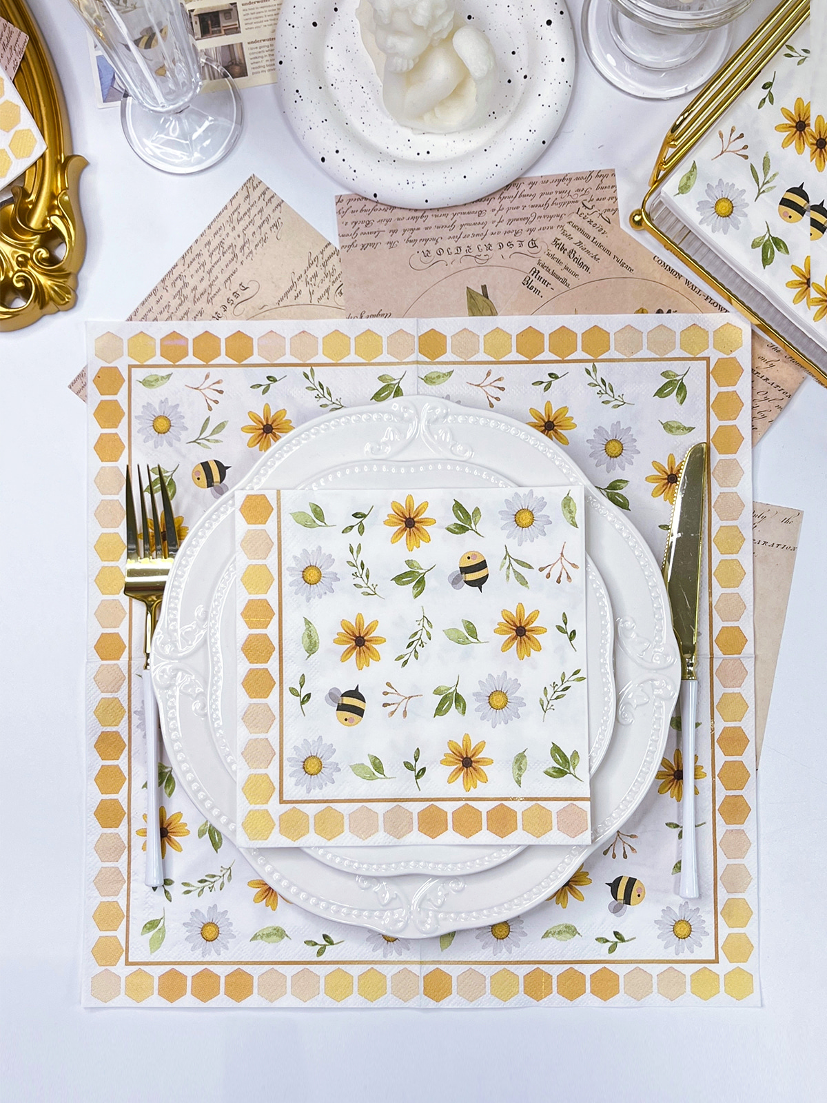
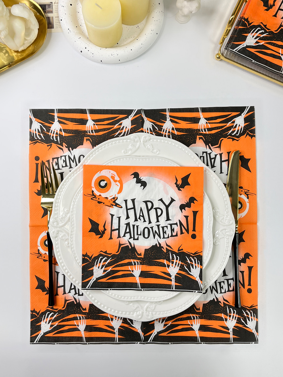
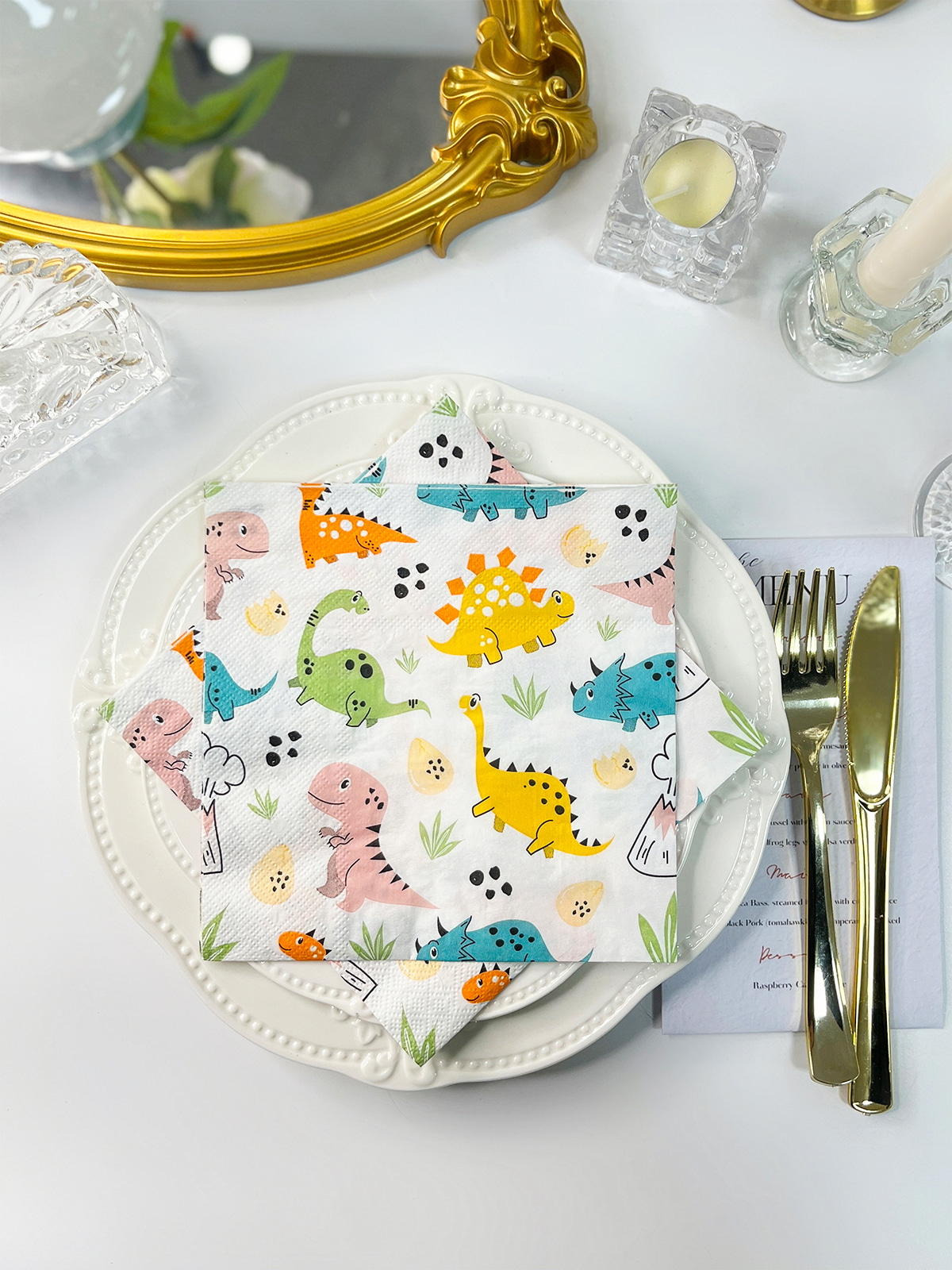
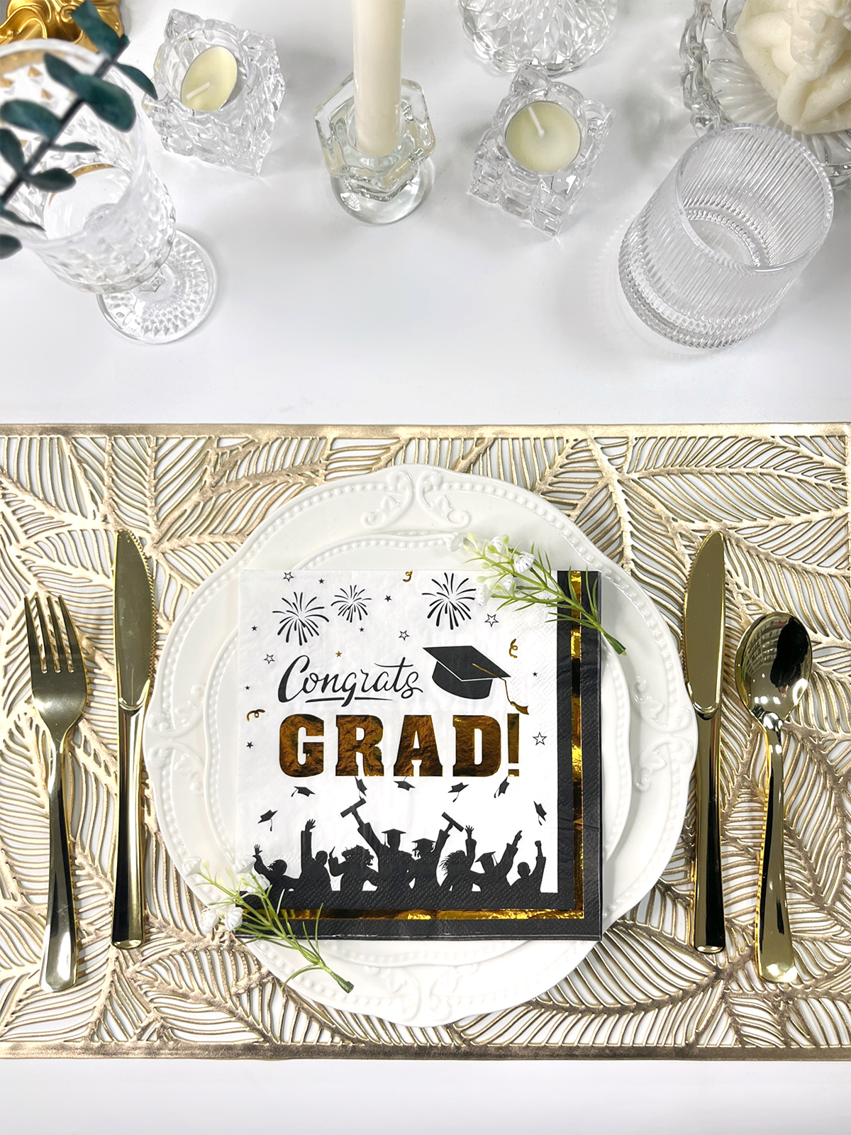
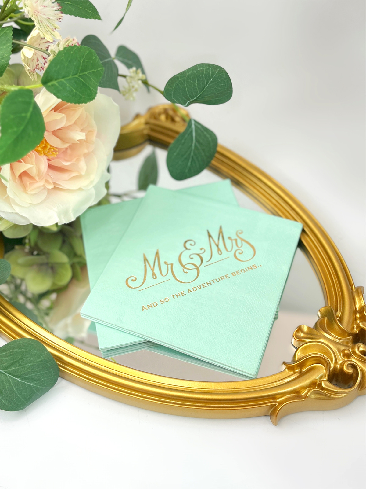
Napkins sit in plain view through the whole meal. Guests pick them up, fold them, wipe their fingers, and set them down again, so a printed mark gets seen many times. A restaurant uses a logo for recognition. A hotel often matches the pattern to the style of its dining room. Caterers and wedding planners may need a design tied to a single event.
Print choices should still respect daily use. Napkins meet food, grease, and moisture, so artwork needs to stay legible when the paper is damp or crumpled. A delicate pattern that smudges after one sip of spilled water does little for the brand.
Printing can serve several purposes:
Each method handles color, detail, and repeat production differently. Suitability also depends on the paper structure, so the supplier should confirm what works for the specific napkin.
| Printing Method | General Characteristics | Typical Use |
|---|---|---|
| Flexographic | Flexible plates, consistent repeats | Logos and recurring patterns |
| Offset | Can handle detailed artwork on suitable paper | Graphic-heavy designs |
| Digital | Easy artwork changes | Small runs and design trials |
| Screen | Ink pushed through a prepared screen | Selected decorative work |
Flexographic printing is common for paper products and suits designs that repeat across large runs, such as a cafe logo ordered again every few months. Offset can reproduce fine detail, though absorbent napkin stock does not always suit it, so buyers should ask whether the supplier offers it for that construction.
Digital printing helps when a business wants to test a design or prepare a one-off event order. The available color range and the finished look should be checked beforehand. Screen printing may suit certain decorative effects, again depending on the paper.
A supplier should name the methods actually available for the chosen napkin instead of describing general printing capability. That answer says more about the likely result than any brochure.
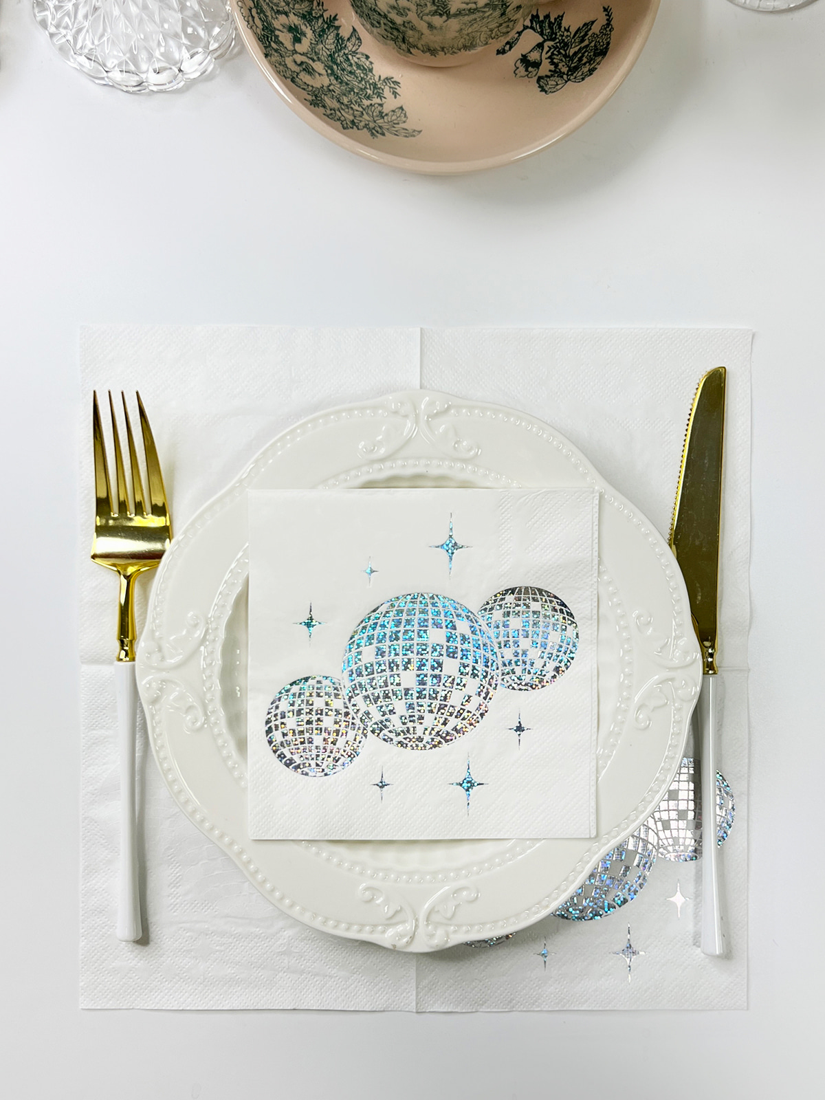
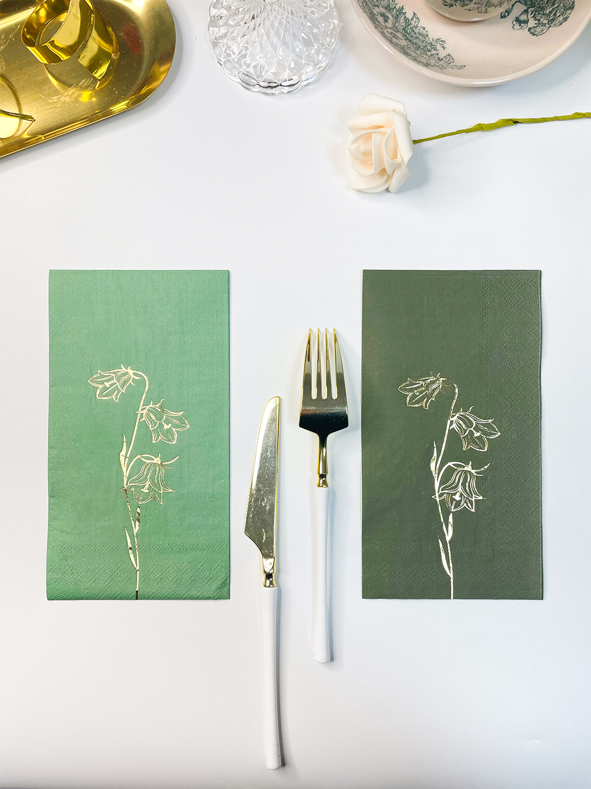
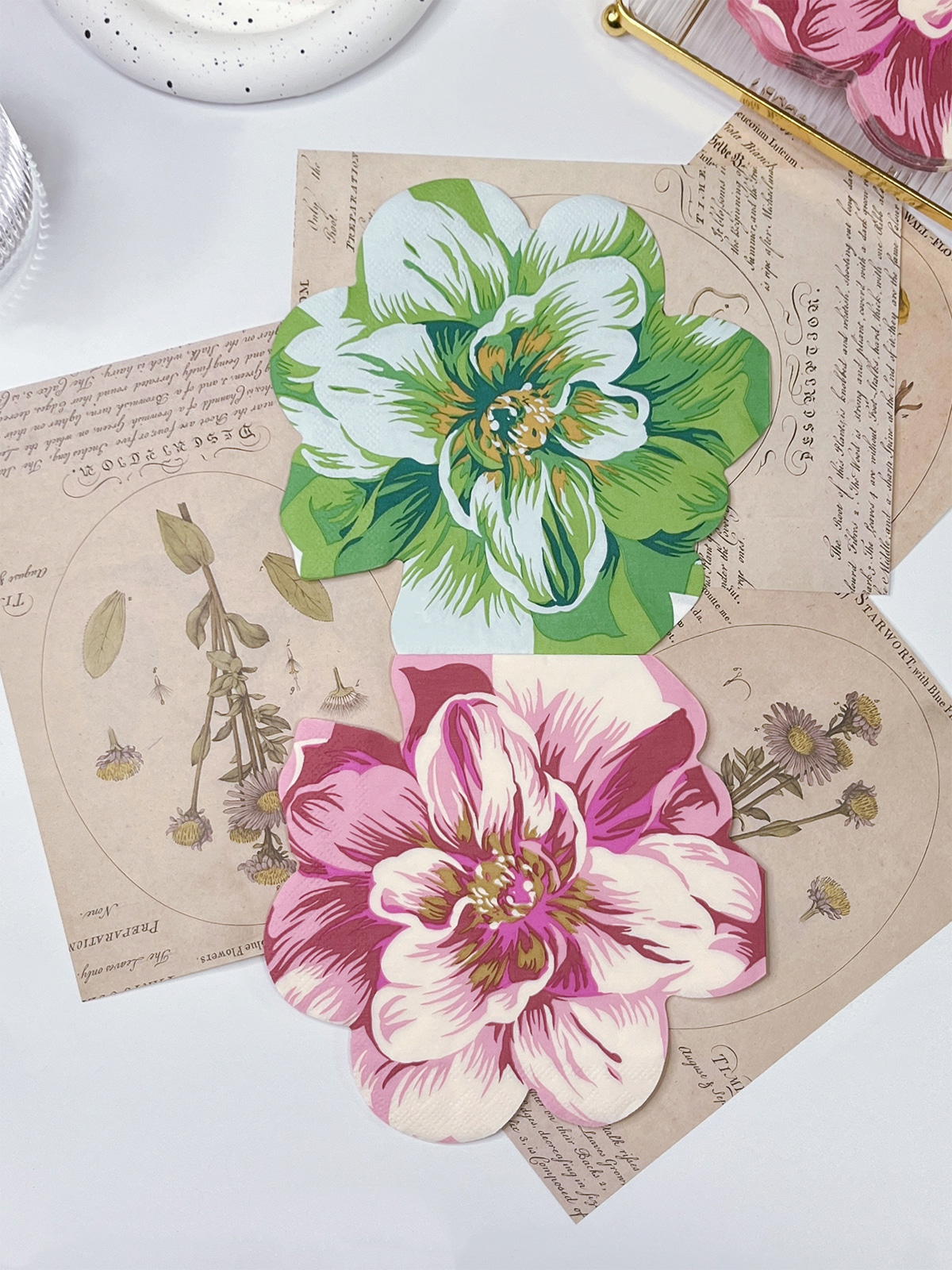
Screens glow, paper does not. A shade that looks vivid on a monitor can look softer once absorbed into tissue. The natural paper tone also shifts the printed result, so a pale blue on white stock may differ from the same blue on cream.
Practical guidelines help:
A family restaurant may favor a warm, relaxed palette, while a hotel dining room may prefer restraint. Event products allow more freedom if the design stays clear. Dark ink on a light sheet usually reads well, though the printing process and paper must support it.
Request a printed sample on the actual paper before approving production. A digital preview rarely shows how ink spreads, and a sample placed on a real table under dining-room lighting shows far more.
Thin lines, tiny text, and layered effects often blur on absorbent paper, particularly near folds and edges. Simplifying a logo for print does not weaken the brand. It keeps the mark readable from across a table.
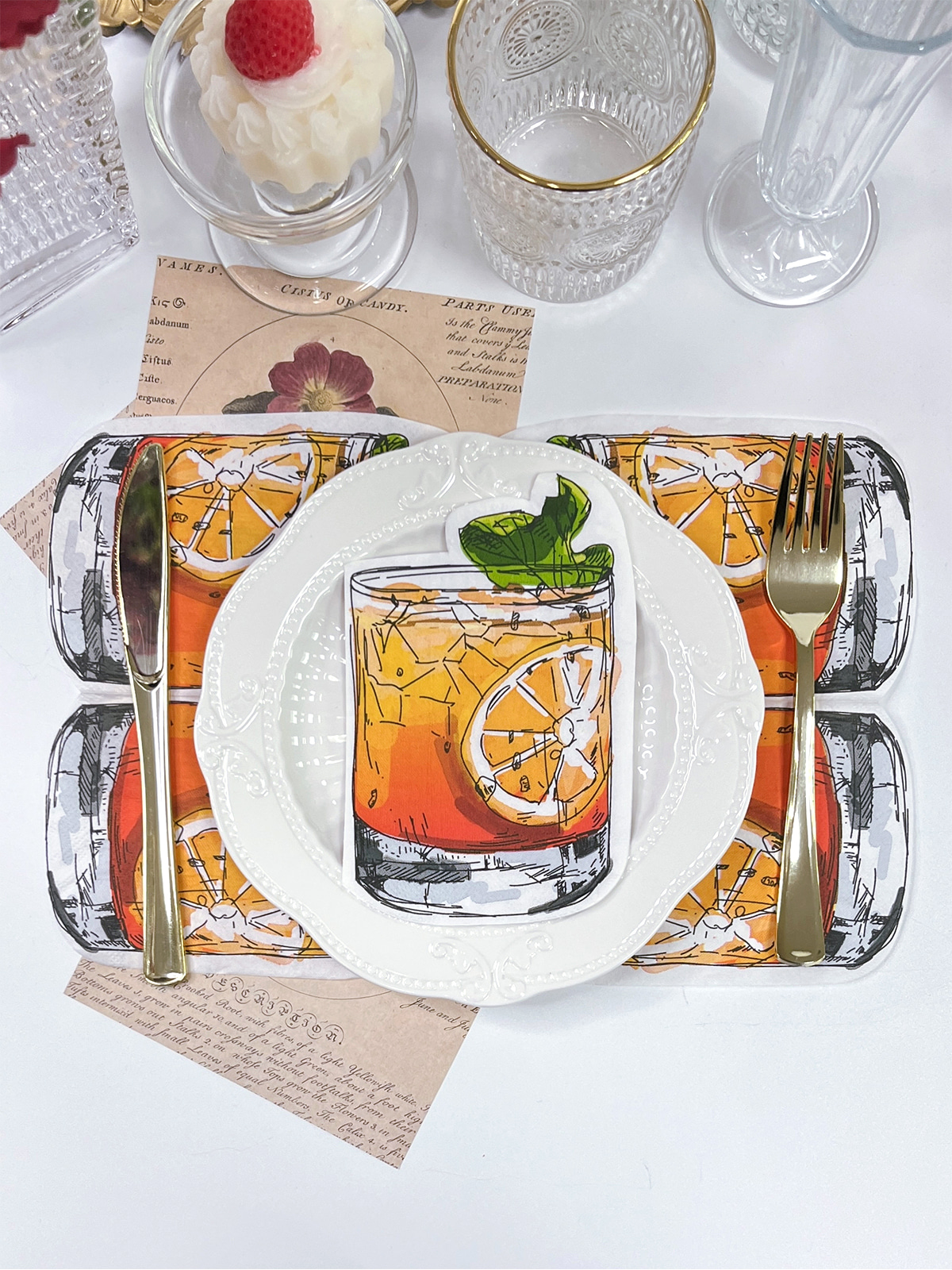
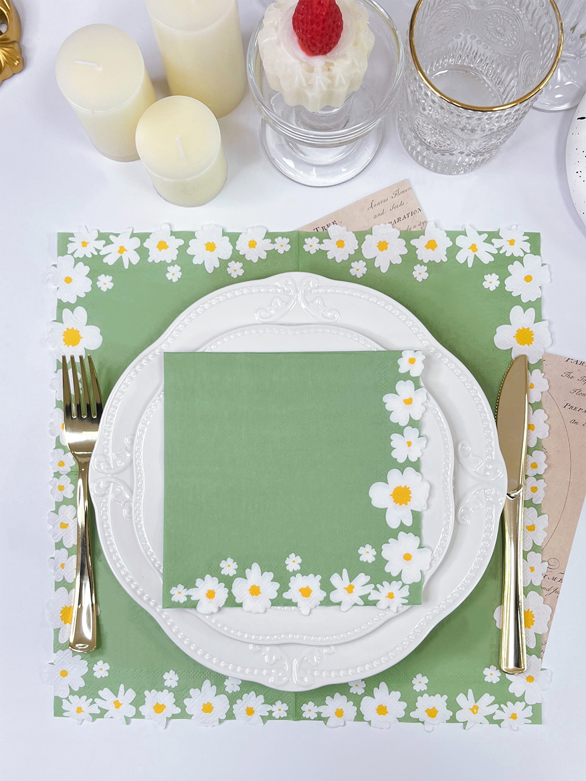
Placement matters as much as detail. Napkins are folded before they reach the guest, so a logo placed carelessly may show only half its shape. Check the artwork against the actual fold, and consider which part faces up when the napkin is set on a plate or wrapped around cutlery.
| Artwork Element | Consideration |
|---|---|
| Business logo | Keep it recognizable at small size |
| Brand name | Use clear lettering and sensible placement |
| Decorative pattern | Avoid crowding the main visual |
| Event message | Check visibility after folding |
| Fine details | Confirm they reproduce clearly |
| Edge graphics | Allow for folds and handling |
Send artwork in the format the supplier requests, and expect suggestions for adjustment. Complex effects may need to be simplified before production.
Confirm ownership of the design files and whether they can be reused for repeat orders. This matters for businesses planning to reorder or build a related range later.
Napkin paper is built to absorb, and that same quality changes how ink behaves. Soft, absorbent stock can spread ink at letter edges, while a smoother sheet holds fine lines better. Texture may even become part of the product's character, giving a printed pattern a gentle, natural look.
Layer construction also plays a role. A multi-layer napkin can show print differently depending on which surface carries the ink and how the sheet folds. Printing across several folds needs extra planning, since the pattern shifts each time the napkin is opened.
Review these points together with the design:
A sample lets the buyer judge print and paper as one item, along with the feel in the hand.
One-sided printing keeps layout simple and suits designs where a single visible surface carries the logo. It also keeps the napkin looking clean when it is folded in a standard way.
Two-sided printing offers more space when both faces show, such as a logo on one side and a pattern on the other. Printing both sides raises questions about ink placement and how the design holds up in contact with moisture, so the process should be reviewed with the supplier.
Extra printing should serve a purpose. A small logo may be enough for a daily cafe napkin, while a themed event may justify a wider pattern. The way the napkin is presented, flat, folded, or rolled around cutlery, should guide the choice.
Defining the application early makes the design brief easier to write.
A clear brief helps the supplier. It can list the application, paper preference, artwork, fold, printing arrangement, and expected reorder pattern.
Approving an image is only one step. Artwork, paper, process, and finished product have to work together. A practical sequence looks like this:
Packaging deserves attention too. Napkins stored in damp or dusty conditions lose their appeal before use, so cartons should protect the paper and carry clear labels for each design. Mixed designs in one storeroom are easy to confuse without them.
When custom Luncheon Paper Napkins are planned around their real use, printing becomes part of a broader product decision covering paper, artwork, folding, color, and packaging.
Related Products
Shopping for a reliable source of napkins?
Established in 2007 and located in Zhuji City, Zhejiang Province, Zhuji Furong Paper Products Co., Ltd. is a professional manufacturer of color-printed napkins. Enhance Your Event With Custom Printed Napkins.
Telephone
+86-15325932613
Address
Jianglong Industrial Park, Jiyang Street, Zhuji City, Shaoxing, Zhejiang, China.
Contact Us
Products
Contact Us
+86-15325932613
+86-575-87765556
+86-575-87765559
Jianglong Industrial Park, Jiyang Street, Zhuji City, Shaoxing, Zhejiang, China.
Party Printed Paper Napkins Manufacturer Customized Napkins And Paper Towels Factory
Copyright © by Zhuji Furong Paper Products Co., Ltd. Rights Reserved.

 English
 中文简体