2026-06-17
Foil Stamping Napkins sit in a strange position in event design. Small item, simple use, yet once placed on a table, they start interacting with everything around them. Plates, lighting, table fabric, even empty space nearby all change how the same napkin design is perceived.
Balance on a surface like this is not about decoration density. It is more about how the eye moves across a small area without interruption. If too many elements gather in one place, the foil loses clarity and the surface starts feeling visually tight. If spacing is left more open, reflective parts behave differently, catching light in a softer rhythm.
Creative Paper Napkins often appear in this space because paper texture does not fight against foil. Both sit together without forcing attention. One holds structure, the other adds reflection. Between them, empty space becomes part of the design instead of leftover area.
What usually works in practice is not complicated:
When balance feels right, the napkin does not stand out loudly, yet it still changes how the table feels when viewed as a whole.
Content
Typography on Foil Stamping Napkins behaves differently compared to flat printing. Foil reacts to light, and letter shapes decide how that reflection is broken or carried across the surface.
Heavy or complex fonts tend to complicate that reflection. Light hits uneven edges, small details get lost, and the result can feel crowded even when the design is small. Simpler letter shapes usually avoid that issue. The foil becomes easier to read, and the surface feels more stable.
Short text also plays a role. A name, a set of initials, sometimes a very short phrase. Once the text becomes long, folding and viewing angles start affecting readability more strongly.
Some patterns tend to appear repeatedly in workable layouts:
Typography in this setting is less about expression and more about clarity under changing light.
Symbols tend to survive better than detailed visuals on Foil Stamping Napkins. The reason is simple. Small space, repeated folding, shifting light. Complex images lose shape quickly in that environment.
Simple geometry holds up more naturally. A circle remains a circle. A line remains a line. Even when foil reflects unevenly, the structure stays readable.
Event-based symbols also appear, though they are usually reduced to their simplest form. Not drawn for detail, more for recognition at a glance.
Common directions include:
When symbols stay light, they do not compete with plates, glass, or surrounding décor. Instead, they sit quietly within the table setting.
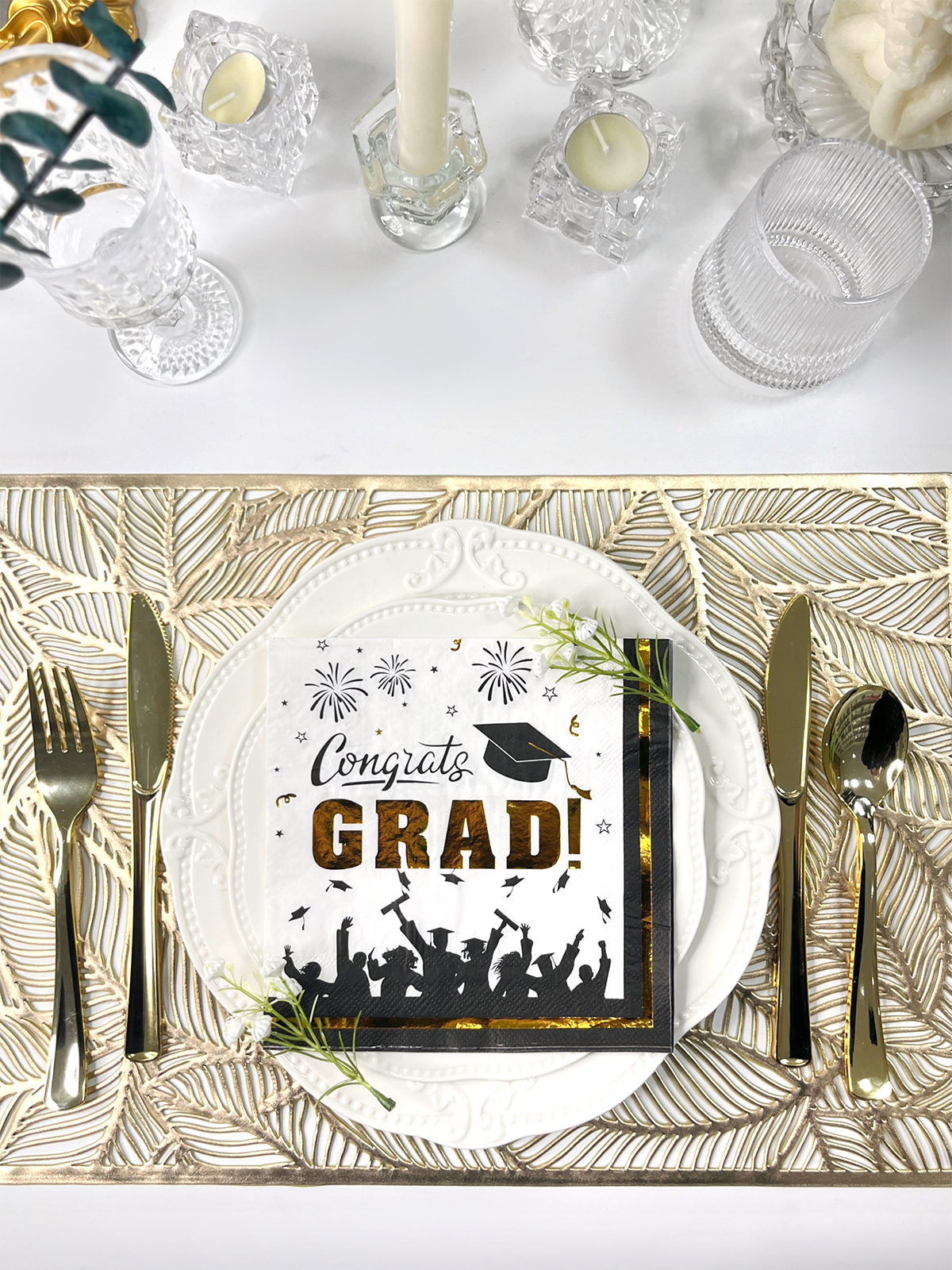
Color underneath foil changes everything, even when the printed design stays identical. Foil does not exist alone; it reacts constantly with background tone and surrounding light.
Light backgrounds tend to soften reflection. Foil sits gently on the surface and blends more into the overall table feel. Dark backgrounds push the foil forward visually, making reflection more noticeable even from a distance.
Creative Paper Napkins make this interaction more flexible because surface tone can be adjusted depending on table style.
| Background Tone | Foil Reaction | Overall Feel |
|---|---|---|
| Light surface | soft reflection spread | calm and subtle |
| Dark surface | stronger contrast | sharper visual presence |
| Neutral tone | balanced effect | steady appearance |
| Warm tone | gentle glow behavior | relaxed mood |
| Cool tone | cleaner reflection edge | structured feel |
Color pairing usually works better when repeated across the table instead of changing too often between settings. Consistency keeps visual rhythm intact.
Placement changes how attention travels across Foil Stamping Napkins. Even a small shift can make the same design feel different.
Centered layouts feel grounded. The eye lands in one stable point. Corner placement feels lighter, almost like decoration that stays in the background rather than asking for attention.
Foil also reacts to placement. When positioned near folds, reflection can break unevenly. When placed in open areas, light spreads more evenly across the surface.
Practical considerations usually stay simple:
When placement is consistent, table surfaces feel more organized even without obvious decoration.
Minimal design on Foil Stamping Napkins often works because it does not try to dominate the table. Instead, it stays in the background while still being visible enough to shape perception.
One symbol, one line, or one short text element is often enough once foil is involved. Reflection already adds variation, so extra complexity is not always necessary.
Minimal layouts also reduce visual competition across tables. When everything around the napkin already carries texture, color, and movement, keeping the napkin simple prevents overload.
Typical traits of minimal direction:
Creative Paper Napkins often support this approach because the material does not force heavy visuals, allowing foil to stay as a soft accent instead of a dominant feature.
Foil on napkins never behaves the same way twice. Even when the same design is used, surface texture shifts how light spreads and how the final look feels on the table. That detail often gets overlooked, yet it quietly changes the entire impression.
A smoother paper surface usually allows foil to sit more evenly. Reflection feels cleaner, edges of shapes appear more stable, and text becomes easier to read from different angles. On the other hand, lightly textured paper brings a different character. The foil breaks slightly as it follows the surface grain, creating a softer and less rigid appearance.
Creative Paper Napkins often use these surface variations as part of design direction rather than treating them as background detail. Texture becomes part of how decoration is experienced, not just how it is printed.
A few patterns often appear in real use:
Texture does not replace design, yet it changes how design behaves once light enters the space.
Creative Paper Napkins allow more variation in layout thinking because the material is not fixed to a single visual direction. Foil stamping, print layering, and spacing choices can all sit together without forcing one style.
Instead of limiting design, the paper surface becomes a kind of working space where different ideas can be tested visually. Some designs rely more on typography, others lean into symbols or empty space. Foil becomes the connecting element that ties everything together.
Common directions include:
A single Foil Stamping Napkin design rarely defines an entire event space. What shapes perception is repetition across many tables. When the same visual detail appears again and again, it slowly becomes part of the environment rather than a single object.
Repetition does not need to be exact duplication. Even small shared elements are enough. A similar foil placement, a repeated symbol, or a consistent color tone can quietly connect separate tables into one visual system.
That kind of consistency often appears in subtle ways:
When repetition is handled lightly, the space avoids feeling rigid. Instead, it feels connected without looking forced.
Modern table design tends to move away from heavy decoration. Instead of filling space with strong visual statements, more attention goes into smaller details that sit naturally within the environment.
Foil Stamping Napkins fit into that direction because they add visual interest without overwhelming the table. Reflection is present, yet controlled. Decoration exists, yet stays close to function.
In many modern settings, design decisions often follow a quieter logic:
Creative Paper Napkins often adapt well to this approach because they support both simplicity and variation at the same time.
Instead of trying to create strong focal points, modern design tends to let many small details work together. Napkins become part of that structure, not as decoration alone, but as one piece in a wider visual rhythm.
A table is rarely viewed as a single object. It is experienced in layers. Plates, glassware, fabric, light reflection, and small printed elements all sit together in one shared visual field.
Foil Stamping Napkins enter that environment quietly. They are handled, folded, placed, and seen repeatedly during interaction. Because of that repetition, even small design decisions start to influence how the table feels over time.
What stands out is not the napkin alone, but how it interacts with surrounding elements. Reflection from foil may echo lighting in the room. Simple shapes may mirror other decorative forms nearby. Consistent spacing may align with overall table arrangement.
In many cases, the effect builds slowly:
The design does not need to dominate. It simply needs to stay aligned with the environment it sits in.
Not because complex design is wrong, but because the table environment already carries many layers of visual information. Glass, fabric, lighting, movement, and conversation all compete for attention.
Within that setting, design elements that remain calm, balanced, and repeated tend to fit more naturally. Creative Paper Napkins give enough flexibility for variation, while foil adds a controlled highlight that shifts gently with light.
When those pieces come together without forcing attention, the result often feels less like decoration and more like atmosphere.
Related Products
Shopping for a reliable source of napkins?
Established in 2007 and located in Zhuji City, Zhejiang Province, Zhuji Furong Paper Products Co., Ltd. is a professional manufacturer of color-printed napkins. Enhance Your Event With Custom Printed Napkins.
Telephone
+86-15325932613
Address
Jianglong Industrial Park, Jiyang Street, Zhuji City, Shaoxing, Zhejiang, China.
Contact Us
Products
Contact Us
+86-15325932613
+86-575-87765556
+86-575-87765559
Jianglong Industrial Park, Jiyang Street, Zhuji City, Shaoxing, Zhejiang, China.
Party Printed Paper Napkins Manufacturer Customized Napkins And Paper Towels Factory
Copyright © by Zhuji Furong Paper Products Co., Ltd. Rights Reserved. English
 中文简体
中文简体


