2026-08-12
For a formal wedding setting, paper finish tends to work when it fits the surrounding design rather than standing apart from it. A smooth surface can give printed patterns a genuinely clean appearance, while a softer matte surface creates a quieter visual effect instead. Reflective details bring their own character too, especially once table lighting shifts throughout the event.
Surface feel matters during handling as well. Napkins get folded, placed beside tableware, picked up during meals, and sometimes arranged into simple decorative shapes. Paper that holds its fold well helps maintain an orderly table arrangement, while a softer surface tends to create a more relaxed appearance overall.
Color behaves differently across various finishes too. Pale shades can look gentle on a low‑reflection surface, while deeper colors gain real visual depth once paired with selective reflective decoration. Printed patterns depend heavily on surface smoothness as well, since fine lines and small decorative elements need enough contrast to stay easy to recognize.
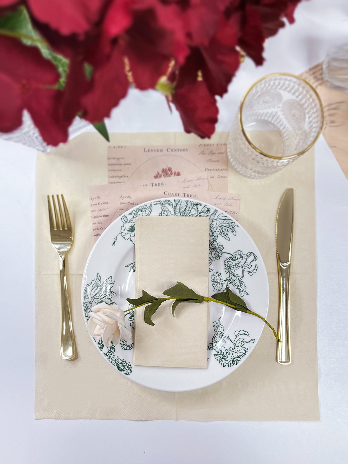
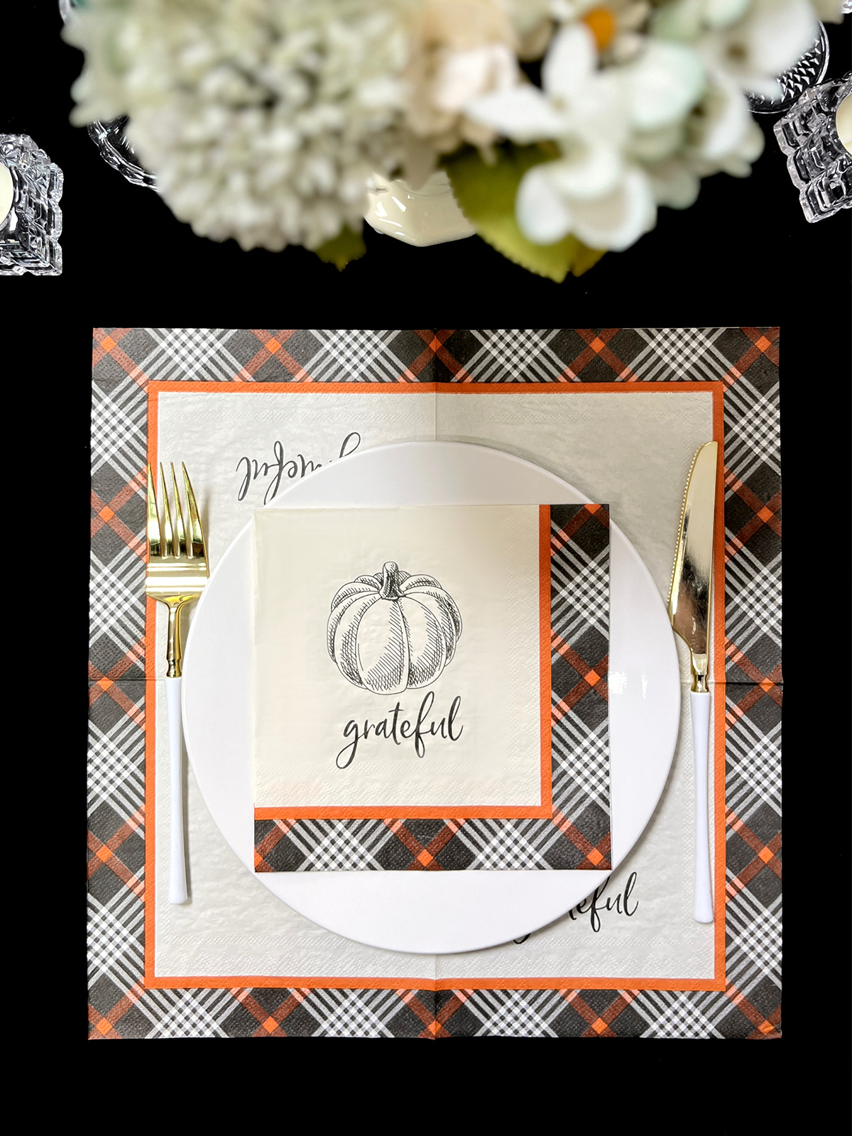
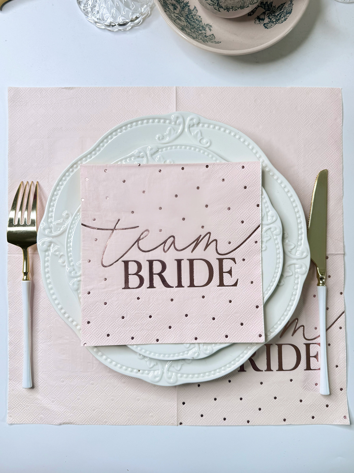
For personalized wedding settings, Custom Paper Napkins Wedding designs often bring together color, wording, pattern, and surface treatment all at once. A name, date, initial, or simple decorative border can look genuinely different depending on which paper finish gets chosen.
Rather than treating finish as some isolated detail, wedding planners and paper product designers tend to weigh several elements together:
A suitable finish helps all of those elements sit within the same visual direction.
Content
Matte paper surfaces create limited reflection, giving wedding napkins a genuinely softer visual character. Under bright room lighting, candlelight, or natural daylight, reduced glare tends to make colors feel calmer and printed details easier to view from different angles around the table.
This kind of surface often works well with simple table designs where decoration relies on color and texture rather than reflective accents. Neutral shades, muted floral patterns, and lightly printed borders can sit pretty naturally against a matte background.
Soft finishes also shape how a color's weight comes across. A pale cream or warm white surface can look gentle, while darker shades create a more grounded visual effect without pulling in strong reflections.
Folding behavior deserves attention here too. Wedding napkins commonly get folded into rectangular forms, narrow bands, simple fan shapes, or other arrangements. Surface texture genuinely shapes how easily paper holds its intended shape after folding.
A matte finish can suit settings built around:
Another real benefit of a low‑reflection surface is visual consistency. Reflections can sometimes interrupt a printed pattern when light falls directly across the paper, but reduced shine lets decorative elements stay more visually stable across different parts of a room.
These characteristics make matte finishes genuinely useful for wedding tables where atmosphere depends on softness, balance, and restrained decoration.
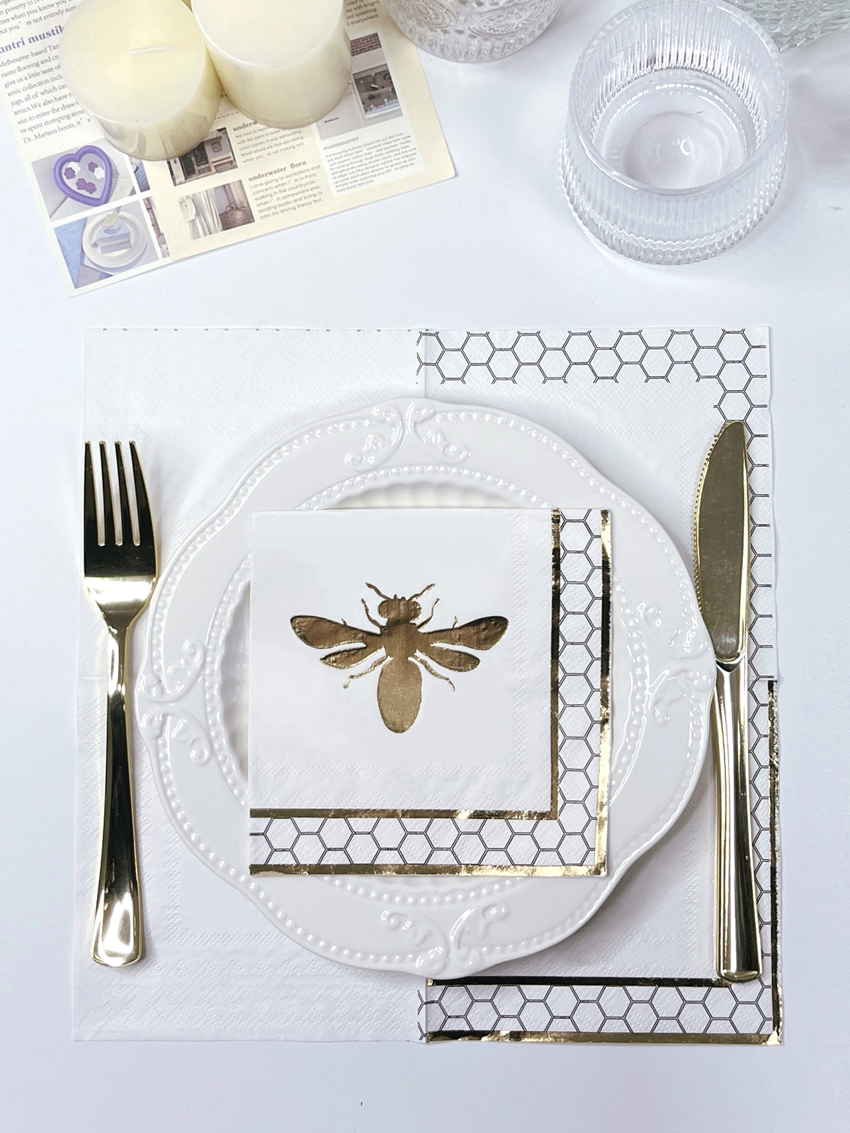
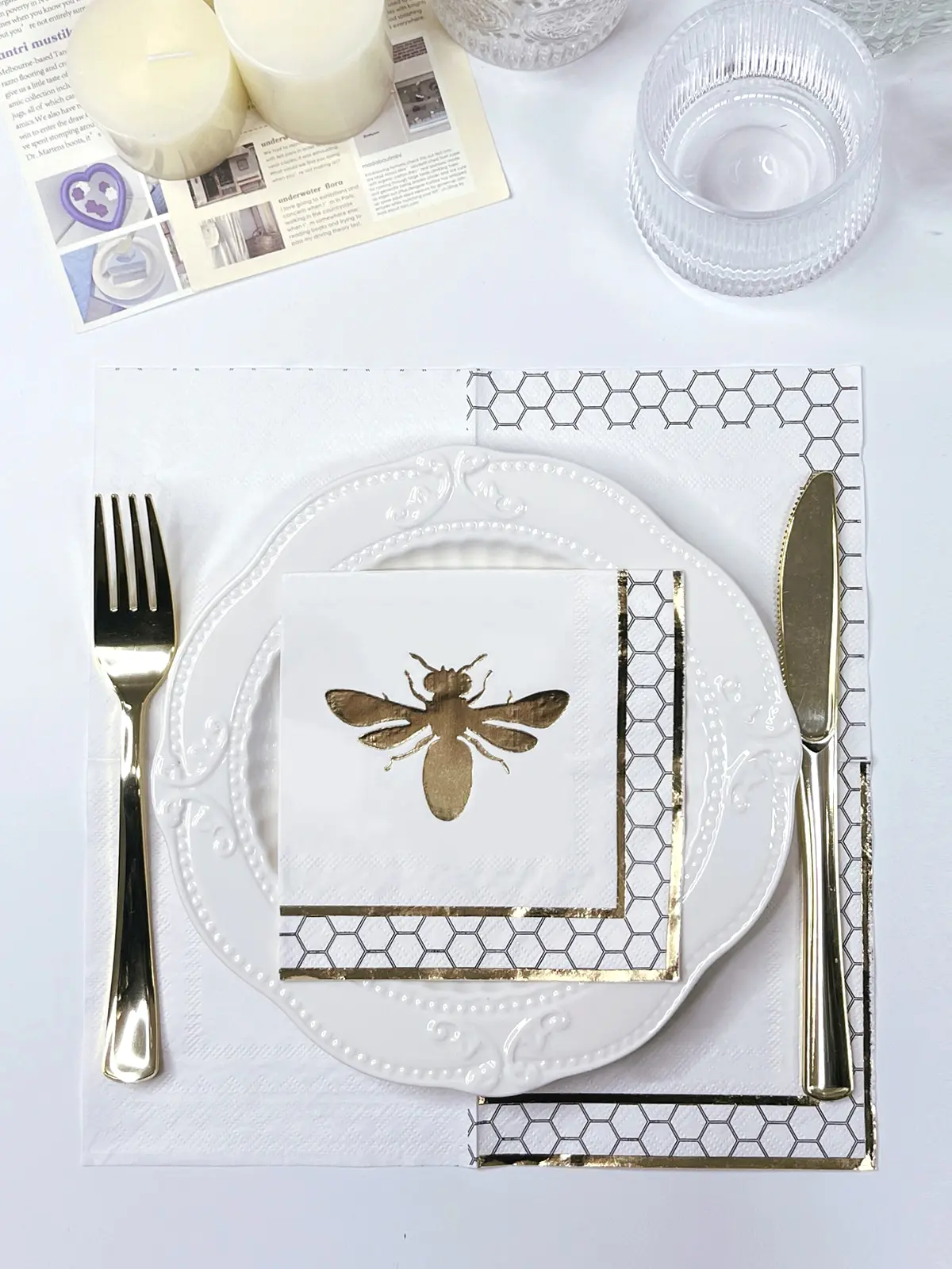
Reflective foil decoration creates a genuinely different visual response. Rather than leaning mainly on color or texture, metallic‑looking details interact with surrounding light and can draw attention toward selected parts of a design.
Foil Stamping Napkins might include decorative lettering, borders, symbols, or small graphic elements. Reflective areas tend to shift in appearance as guests move around the table, simply because light reaches the surface from changing directions throughout the evening.
Lighting becomes a genuinely important consideration here as a result. A reflective detail might look subtle under soft daylight and turn noticeably more striking under evening table lighting. Candlelight can bring its own small shifts in brightness across metallic areas too, giving printed details a genuinely shifting appearance over the course of the event.
Foil doesn't need to cover a large part of a napkin to shape the overall design. Small areas can offer real contrast against a plain paper surface, especially when the surrounding decoration already carries several colors or textures of its own.
A balanced approach might involve:
Color selection changes how reflective details come across too. Light paper can create a delicate contrast, while darker paper tends to make metallic areas feel more visually defined against the surface.
These combinations often come up for evening receptions, formal dining arrangements, or table settings where lighting genuinely plays into the overall decoration.
Reflective decoration still needs to work with the rest of the table, though. Excessive contrast can make individual elements compete for attention, while carefully placed details connect napkins with cutlery, glassware, candle holders, and other decorative pieces around them.
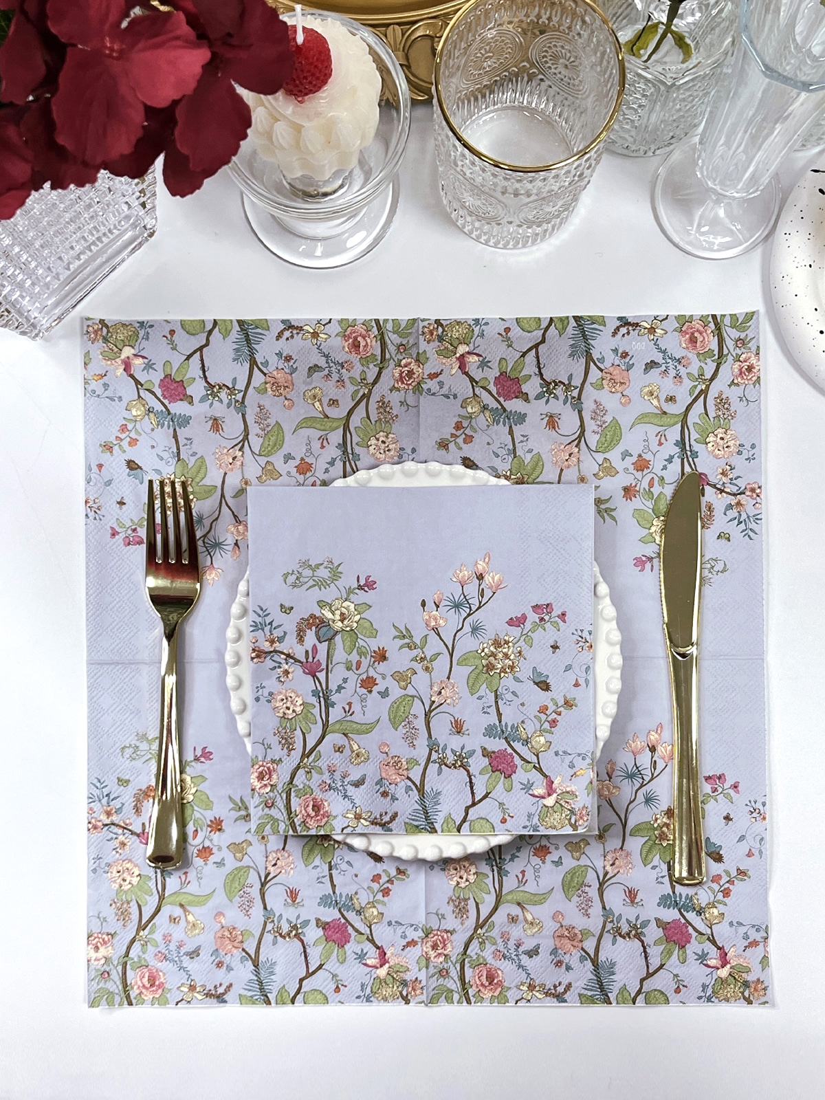
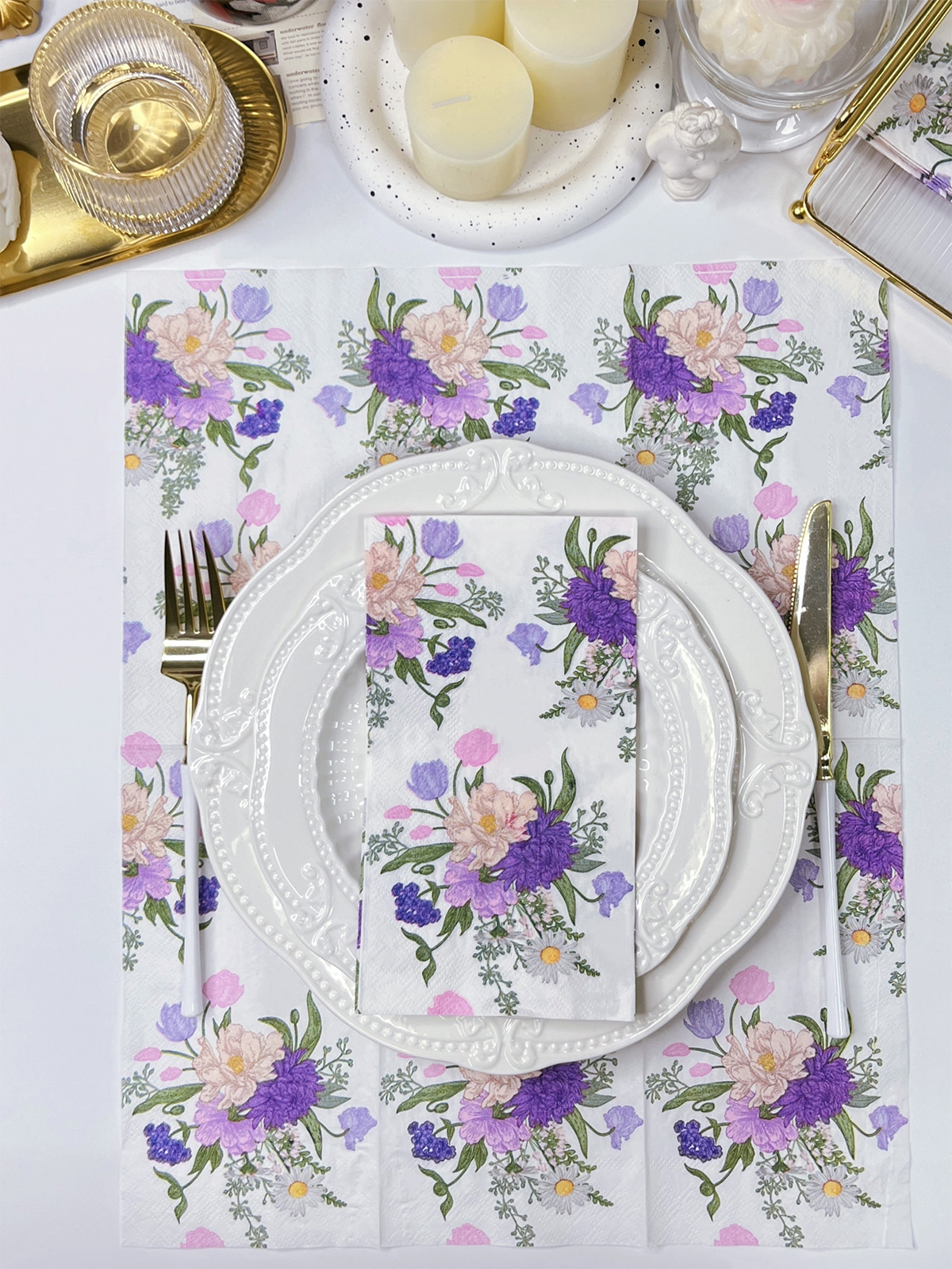
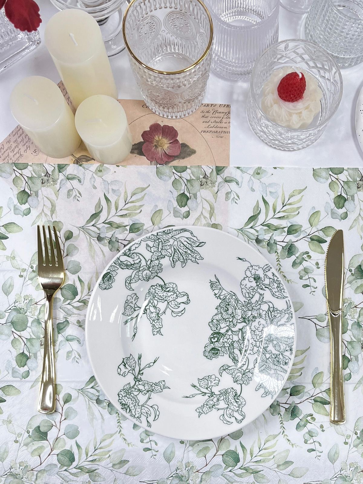
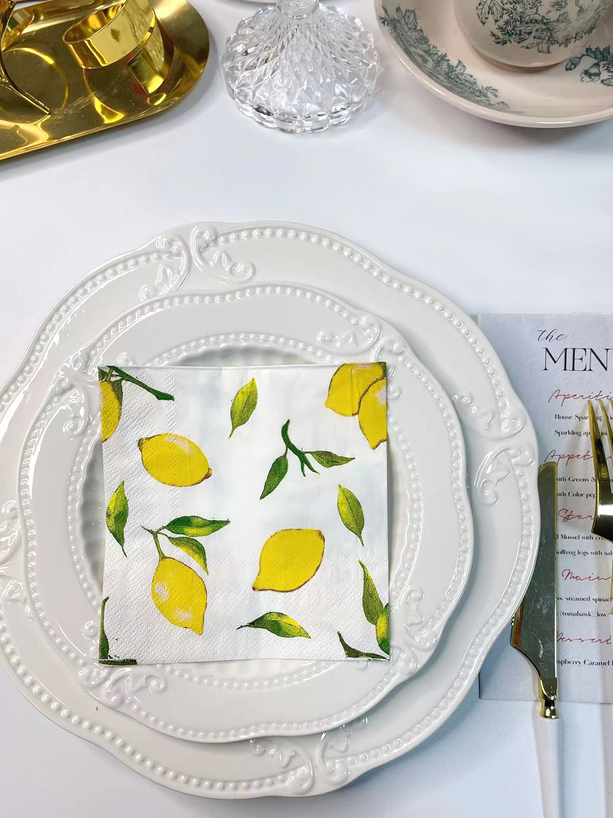
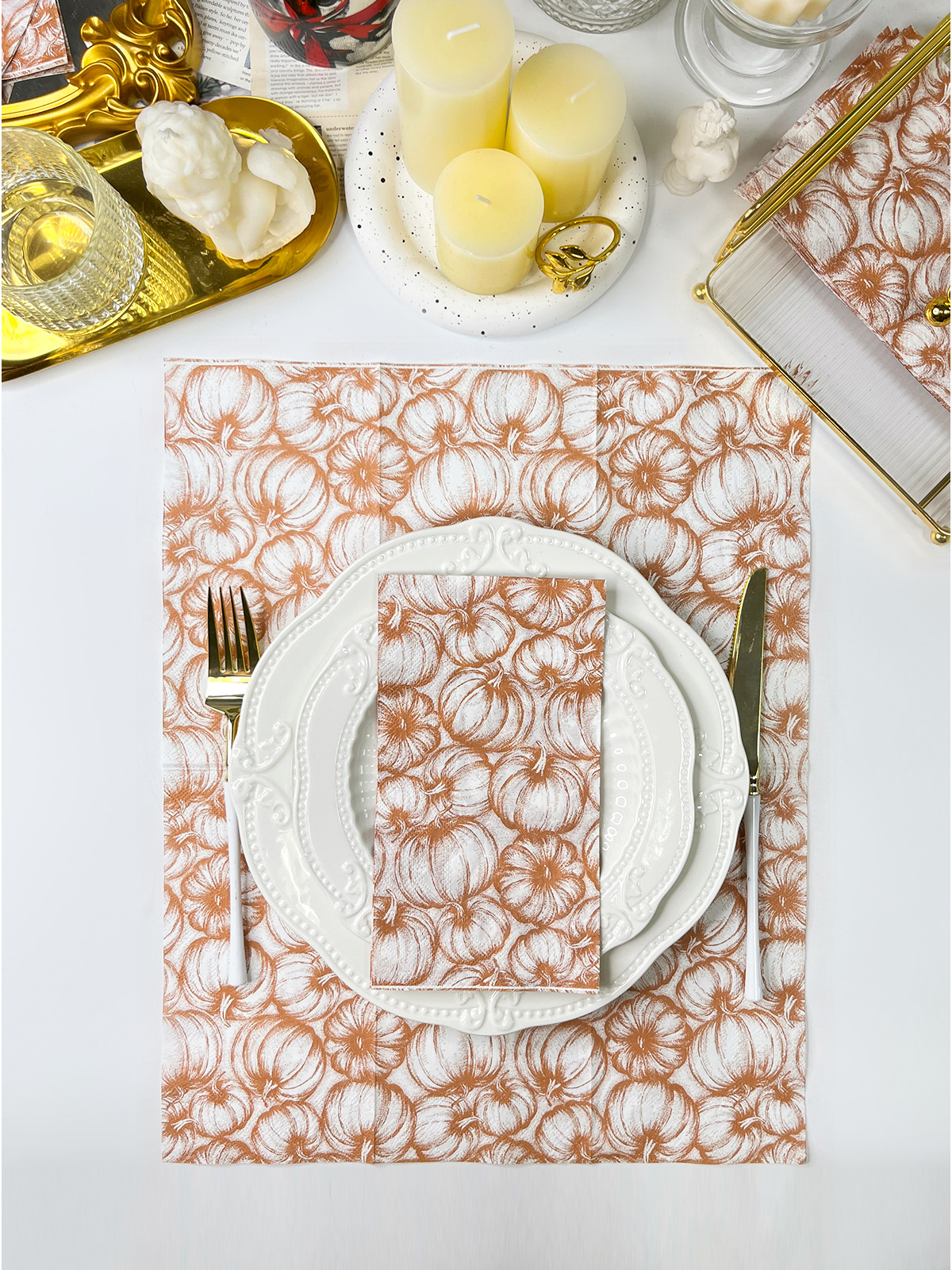
Printed napkins offer another genuine way to shape a wedding table's appearance. Patterns can bring in color, lettering, or visual repetition without leaning on additional decorative objects at all.
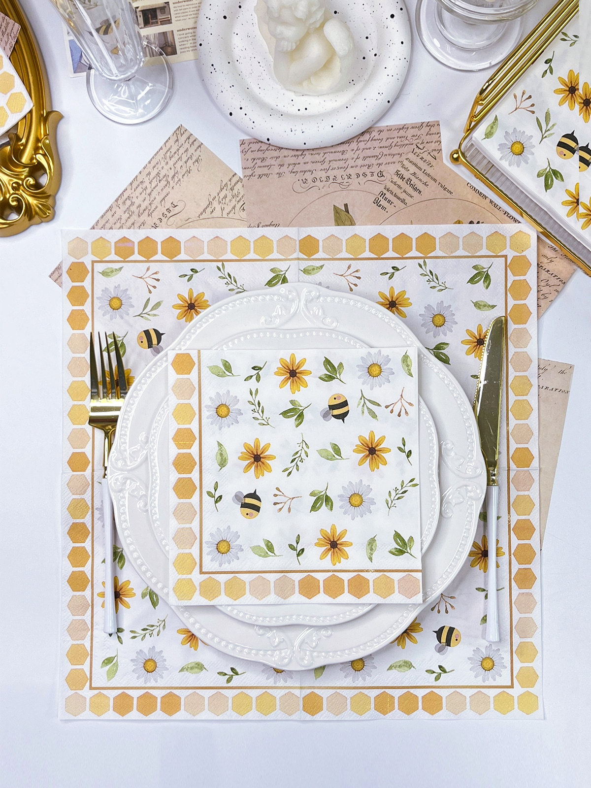
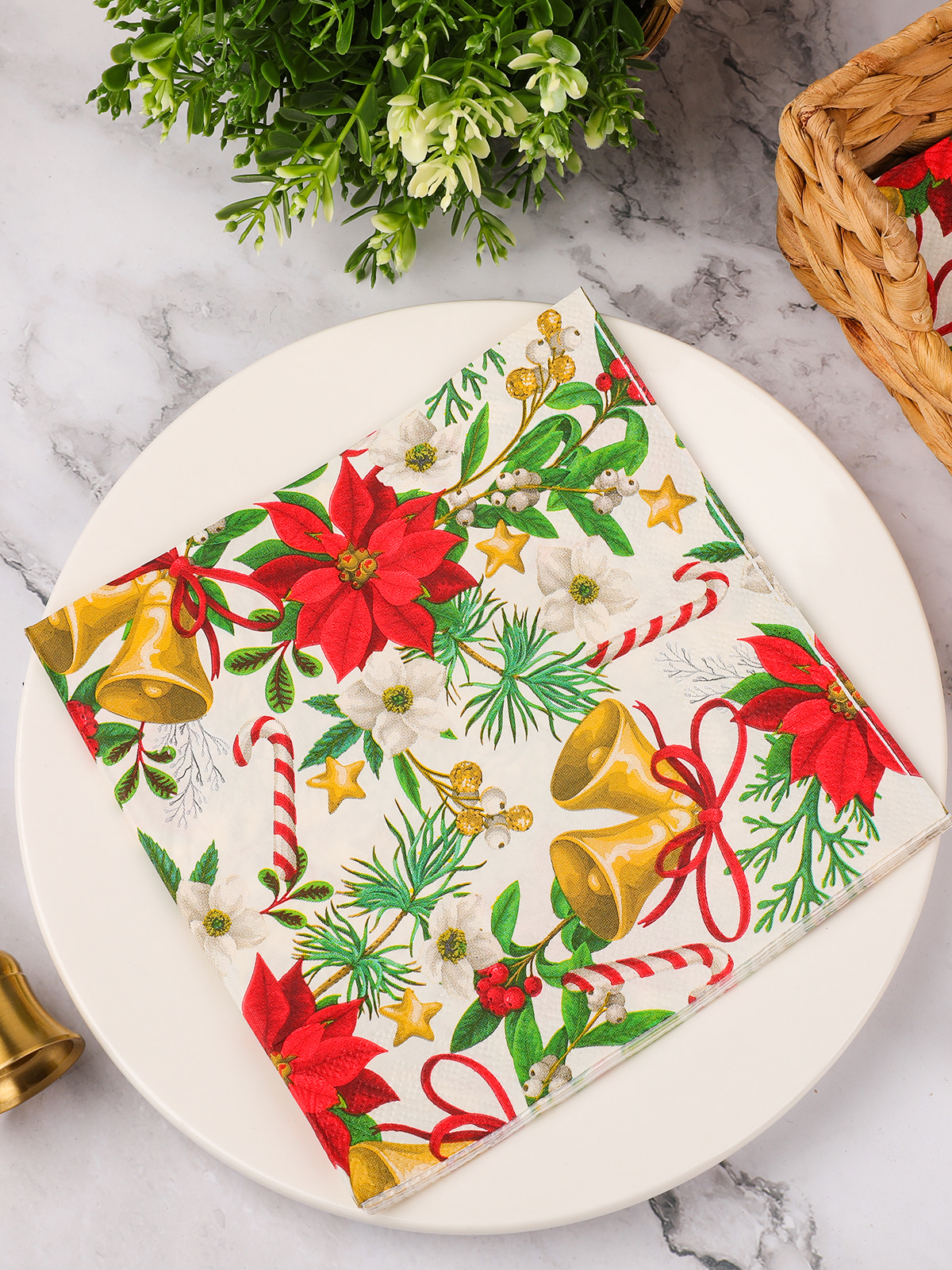
Printed Table Napkins might carry floral graphics, geometric lines, initials, simple borders, or other personalized elements. Pattern placement really matters here, since a design covering the entire surface creates a genuinely different impression than a small mark placed near an edge would.
Print density shapes how a napkin interacts with nearby objects too. A heavily patterned surface can become a strong visual element on its own, while a small border tends to stay quieter and lets flowers, plates, and table linens draw more attention instead.
For formal wedding arrangements, printed designs often work better when their visual weight actually matches the surrounding decoration. A delicate floral pattern can pair nicely with light‑colored flowers, while a simple line or monogram might fit a cleaner table arrangement better.
Paper surface shapes print appearance as well. Smooth finishes tend to support clear edges and defined lettering, while textured surfaces can soften small details and create a more tactile appearance overall.
Good table coordination really does consider the complete setting rather than the napkin in isolation. Color, pattern size, surface texture, and lighting all feed into how guests end up perceiving the finished arrangement.
Wedding styles vary greatly, so paper finish usually needs to follow the wider table design rather than work as a separate feature. A garden setting may call for a soft surface and gentle colors, while an evening reception may suit a darker paper tone with small reflective details.
Classic formal tables often rely on clean lines, balanced colors, and carefully arranged tableware. A smooth printed finish can support such a setting because lettering and borders remain visually defined without adding too much texture.
Natural wedding themes tend to work well with quieter surfaces. Matte paper can sit comfortably beside flowers, woven materials, wood‑toned decorations, and soft‑colored table linens, creating a relaxed appearance without strong reflections.
Evening settings bring lighting into the selection process. Reflective details can respond to candlelight or overhead lighting, creating subtle changes as guests move around the room. A limited amount of foil decoration may therefore add visual depth without changing the character of the entire table.
| Wedding Style | Finish Direction | Possible Visual Character |
| Natural and Soft | Matte surface | Calm and gentle |
| Classic Formal | Smooth printed surface | Clean and organized |
| Evening Reception | Selective foil details | Light‑catching accents |
| Pattern Based | Clear printed surface | Defined decorative elements |
| Minimal Table Setting | Light matte or smooth finish | Simple and balanced |
Pattern‑focused settings require a little more attention to print density. A decorative surface already carrying flowers, lines, or lettering may need a calmer finish so surrounding elements remain easy to distinguish.
No single finish suits every wedding environment. Venue lighting, table decoration, clothing colors, flowers, and tableware can all change how a paper surface appears.
Color and surface treatment influence one another. A color that appears quiet on a matte background may look more noticeable when paired with a reflective finish, while a dark shade can gain stronger contrast from small metallic details.
Light colors often work naturally with softer surfaces. Cream, ivory, pale gray, and other muted shades can create a gentle background for floral decoration or simple printed wording.
Darker colors create a different relationship with light. Reflective lettering or borders can stand out against a deep background, especially in an evening setting where artificial light reaches the table from several directions.
Neutral colors provide another option. White, beige, gray, and similar tones can support printed patterns without creating strong competition with flowers or tableware.
Color matching can be considered through several relationships:
Printing also changes how color is perceived. A dense pattern can make a color appear stronger across the table, while small lettering or a narrow border may create a more restrained effect.
Such choices become particularly relevant when personalized wording is part of the design. Names, initials, short phrases, and decorative symbols need enough contrast with the paper background to remain readable without dominating the entire setting.
Appearance is only one part of finish selection. Practical handling can influence the choice just as much, especially when napkins need to be folded, stacked, placed beside tableware, and handled throughout a reception.
Folding requirements deserve attention because different surfaces can respond differently to creasing. A design intended for a simple folded shape may not need the same surface characteristics as a napkin arranged into a more detailed form.
Print clarity also matters. Small letters and thin decorative lines require a surface that allows enough definition. Larger patterns are generally less sensitive to small changes in surface texture.
A practical selection process can consider:
Wedding table design has gradually moved toward greater attention to coordinated details. Paper goods are no longer treated only as functional items in many formal table arrangements. Color, lettering, pattern, and surface treatment can all contribute to the visual character of a setting.
Personalized paper products remain relevant because they can connect small table details with a wider decoration plan. Initials, names, simple symbols, or coordinated wording can create visual links between different parts of a reception.
At the same time, decorative choices have become more varied. Some table settings rely on quiet surfaces and restrained printing, while others combine plain paper with small reflective details.
Several directions can be seen in current design thinking:
A mixed approach can also work. A matte paper background paired with a small reflective border creates a different effect from a fully reflective surface, while a simple printed pattern can provide structure without adding another material.
Such combinations show how paper finish has become part of wider table planning. Selection is no longer based only on whether a napkin carries a pattern. Surface feel, light response, color, printing, and folding all contribute to the final appearance.
A wedding table contains many visual elements, so paper finish needs to maintain a reasonable relationship with everything around it. Strong patterns, reflective details, and bright colors can attract attention, while softer finishes tend to recede into the overall arrangement.
Balance does not require every item to use the same surface. A simple napkin can sit beside decorative plates, textured linen, or reflective tableware and still create a coherent setting when colors and visual weight remain connected.
Selection can therefore begin with the table rather than the napkin. Venue lighting, decoration style, flower colors, tableware, and folding methods provide useful context for deciding whether a matte, smooth, printed, or foil‑treated surface fits the intended setting.
A quiet design may benefit from a soft finish and limited printing, while a formal evening table may gain visual interest from small reflective details. Pattern‑heavy arrangements can use calmer paper surfaces to prevent the table from becoming visually crowded.
Paper finish is ultimately one part of wedding table design. Its effect comes from the relationship between texture, color, print, lighting, and surrounding decoration. A suitable combination allows the paper element to perform its practical role while remaining naturally connected with the overall setting.
Related Products
Shopping for a reliable source of napkins?
Established in 2007 and located in Zhuji City, Zhejiang Province, Zhuji Furong Paper Products Co., Ltd. is a professional manufacturer of color-printed napkins. Enhance Your Event With Custom Printed Napkins.
Telephone
+86-15325932613
Address
Jianglong Industrial Park, Jiyang Street, Zhuji City, Shaoxing, Zhejiang, China.
Contact Us
Products
Contact Us
+86-15325932613
+86-575-87765556
+86-575-87765559
Jianglong Industrial Park, Jiyang Street, Zhuji City, Shaoxing, Zhejiang, China.
Party Printed Paper Napkins Manufacturer Customized Napkins And Paper Towels Factory
Copyright © by Zhuji Furong Paper Products Co., Ltd. Rights Reserved.

 English
 中文简体
中文简体