2026-08-10
Metallic accents on Foil Stamping Napkins show up often across wedding venues, hotel dining rooms, and catered events. That shimmer under overhead lighting draws attention in a way flat ink never quite manages. Few guests stop to consider how such a delicate flash of shine survives being folded, tucked under silverware, or crumpled after a meal — but for anyone sourcing these products, that question carries real weight.
Getting a metallic layer to stay put on soft, absorbent paper isn't as simple as pressing metal onto fiber and calling it finished. Several layers, each doing a different job, work together beneath that shiny surface. And the way those layers get applied — heat, pressure, timing — decides whether the finish holds up through normal use or starts flaking within days.
Content
Custom Foil Napkins rely on a composite structure rather than a single sheet of metal. Peel back what looks like solid shine and four distinct layers emerge, stacked in a specific order:
None of these layers alone would survive a fold. Stack them together, though, and the whole assembly behaves more like a flexible skin than a rigid plate.
| Layer | Where It Sits | What It Actually Does |
| Carrier film | Outer support, removed after stamping | Holds everything steady during transfer |
| Release coating | Between carrier and metal | Lets the foil peel away cleanly |
| Metallic film | Reflective core | Produces the color and shine |
| Adhesive coating | Bottom layer | Bonds foil to paper fiber |
A solid metal sheet would snap the second someone folded a napkin in half. This layered version bends instead, because the thinness and softness of each component lets the whole structure flex along with the paper underneath.
Bonding happens fast, but it's not forgiving. Heat softens the adhesive just enough for it to grip paper fibers, then pressure from the stamping die pushes that softened layer into close contact before it cools and locks.
Push the temperature too high and the adhesive overcooks — it hardens into something brittle that snaps rather than bends. Keep it too low, and the bond never forms properly, so edges lift after a single use. Pressure follows a similar pattern: not enough, and gaps form where the foil never touches down fully; too much, and delicate paper fibers get crushed, leaving an uneven texture right beneath the metallic surface.
No single fixed setting works across the board. Paper weight changes things. So does layer count — a single‑ply sheet reacts to heat differently than a three‑ply one. Manufacturers adjust temperature and pressure case by case, matching the adhesive's behavior to whatever stock is running through the machine at the time.
Even with heat and pressure dialed in correctly, the paper itself can undo everything if its surface isn't right. Rough or uneven fiber structure creates tiny gaps — spots where the metallic film simply can't make full contact. Those gaps become weak points later, showing up as small cracks or dull patches once the napkin gets handled a few times.
To head this off, paper meant for foil work often goes through a smoothing step before stamping starts. Pressing the fibers down flattens out microscopic irregularities, giving the adhesive a more even surface to grab onto. Stress ends up distributed more evenly across the foil once folding happens, rather than concentrating on a few raised fiber points that poke through.
Absorbency plays a role too. Paper that soaks up moisture or adhesive too fast can leave the bond patchy — solid in some spots, weak in others. Balancing how much a surface absorbs against how the adhesive is formulated keeps that inconsistency from becoming a visible problem later in the finished product.
Napkins don't stay still for long once they leave the packaging. Someone pulls one from a dispenser, folds it into a pocket shape or a sharp triangle, sets a plate on top of it, then crumples the whole thing and tosses it aside. All that motion puts real mechanical stress on anything printed or stamped onto the surface. Metal reacts to this differently than ink does — even a film thinner than a human hair resists stretching in ways plain color coating never has to deal with.
What actually happens at a microscopic level is that the metallic layer sits between a somewhat flexible adhesive base and open air. Room to shift slightly matters here. As paper bends underneath, the foil moves along with it instead of locking into one rigid shape and snapping. That said, folding the same crease over and over eventually wears at any coating — foil included. A properly bonded layer just tends to survive far more of that repeated folding before showing cracks, compared to one where the adhesive never cured right.
Sharp geometric folds used in formal table settings put noticeably more strain on foil than a napkin left loosely folded beside a plate. Producers making decorative or event‑focused napkins tend to work around this by keeping heavy foil placement away from fold lines — putting metallic detail where creases won't concentrate stress directly on top of it.
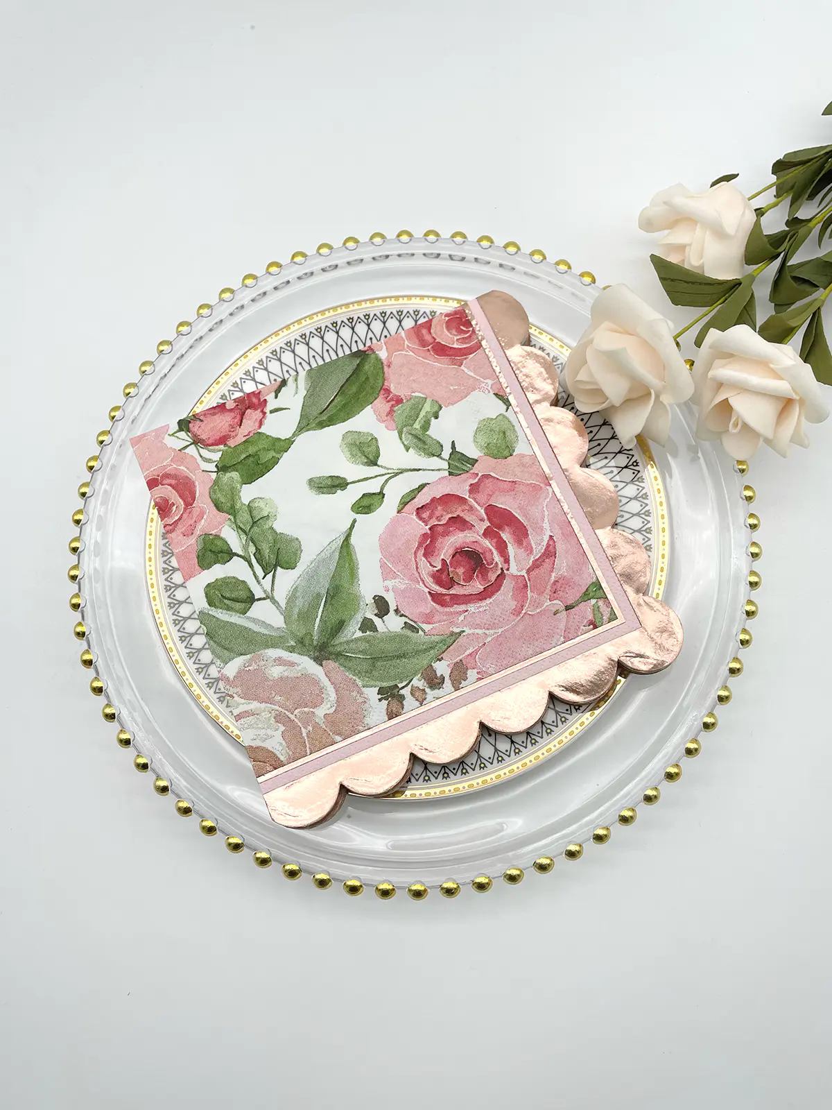
Foil color for napkins generally falls into a few recognizable groups, and each one reflects light a little differently once applied.
Gold remains common, showing up in everything from a warm classic tone to deeper, almost antique variations. Silver runs cooler and more neutral, often picked for settings leaning modern or minimal. Rose gold lands somewhere between the two — a soft pink undertone that reads warmer than silver without going as saturated as straight gold. Black metallic foil produces a darker shine, nearly matte under low light, and creates sharp contrast against pale paper. Holographic or iridescent foil behaves differently from all of these — it shifts color depending on the angle someone views it from, breaking light into small rainbow fragments rather than holding one fixed hue.
| Foil Color | Visual Character | Typical Pairing |
| Gold | Warm, reflective, traditional | Cream or white paper stock |
| Silver | Cool, neutral, sharp reflection | Pale blue or white paper stock |
| Rose gold | Soft pink undertone, gentle shine | White or blush paper stock |
| Black metallic | Dark shine, strong contrast | Light‑colored paper stock |
| Holographic | Shifting rainbow reflection | Neutral or pastel paper stock |
None of these colors behave the same way twice — base paper tone and room lighting both shift how each one actually reads once applied.
Picking a foil color isn't just personal taste. Contrast and lighting both factor into how the finished product looks once it's sitting on a table. White or cream paper stock tends to let gold and rose gold stand out clearly — there's enough tonal separation for the metallic layer to catch light without getting lost against a busy background.
Darker stock works differently. Navy, black, or deep green paper pairs better with silver or holographic foil, since gold can sometimes blend into darker backgrounds rather than standing apart from them. Silver's cooler cast tends to create sharper visual separation against those darker tones.
Lighting in the room matters just as much as paper color. Candlelit dinner venues, with their warm ambient glow, tend to bring out gold or rose gold in a way that feels natural rather than forced — the light source and the foil color reinforce each other. Daylight settings, like outdoor brunches or daytime gatherings, often suit silver or holographic foil better, since cooler natural light sharpens those reflective qualities instead of dulling them down.
Sometimes foil color gets matched straight to an event theme or seasonal palette instead of following any general rule at all. That flexibility is probably why color selection stays more of an ongoing design decision than something locked into a fixed formula.
Durability and color both circle back to decisions made early in the production process — how layers get bonded, how paper gets prepared, and which foil tone gets paired with which base stock. None of these choices work in isolation. Heat and pressure settings determine whether a metallic finish survives daily folding, while paper tone and room lighting shape whether a chosen foil color actually reads the way it's meant to once the napkin reaches a table.
Related Products
Shopping for a reliable source of napkins?
Established in 2007 and located in Zhuji City, Zhejiang Province, Zhuji Furong Paper Products Co., Ltd. is a professional manufacturer of color-printed napkins. Enhance Your Event With Custom Printed Napkins.
Telephone
+86-15325932613
Address
Jianglong Industrial Park, Jiyang Street, Zhuji City, Shaoxing, Zhejiang, China.
Contact Us
Products
Contact Us
+86-15325932613
+86-575-87765556
+86-575-87765559
Jianglong Industrial Park, Jiyang Street, Zhuji City, Shaoxing, Zhejiang, China.
Party Printed Paper Napkins Manufacturer Customized Napkins And Paper Towels Factory
Copyright © by Zhuji Furong Paper Products Co., Ltd. Rights Reserved.

 English
 中文简体
中文简体