2026-06-08
Table settings often carry meaning that goes beyond simple arrangement. Plates and glasses form structure, while smaller pieces quietly shape the mood around them. Napkins sit in that smaller layer, yet their visual role is often noticed sooner than expected.
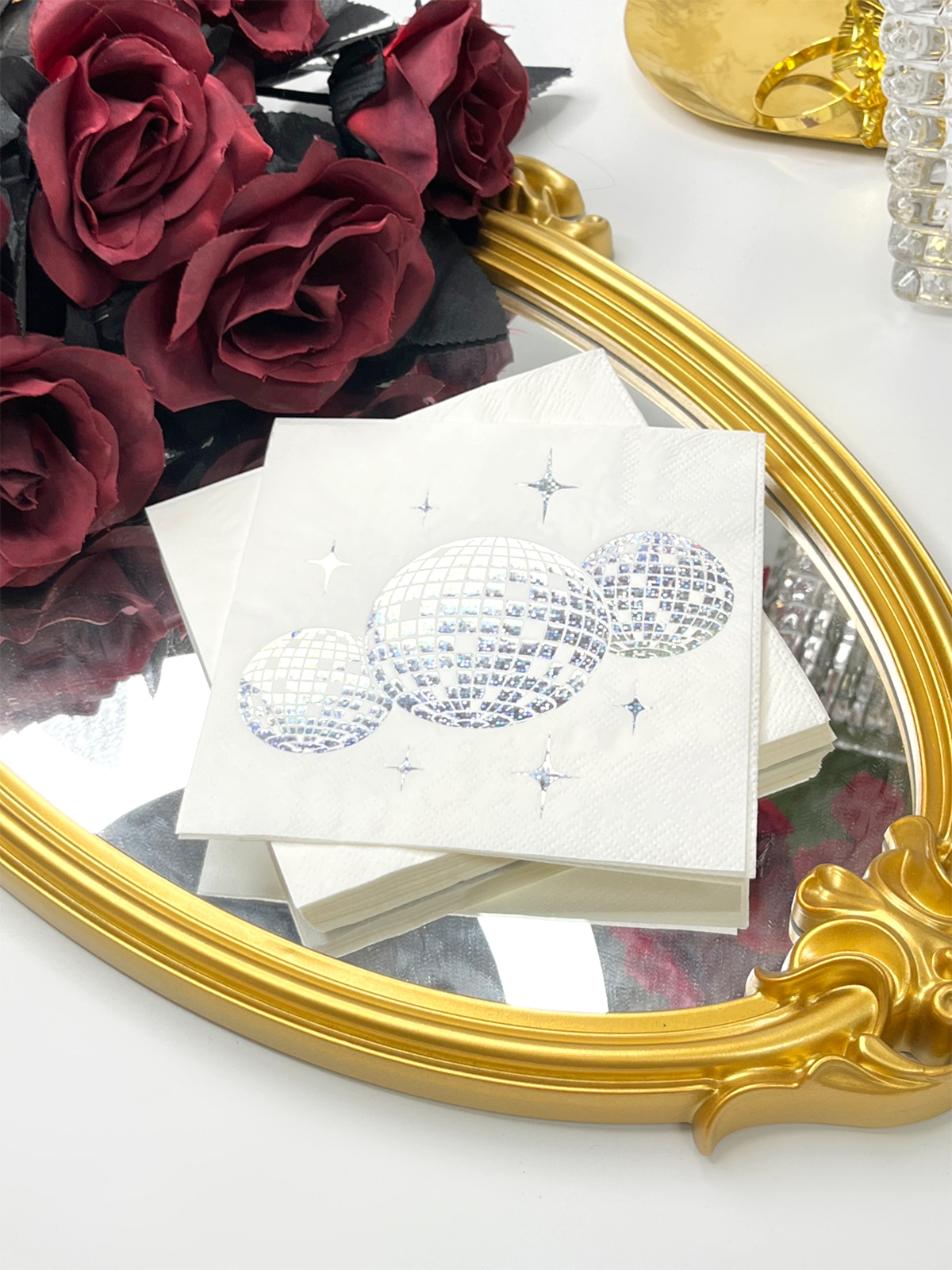
Creative Paper Napkins appear in many table layouts because surface design changes how a space feels. A shift in pattern, a softer tone, or a slight texture difference can adjust the atmosphere without touching the overall structure of the table. That kind of subtle influence is what makes them relevant in modern table design.
In many cases, napkins are no longer treated as items used only for function. Appearance and function sit closer together now. Creative Paper Napkins exist in that middle space where practical use and visual direction overlap.
Content
Standard napkins usually stay close to their basic role. Plain surface, limited design, and a focus on use rather than appearance. Creative Paper Napkins move away from that narrow function by introducing visible surface variation.
The idea of "creative"does not always mean complex design work. Sometimes it appears through a soft repetition of shapes or a gentle shift in color tone. In other cases, light patterns appear only in certain areas of the surface. Nothing feels forced, and the material still keeps its original function.
A quick comparison helps clarify the difference:
| Feature | Standard Napkins | Creative Paper Napkins |
|---|---|---|
| Surface look | Plain or minimal print | Patterned or lightly textured design |
| Role on table | Mainly practical | Practical with visual presence |
| Table effect | Quiet background item | Part of table composition |
| Light response | Almost unchanged | Slight variation across surface |
| Usage style | Simple daily use | Planned table arrangement |
Creative Paper Napkins often rely on restraint rather than heavy decoration. The design stays controlled so it can blend into different table environments without drawing too much attention away from the whole setup.
Table design usually sets the direction for all supporting elements. Once the main visual tone is decided, smaller items tend to follow that same direction. Napkins are included in that process rather than added separately at the end.
Creative Paper Napkins respond to table style through tone, pattern density, and surface clarity. A softer table layout often pairs with light and simple napkin designs. A more structured setting may use clearer patterns to support visual order.
Selection is often guided more by atmosphere than by appearance alone. A calm environment leans toward subtle design, while a more defined table layout may accept stronger visual contrast.
Several factors quietly influence matching decisions:
Creative Paper Napkins often act as a linking element inside the table structure. They help reduce visual gaps between different objects placed across the surface.
Choosing napkins for a table setting rarely comes down to appearance alone. What looks fine in design can behave differently once folded, placed, and viewed under real lighting conditions.
Creative Paper Napkins often change character after handling. A flat sheet may show clear patterns, yet folding can soften details or hide certain areas. That shift is easy to overlook during selection, yet it affects how the table finally reads visually.
Light conditions also shape perception in a quiet way. A dim indoor space reduces contrast. Stronger lighting brings out pattern edges and texture. The same napkin can feel slightly different depending on where it is used.
Several practical points usually come into play:
Tables rarely behave as isolated objects. Everything sits in one shared visual field. When one element feels visually heavy, balance shifts quickly. That is why design control matters more than decoration intensity.
Table environments do not follow a single pattern. Each setting carries its own rhythm, and napkins adjust to that rhythm rather than standing apart from it.
In casual dining spaces, visual calm usually matters more than decoration. Simple tones and light patterns blend into the background, supporting a relaxed feel without pulling attention away from conversation or food.
More structured layouts rely on repetition. When each seat carries the same napkin design, the table gains a sense of order. The repetition creates a quiet visual line across the surface.
Themed arrangements work differently. Color shifts or pattern changes appear more freely, often tied to a specific mood. Outdoor tables may face changing light, so clearer patterns tend to hold up better across different moments of the day.
Common usage environments include:
Napkins fit across these settings because design strength can be adjusted without changing their basic function.
Color and pattern often guide how a table is understood before anything is touched. The eye reads surfaces quickly, and even small differences in tone can shift the entire impression.
Soft colors tend to settle into the background, leaving more space for other table elements. Stronger contrast draws attention toward specific points on the table. Pattern spacing also matters. Wide spacing feels open, while tight repetition creates a more active surface.
Napkins use these elements in a controlled way. Patterns are rarely random. They repeat across seats or appear in measured sections, forming a gentle rhythm across the table.
A simple way to view design behavior:
Balance matters more than decoration density. Too much visual activity can disturb clarity. Controlled use of pattern helps keep the table readable as one complete surface.
Perception at a table begins earlier than interaction. A quick glance across the surface already forms an impression of order, tone, and atmosphere.
Napkins contribute to that moment through repetition and surface detail. When each seat carries the same visual element, the table feels more structured even without heavy decoration.
There is also a timing effect. The impression forms quickly, while smaller details reveal themselves later as lighting shifts or attention moves around the table. That slow discovery adds depth without adding complexity.
Common perception effects include:
The experience is rarely about single objects. It comes from how all parts interact in one field of view.
Beyond appearance, practical behavior often decides whether a napkin design works in real use. Folding, stacking, and placement all influence final presentation.
Creative Paper Napkins behave differently depending on material and print style. Some designs remain clear even after tight folding. Others need open placement to keep pattern visibility.
Compatibility with surrounding tableware also matters. Plates, glassware, and fabrics share visual space, and small clashes in tone or pattern can break balance.
Key practical points include:
A table works as a shared surface rather than separate objects placed side by side. When one part feels out of place, the entire composition can feel uneven.
Creative Paper Napkins remain part of table arrangement choices because they sit between function and visual detail. They do not change how a table is used, yet they influence how it is seen.
Across different environments, flexibility becomes a quiet advantage. Small shifts in color or pattern allow adaptation to different table moods without disrupting structure.
Table design often depends on balance rather than decoration volume. When napkins follow that balance, they help the overall surface feel more connected and visually steady
Related Products
Shopping for a reliable source of napkins?
Established in 2007 and located in Zhuji City, Zhejiang Province, Zhuji Furong Paper Products Co., Ltd. is a professional manufacturer of color-printed napkins. Enhance Your Event With Custom Printed Napkins.
Telephone
+86-15325932613
Address
Jianglong Industrial Park, Jiyang Street, Zhuji City, Shaoxing, Zhejiang, China.
Contact Us
Products
Contact Us
+86-15325932613
+86-575-87765556
+86-575-87765559
Jianglong Industrial Park, Jiyang Street, Zhuji City, Shaoxing, Zhejiang, China.
Party Printed Paper Napkins Manufacturer Customized Napkins And Paper Towels Factory
Copyright © by Zhuji Furong Paper Products Co., Ltd. Rights Reserved. English
 中文简体
中文简体


