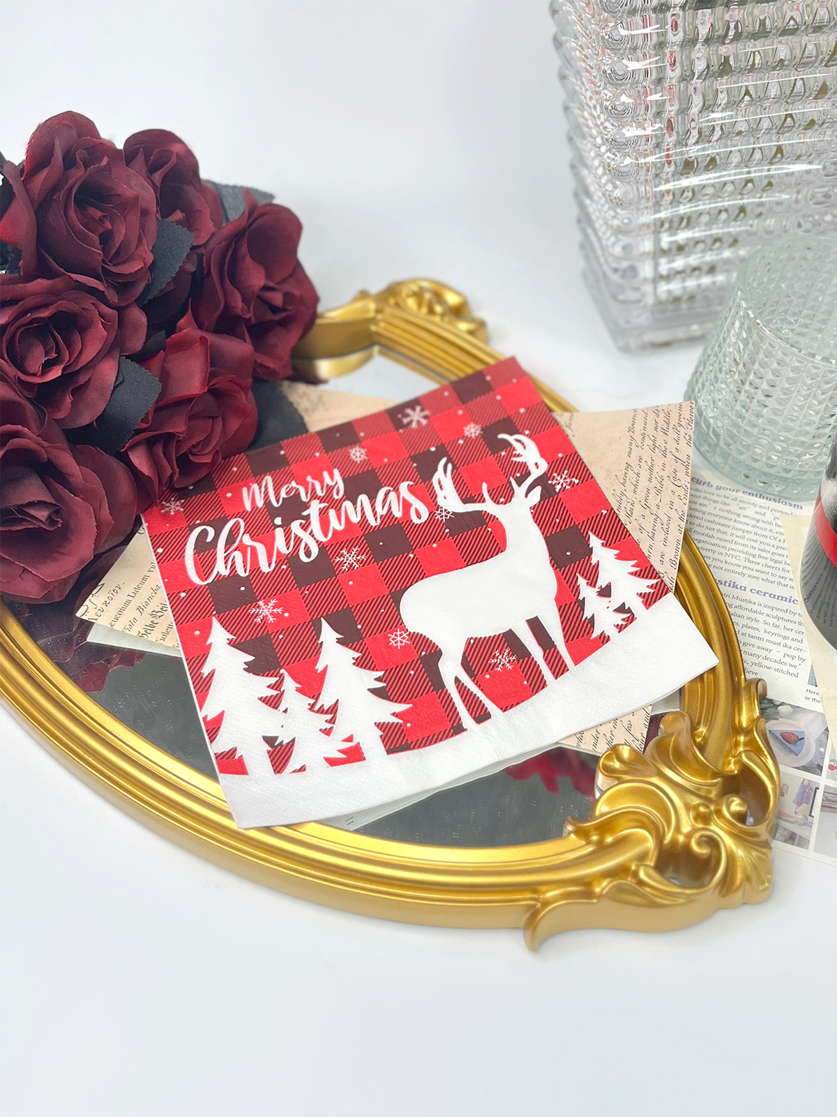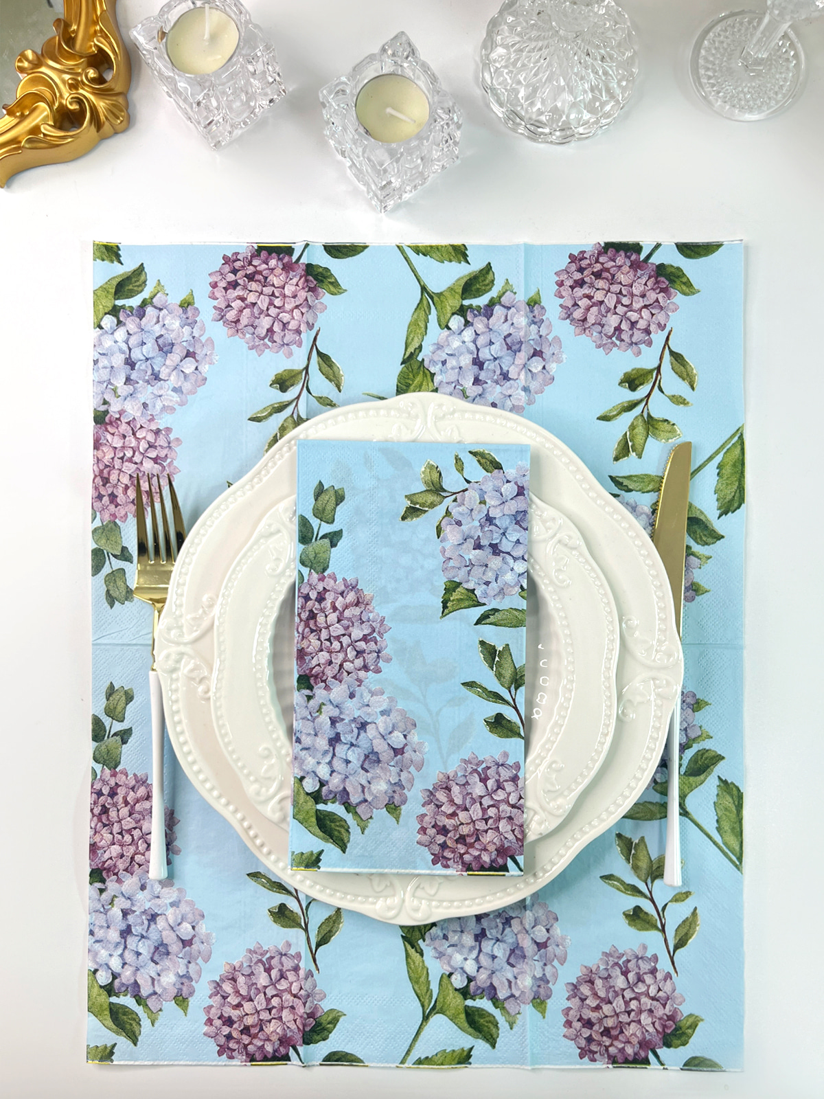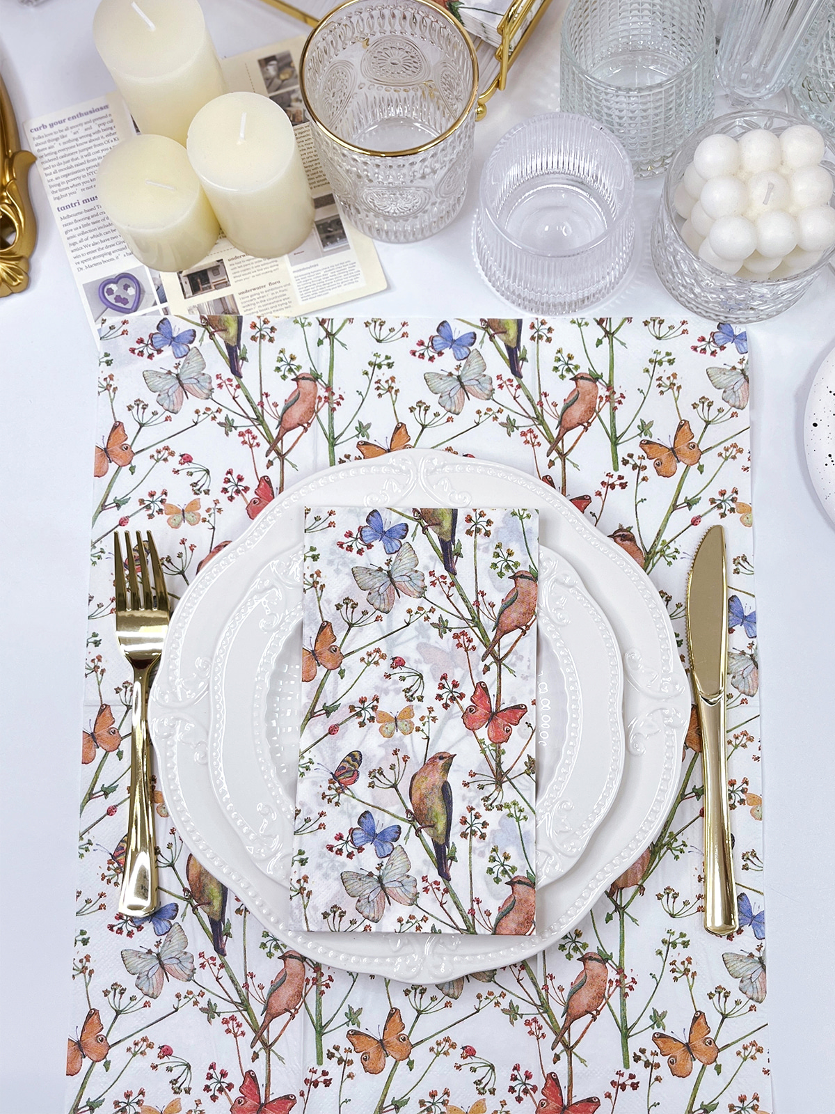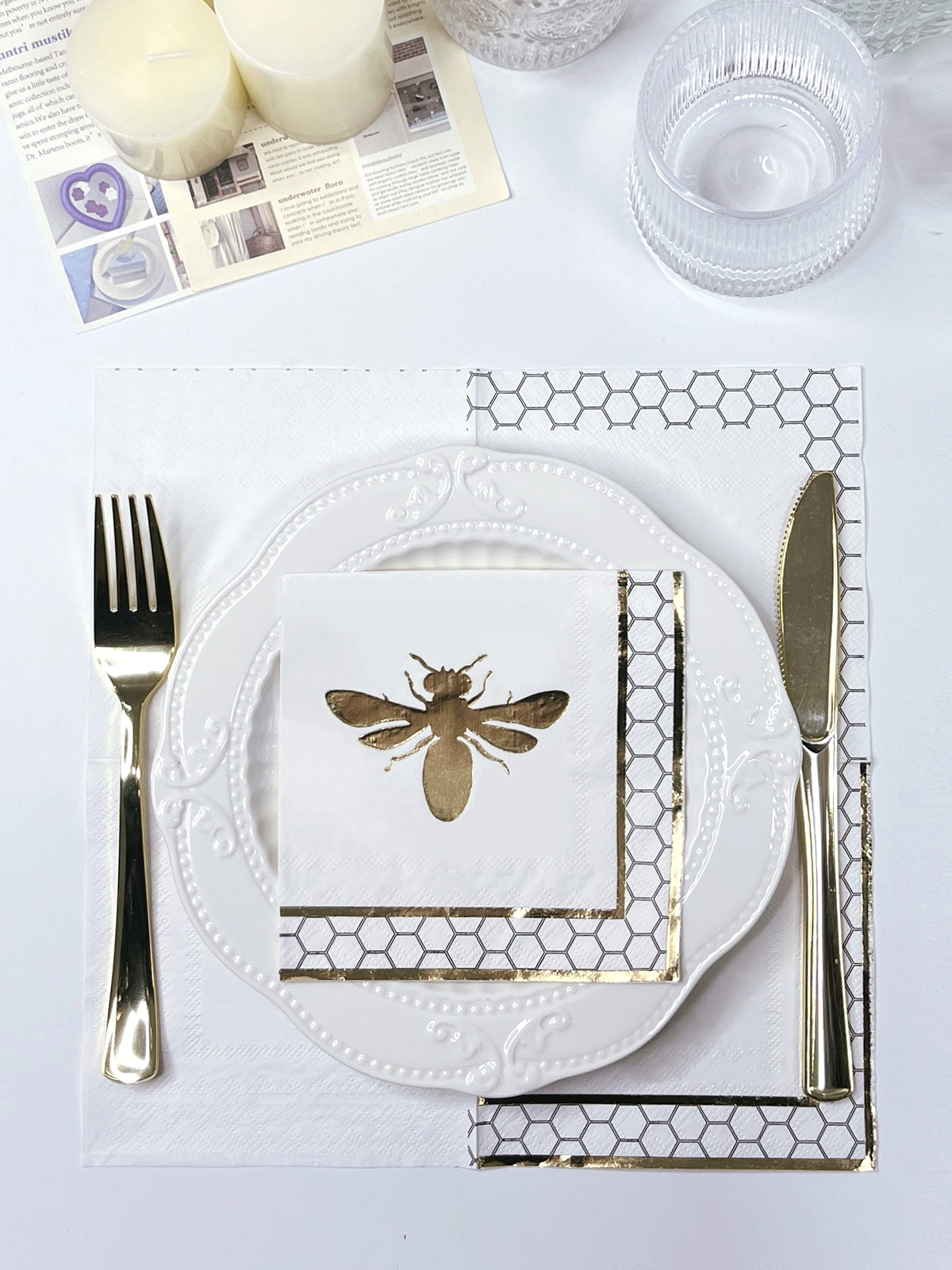
 English
 中文简体
中文简体
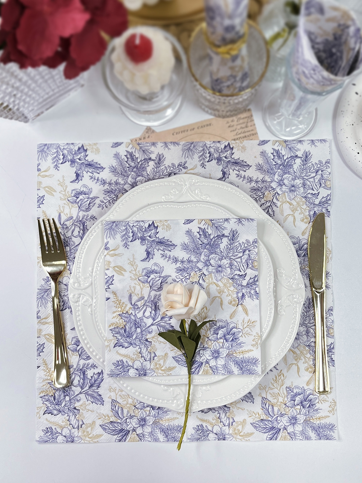
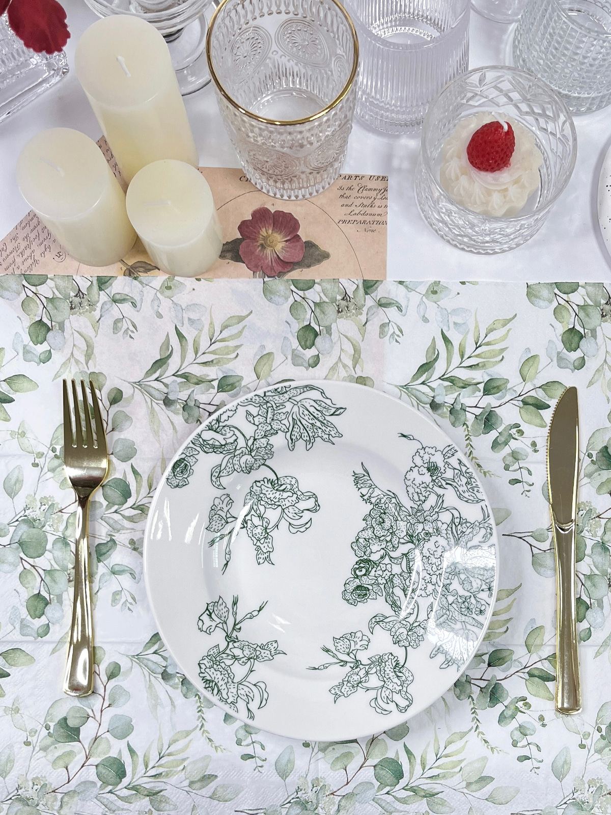
Choosing a napkin color is easier when the wedding table is considered as a whole. A color that looks attractive on a sample card may appear quite different beside a white plate, beige tablecloth, green leaves, or warm lighting. Wedding planners and couples often need to look at the actual table setting rather than choosing a shade on its own.
A useful starting point is the tablecloth. White cloth leaves plenty of room for color changes, while beige, champagne, gray, or darker fabrics already create a visual base. Napkins can either blend into that base or provide a clear contrast. Both approaches can work for an elegant table, depending on the other decorations.
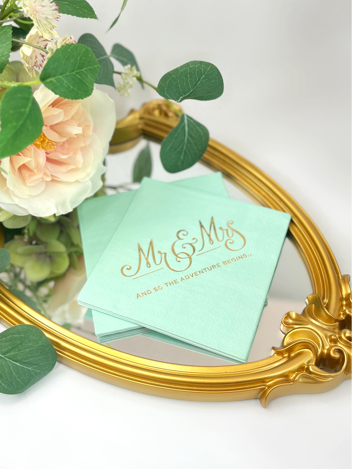
For Custom Paper Napkins Wedding, checking the color beside the actual tableware is especially useful. Paper absorbs light differently from ceramic, glass, metal, and fabric, so two materials with similar colors may not look identical under the same lighting.
Content
- 1 Why Does Color Matter on a Wedding Table
- 2 Which Soft Colors Suit an Elegant Wedding Style
- 3 How Can Neutral Shades Work With Different Table Settings
- 4 When Can Deeper Colors Add Contrast
- 5 Can Pastel Colors Create a Softer Wedding Atmosphere
- 6 How Should Napkin Colors Match Wedding Decorations
- 7 What Role Does Custom Design Play in Wedding Napkin Colors
- 8 How Does Paper Affect the Look of Printed Colors
- 9 What Should Be Checked Before Choosing a Color
- 10 How Is Color Consistency Managed During Production
- 11 How Can Elegant Napkins Keep a Balanced Color Scheme
Why Does Color Matter on a Wedding Table
Napkins usually sit close to plates, glasses, cutlery, and place cards, which makes their color easy to notice. A small change in tone can alter how a table feels without changing any furniture or decoration.
Imagine a white tablecloth with white plates and clear glasses. A cream napkin introduces only a small color difference, keeping the setting quiet. A pale green napkin creates a clearer connection with greenery placed in the center of the table. A dark blue napkin produces stronger contrast and draws more attention toward each place setting.
Practical color selection can start with three questions:
- What color is the tablecloth?
- Which colors already appear in the flowers and tableware?
- Should the napkin blend with the setting or create contrast?
Answering those questions narrows the choices quickly. A table that already contains several flower colors usually benefits from a quieter napkin shade. A simple table with limited decoration has more room for a deeper or more noticeable color.
Which Soft Colors Suit an Elegant Wedding Style
Soft colors work well when a wedding setting needs a gentle appearance without adding another strong visual element. Pale pink, cream, light blue, soft green, and muted lavender are common choices for floral or light-colored table settings.
Pale pink can sit comfortably beside white roses, cream flowers, or light-colored table linens. A slightly dusty pink often feels easier to coordinate than a very bright pink because it does not compete as strongly with nearby decorations.
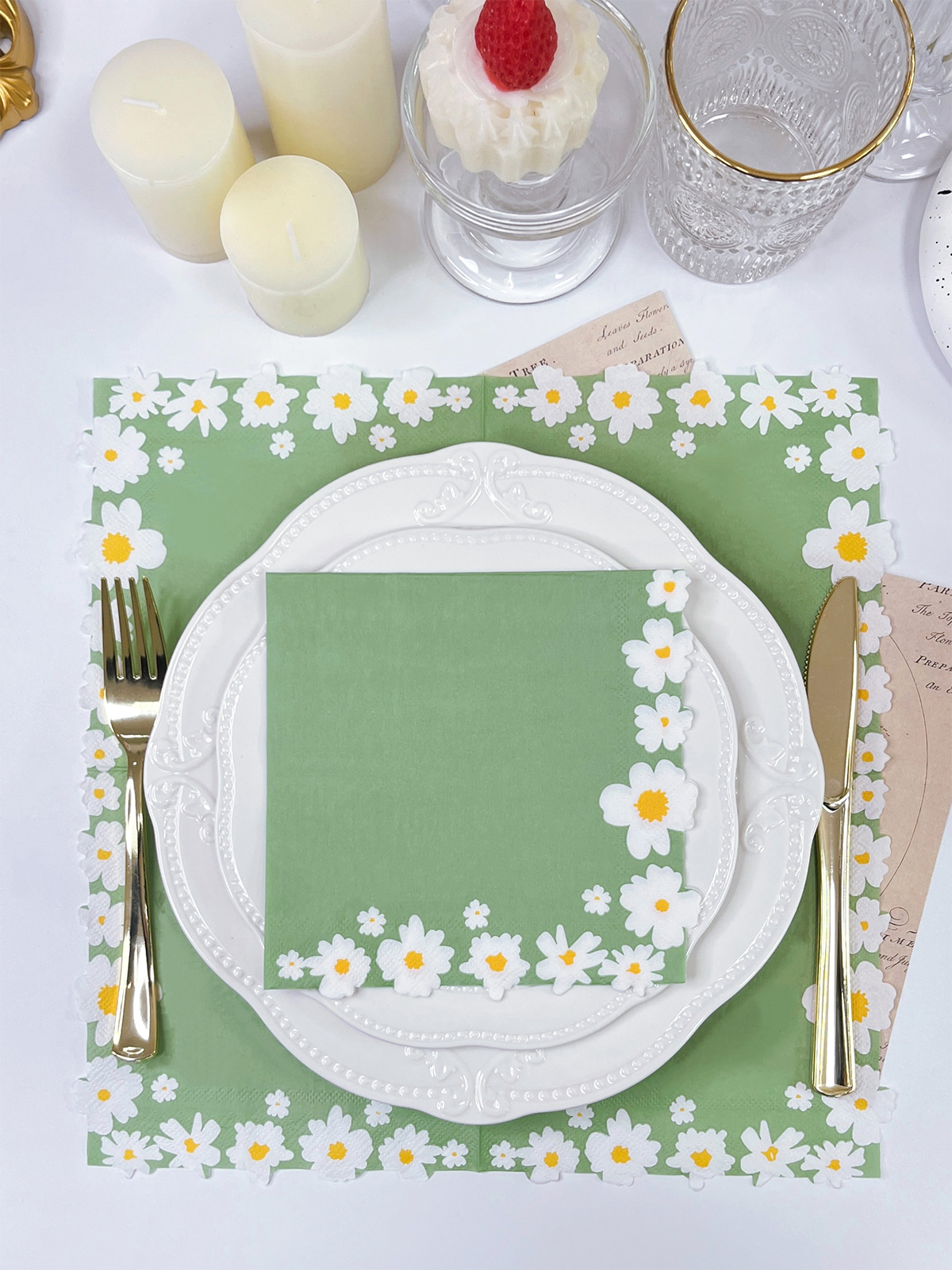
Soft green has a practical advantage for garden or outdoor settings. Green napkins can echo leaves and foliage already present on the table. A similar approach works with light blue when the surrounding decoration contains cool-colored flowers or simple white tableware.
Cream and ivory are useful when the goal is to keep the table warm rather than bright white. Such shades can work with wooden chairs, beige fabrics, gold-colored cutlery, or warm floral arrangements.
Using several pastel colors together requires some restraint. Three or four unrelated shades can make individual table elements look disconnected. One main soft color with one supporting shade is often easier to manage.
How Can Neutral Shades Work With Different Table Settings
Neutral colors are useful when other parts of the wedding table already carry strong visual information. White, ivory, cream, beige, and light gray can sit beside different materials without creating a sharp break between the napkin and surrounding items.
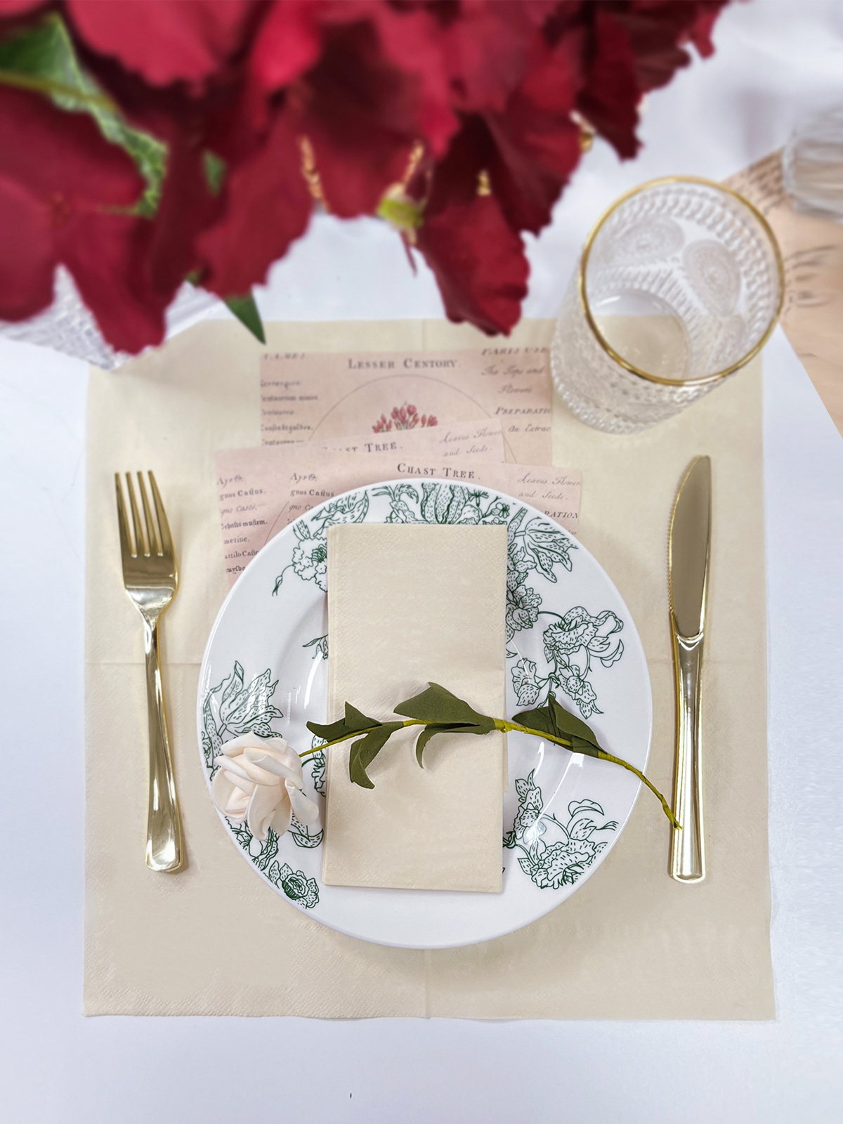
A simple example is a table with patterned flowers and decorative plates. Adding another strong color through the napkin may make the setting feel crowded. An ivory or cream napkin can keep attention on the existing details.
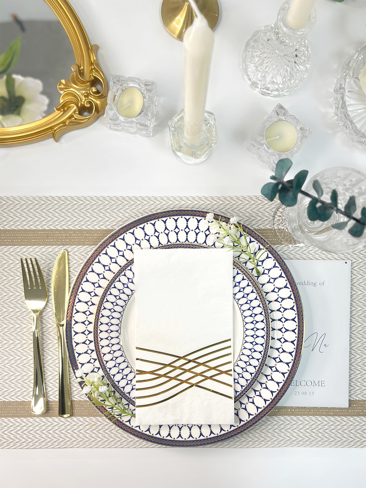
A different situation appears with a plain table. White plates, clear glasses, and a simple white cloth may leave very little contrast. A beige, muted green, or pale blue napkin can give each place setting a clearer outline.
| Table Setting | Suitable Napkin Direction | Practical Reason |
|---|---|---|
| White cloth and white plates | Cream or soft color | Adds gentle contrast |
| Beige cloth and warm decor | Ivory or muted brown | Keeps the warm color family |
| White cloth with green flowers | Soft green or cream | Connects with floral details |
| Simple white setting | Pale blue or muted pink | Adds a small color accent |
| Dark tablecloth | White, cream, or pale tones | Keeps the place setting visible |
Paper surface also affects the way a color looks. A matte napkin can appear softer than a smooth decorative material under direct light. For custom orders, checking a physical paper sample beside the planned tablecloth and plates can prevent a color choice from looking different after production.
When Can Deeper Colors Add Contrast
Dark colors have a practical role on tables that contain many pale surfaces. Navy, deep green, wine red, and muted brown can make a folded napkin easier to notice against white or cream table linens.
Navy works well with white plates and clear glassware because the difference in tone is easy to see. Deep green can connect with greenery while giving more weight to a light table. Wine red can suit warm floral arrangements, especially when small details such as candles or flowers already contain related tones.
Placement changes the visual effect. A dark napkin placed on a white plate becomes part of the place setting, while the same napkin placed directly on a dark tablecloth may almost disappear. Checking the actual folding and placement method before selecting the color can save unnecessary changes later.
Dark colors also need room around them. A deep green napkin, dark plate, dark flowers, and dark tablecloth can make a setting feel heavy. Keeping one or two surrounding elements light gives the darker shade enough space to work.
Can Pastel Colors Create a Softer Wedding Atmosphere
Pastel shades are useful for spring-like floral arrangements, garden settings, daytime receptions, and tables built around light fabrics. Their softer appearance allows flowers and tableware to remain visible without creating strong competition.
Color temperature matters during selection. Pale blue beside cool white plates can create a clean appearance, while the same blue beside cream fabrics may look slightly different. Pale pink can become warmer next to beige, cream, or warm-colored flowers.
Lighting deserves a practical check as well. A napkin that looks pale and cool near a window may appear warmer under indoor lights. Viewing a paper sample beside the actual tablecloth under the planned lighting gives a more reliable impression than judging the color from a screen.
For Custom Paper Napkins Wedding, such checking is useful before the final design is prepared. A physical sample can show how the paper, printed color, folding method, and surrounding materials work together, giving a clearer basis for the final color choice.
How Should Napkin Colors Match Wedding Decorations
Once a tablecloth and basic tableware have been selected, napkin color can be matched with the decorations already present. Flowers are often a useful reference because floral arrangements usually contain several shades that can guide the rest of the table design.
For example, a table with white flowers and green leaves can use cream napkins for a quiet appearance or soft green napkins to connect with the foliage. A setting built around blush flowers may suit cream, pale pink, or muted beige. Matching does not require an exact color copy. A related shade can create enough connection while keeping each part of the table visually separate.
Tableware also deserves attention. Gold-colored cutlery can make cream, beige, dusty pink, and warm brown appear more connected to the setting. Silver-colored cutlery tends to sit comfortably with white, gray, pale blue, and cooler green shades.
A simple color plan can follow three roles:
- Main color: used across tablecloths or larger decorations.
- Supporting color: carried through flowers, napkins, or table cards.
- Neutral color: used to give the eyes a quiet area.
Such a structure makes color selection easier when several decorations have already been ordered.
What Role Does Custom Design Play in Wedding Napkin Colors
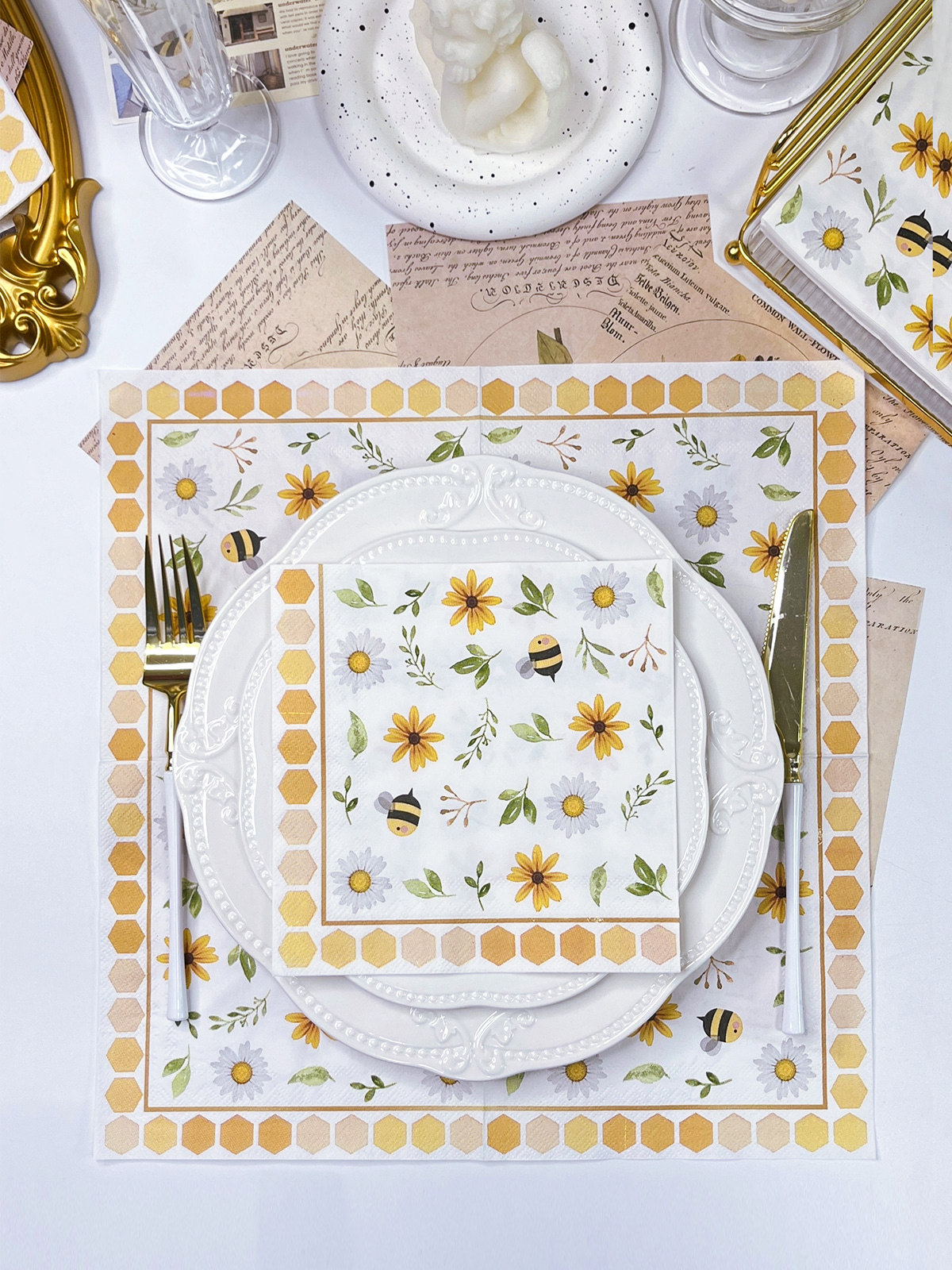
Custom Paper Napkins Wedding can involve more than selecting a plain paper color. Printed patterns, initials, small decorative elements, or table-related details may appear on the surface, so the background shade needs to leave enough visual space for the printed design.
A dark pattern placed on a pale napkin can remain easy to see, while a light pattern may need a deeper background. Small text also requires enough contrast to remain clear after folding. A design that looks balanced on a flat screen may appear different once part of the printed area sits inside a fold.
Folding direction matters during planning. A pattern placed close to an edge may move toward the side of the napkin after folding, changing its position on the finished product. Centered designs are easier to judge, while border patterns require attention to fold lines and edges.
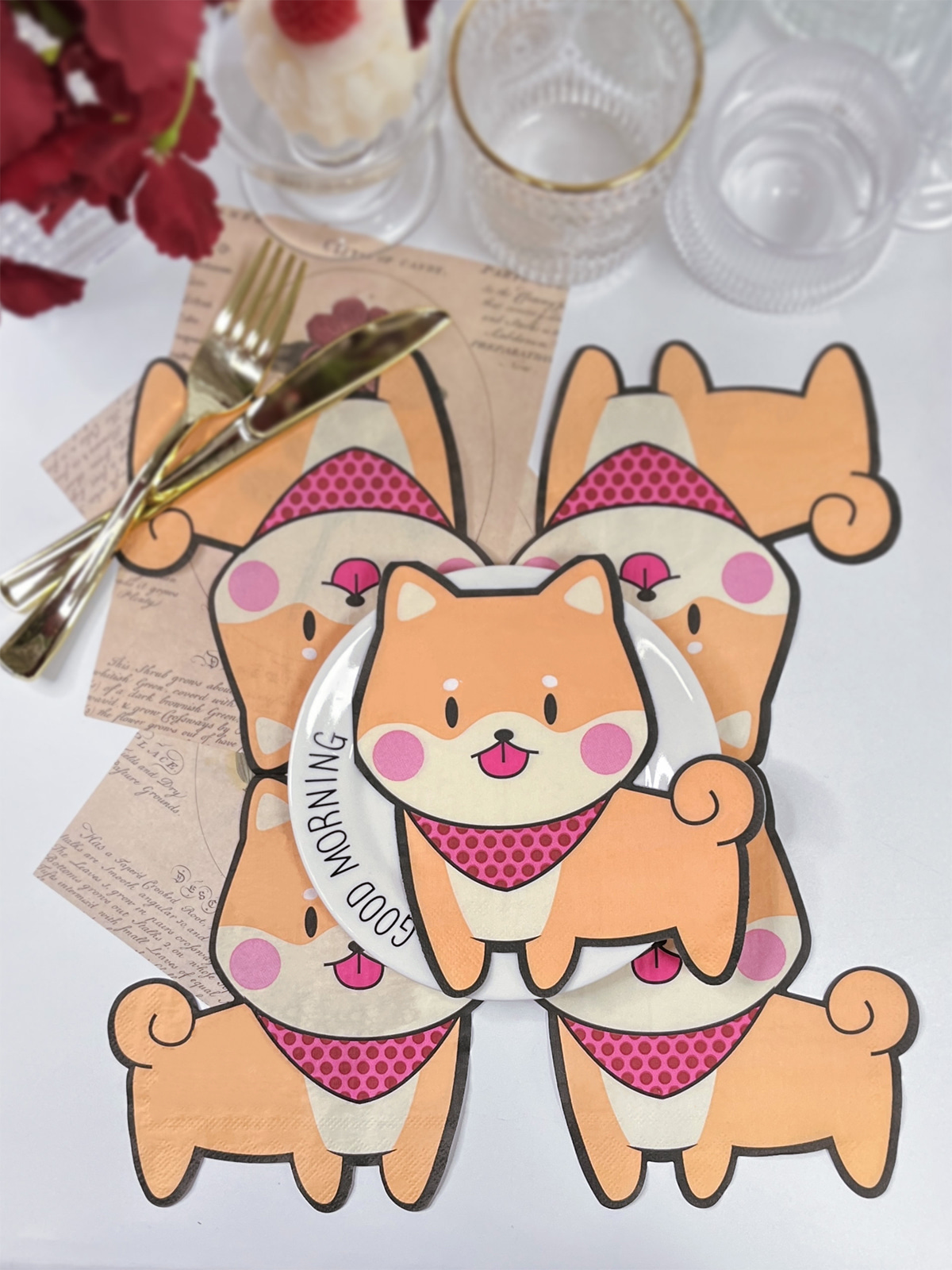
Color selection also needs to account for the actual setting. A napkin with a decorative print can become visually busy when placed beside patterned plates or heavily decorated menus. A simpler background may provide better balance in such surroundings.
How Does Paper Affect the Look of Printed Colors
Paper has a direct effect on how a printed shade appears. A warm-colored paper can make a pale printed tone look warmer, while a cleaner white surface can make the same design appear clearer.
Texture also changes the visual impression. A softer paper surface may give printed colors a gentle appearance, while a smoother surface can make edges and small design details look more defined. Such differences become easier to notice when the napkin is placed beside fabric, ceramic, or glass.
For Custom Paper Napkins Wedding, color checking works better when the actual paper is considered together with the printed design. Looking only at a digital color sample leaves out the effect of paper surface and surrounding light.
A practical check can include:
- Printed sample on the intended paper
- Sample beside the selected tablecloth
- Sample beside plates and cutlery
- Sample under the expected room lighting
- Folded sample viewed from the guest seating position
The folded sample is particularly useful because napkins rarely remain completely flat on a wedding table.
What Should Be Checked Before Choosing a Color
Color selection becomes easier when the physical surroundings are reviewed in advance. A venue with cream walls, wooden tables, and warm lights already has a warm visual base. Cool blue or gray napkins may create a noticeable contrast, while cream, muted green, or dusty pink may sit more quietly within the setting.
Outdoor venues bring different conditions. Green lawns, trees, stone surfaces, and natural daylight can make pale colors appear brighter. A very light napkin may blend into a white plate or light tablecloth, while a slightly deeper shade can make each place setting easier to distinguish.
The planned table layout also matters. Long banquet tables, round tables, and small reception tables create different visual distances. A color that looks clear on a nearby sample may appear less noticeable when many place settings are viewed together from across a room.
Photography is another practical consideration. Bright white lighting can make pale shades look washed out, while warm lighting can change cream, beige, and pink into deeper-looking tones. Viewing samples under the actual venue lighting can reduce surprises during setup.
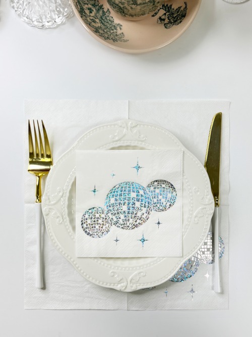
How Is Color Consistency Managed During Production
A Paper Napkin Factory needs to consider several stages when producing colored or printed napkins. Paper preparation, printing, drying, folding, and packing can all affect the appearance of the finished product. Consistent handling during production helps keep the visual result close to the approved sample.
Color checking should not focus only on a flat printed sheet. Folded napkins can show different areas of the design at different angles, while edges may receive more pressure during packing and handling.
For a custom order, the approved design needs to remain clear throughout production. Relevant checks can include:
- Paper shade before printing
- Printed appearance after production
- Alignment of decorative elements
- Folding position
- Condition of finished packs
Packaging also has a connection with appearance. Excessive pressure during packing may leave unwanted creases, while loose packing can allow folded napkins to move against one another. A suitable arrangement helps keep the finished design in a presentable condition during storage and transport.
How Can Elegant Napkins Keep a Balanced Color Scheme
A balanced wedding table does not require every decorative item to share the same shade. A small number of related colors can create enough connection across the setting while allowing flowers, plates, and napkins to retain their own visual roles.
One practical method is to select the tablecloth first, then review the flower colors and tableware before choosing the napkin shade. A neutral napkin can calm a table with detailed decorations, while a soft or deeper color can add definition to a simpler arrangement.
For Custom Paper Napkins Wedding, the same approach can guide printed patterns and background colors. Paper choice, folding style, lighting, and surrounding decorations all have a place in the decision.
A wedding napkin may appear to be a small part of table decoration, yet its position beside every plate gives color selection a practical role. Careful matching can help the entire setting feel connected without relying on excessive decoration.